Name that graphic style!
November 21, 2013 7:40 AM Subscribe
I'm fascinated by old union logos, especially the iconic IBEW (fist-and-lightning-bolts), Teamsters (two horses) and IWW (globe) insignia. I like the heraldic layouts, the modern-as-of-1920 visual style, and the heroic/futuristic/quasi-mystical iconography. You see similar features in Masonic iconography, logos for other fraternal orders (Lions, Eagles, the FOP) and in some older corporate logos (MGM and Paramount, the old American Airlines logo, Does this cluster of design features have a name? Where did it come from? What are some other good examples?
(Bonus: The Jimmy John's Workers Union has the coolest logo.)
(Bonus: The Jimmy John's Workers Union has the coolest logo.)
Best answer: Much of it is straight-up principles of heraldry, with aesthetic updates like streamlining and elements from Social Realism (especially in the case of union logos). Stars, eagles, lions, etc., are heraldic motifs. Round logos mimic heraldic seals. Some more on general logo history here.
posted by Miko at 8:21 AM on November 21, 2013 [2 favorites]
posted by Miko at 8:21 AM on November 21, 2013 [2 favorites]
Best answer: Seals go way back to the beginnings of civilization, way before heraldry. If you are looking for a name for that type of design, how about logo?
posted by JJ86 at 9:02 AM on November 21, 2013
posted by JJ86 at 9:02 AM on November 21, 2013
Response by poster: Just to clarify: I'm not asking what logos are, I'm asking for information on a specific graphical style that was used in logos (and maybe other places too?) during a specific point in history.
posted by Now there are two. There are two _______. at 9:17 AM on November 21, 2013
posted by Now there are two. There are two _______. at 9:17 AM on November 21, 2013
Best answer: I understand your question but that "specific graphical style" is basically the general definition of a logo which becomes clear when you see even the earliest seals and logos.
posted by JJ86 at 9:37 AM on November 21, 2013 [1 favorite]
posted by JJ86 at 9:37 AM on November 21, 2013 [1 favorite]
Response by poster: Ah, that makes more sense — sorry I suggested that you'd misunderstood.
That said: no, I really am asking about a specific style or era of logo design. I admit I've probably done a poor job of describing it in words. (If I knew how to describe it better, I wouldn't have needed this question!) But for instance the Bass logo, the IBM logotype and the Coca Cola logotype are totally different in style to the examples I gave, and even things like this are only vaguely similar.
Sorry to threadsit, and thanks for helping me clarify what I'm trying to ask. Backing out now...
posted by Now there are two. There are two _______. at 10:01 AM on November 21, 2013
Best answer: no, I really am asking about a specific style or era of logo design
The problem is that other than what we have given you, your examples share very little in common. They all reflect general heraldry, but they are from different graphics arts schools and feature different art movement aesthetics.
posted by Miko at 10:18 AM on November 21, 2013
The problem is that other than what we have given you, your examples share very little in common. They all reflect general heraldry, but they are from different graphics arts schools and feature different art movement aesthetics.
posted by Miko at 10:18 AM on November 21, 2013
Best answer: I'm gonna try to break down what I see.
IBEW: you have a seal with a modern sans serif typeface and a social-realism-influenced design, using lightning bolts or flashes from heraldry.
Teamsters: You have a seal with a line-drawn twin horse-head armorial crest (from heraldry) and a modern sans serif font.
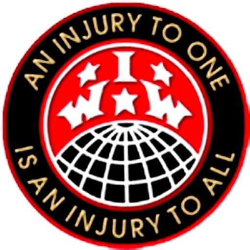
IWW: you have a seal with a motto in concentric circles, English stars (from heraldry) and a sans serif font.
Lions: Heraldic seal, lion supporters, sans serif font, high contrast design. The lions have a little Deco/Moderne influence but also Arts and Crafts.
Eagles: heraldic eagle, heraldic sun rays, seal shape, sans serif font but more of an Edwardian one.
FOP banner is a totally different art style than the others. It is very much late Victorian - a decorated font presented as a banner with flourishes. You have a central seal containing an English star which contains a classic armorial with a checky stripe and a castle mantling. The symbology is explained here.
MGM is a mishmash and strays very far from any single pure style. It started out differently. You've got a seal above a scroll (of film), the theatrical mask as sort of a charge, the lion and the motto. The fonts change with the period.
Paramount is a seal with a circle of heraldic stars surrounding a single mountain. Here's the history. The font is calligraphic.
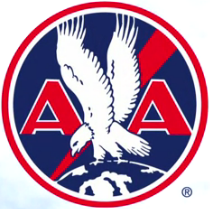
American Airlines didn't even exist until 1930, and its graphics have changed a lot, too. This is one of the older ones, again, basic seal, basic heraldic eagle in flight, sans serif font, stars. The one you've linked to, with the red diagonal slash and globe, looks late 30s/early 40s to me. Oh hey I was right. That one is squarely Deco - the horizontal lines borrow from the period aesthetic of monochrome woodcut illustration.
Jimmy John's is a visual pun on the IWW logo and the Jimmy John's, but the font is a late 70s/80s throwback, attempting the old skool look they try to go for in their corporate "varsity/preppy" marketing. The raised fist as symbol goes back to labor movements of the late 1800s-1930s, but the sketchy, transfer-like rendering here recalls 60s protest art.
So you have a collection here of typefaces and styles ranging from 1907 to the 1980s, and the only thing, really the only thing, I can see that they have in common is their use of visual cues from heraldry to lend emphasis and authority. Those cues vary but each one has them. And most of them use a sans serif print font with slender verticals, but you've also got calligraphic fonts in the mix. Other than that, you've got everything from late Victorian to Arts & Crafts, Art Deco, Art Moderne, maybe a little street art/Fluxus going on with Jimmy John's. These are very strong and tight graphically (except for MGM, good God, I never noticed what a mess that things is). THey feature high contrast and hard, clean lines, mostly.
You would probably also like to look at advertising art from the era, and you might also be interested in stock certificates circa 1900, which use a lot of these classic elements rooted in medieval heraldy. A lot of graphic design, even today, just updates that vocabulary stylistically, but keeps going back to the same glossary.
posted by Miko at 11:05 AM on November 21, 2013 [2 favorites]
IBEW: you have a seal with a modern sans serif typeface and a social-realism-influenced design, using lightning bolts or flashes from heraldry.
Teamsters: You have a seal with a line-drawn twin horse-head armorial crest (from heraldry) and a modern sans serif font.
IWW: you have a seal with a motto in concentric circles, English stars (from heraldry) and a sans serif font.
Lions: Heraldic seal, lion supporters, sans serif font, high contrast design. The lions have a little Deco/Moderne influence but also Arts and Crafts.
Eagles: heraldic eagle, heraldic sun rays, seal shape, sans serif font but more of an Edwardian one.
FOP banner is a totally different art style than the others. It is very much late Victorian - a decorated font presented as a banner with flourishes. You have a central seal containing an English star which contains a classic armorial with a checky stripe and a castle mantling. The symbology is explained here.
MGM is a mishmash and strays very far from any single pure style. It started out differently. You've got a seal above a scroll (of film), the theatrical mask as sort of a charge, the lion and the motto. The fonts change with the period.
Paramount is a seal with a circle of heraldic stars surrounding a single mountain. Here's the history. The font is calligraphic.
American Airlines didn't even exist until 1930, and its graphics have changed a lot, too. This is one of the older ones, again, basic seal, basic heraldic eagle in flight, sans serif font, stars. The one you've linked to, with the red diagonal slash and globe, looks late 30s/early 40s to me. Oh hey I was right. That one is squarely Deco - the horizontal lines borrow from the period aesthetic of monochrome woodcut illustration.
Jimmy John's is a visual pun on the IWW logo and the Jimmy John's, but the font is a late 70s/80s throwback, attempting the old skool look they try to go for in their corporate "varsity/preppy" marketing. The raised fist as symbol goes back to labor movements of the late 1800s-1930s, but the sketchy, transfer-like rendering here recalls 60s protest art.
So you have a collection here of typefaces and styles ranging from 1907 to the 1980s, and the only thing, really the only thing, I can see that they have in common is their use of visual cues from heraldry to lend emphasis and authority. Those cues vary but each one has them. And most of them use a sans serif print font with slender verticals, but you've also got calligraphic fonts in the mix. Other than that, you've got everything from late Victorian to Arts & Crafts, Art Deco, Art Moderne, maybe a little street art/Fluxus going on with Jimmy John's. These are very strong and tight graphically (except for MGM, good God, I never noticed what a mess that things is). THey feature high contrast and hard, clean lines, mostly.
You would probably also like to look at advertising art from the era, and you might also be interested in stock certificates circa 1900, which use a lot of these classic elements rooted in medieval heraldy. A lot of graphic design, even today, just updates that vocabulary stylistically, but keeps going back to the same glossary.
posted by Miko at 11:05 AM on November 21, 2013 [2 favorites]
Best answer: And at the risk of being too obvious because I included it before, they all are, or contain, seals. "Seal" just means the design is bounded by a circle (outlined or not).
posted by Miko at 11:12 AM on November 21, 2013
posted by Miko at 11:12 AM on November 21, 2013
Best answer: I, too, like this style, and the common elements are the outer circle, the use of concentric circles (especially nested rings of type -- oh, baby!), usually one sans serif font, and a pretty simple graphical elements (e.g., a star or a fist) in the center.
The Communications Department of the city of Providence, RI, has another sweet logo, but I can't find it online right now. It's a white disc with concentric rings of red type and a little gold and some stars... and man, it's great. I have only seen it on a few equipment pedestals on Weybosset Street, though. :7(
posted by wenestvedt at 11:33 AM on November 21, 2013
Best answer: Hello,
I have significant personal experience in this field. Your question is too broad to generate helpful answers, I think, although it's apparent you appreciate the info provided above.
The Teamsters and IBEW logos are the logos of what union people refer to as "the international," meaning in that instance the top level (really, national in most cases) administrative unit of the organization. In most cases the international has additional districts, called district councils, and the basic units of organization, the local labor unions themselves.
The big unions we all know of - SEIU, Teamsters, IBEW, you probably can come up with examples on your own - are built of of the locals and often those locals or even the larger organizations themselves are the result of about 125 years of organizing, which has often included merging with other unions.
Therefore the international logo, in this case the Teamsters horseheads and the IBEW fist, represents a long history, sometimes quite specific. I don't have an example to hand, but merged unions often include elements from their precursor union logos in the resulting logo.
In the case of the IBEW fist, supposedly the apparent elements of the image - the clenched fist or organized labor grasping the lightning bolts of electricity - also represent the history of the union. As you might imagine, working with electricity can be hazardous, and the most common accident involved accidental hand contact with a source of electricity. The story I was told is that the founding national chairman of the IBEW had lost his hand in a work accident.
Note that the original logo shows a LEFT fist, while the current one shows a right.
It's been about twenty years since I did that work; it was fascinating.
posted by mwhybark at 8:38 AM on November 22, 2013 [3 favorites]
This thread is closed to new comments.
(That'll teach me to use so many of the little fuckers...)
posted by Now there are two. There are two _______. at 8:02 AM on November 21, 2013