Antique graphic design questions ahoy
October 24, 2021 3:52 AM Subscribe
What is this semi-antiquated illustration *layout style* called? To be clear, I'm looking to identify the placement and structure of the images on the page in a regular and usually symmetrical fashion, rather than the style of the illustrations themselves. Is there a term for this type of layout structure? Catalog Style or something seems close, but I can't find any clear answers via the googles.
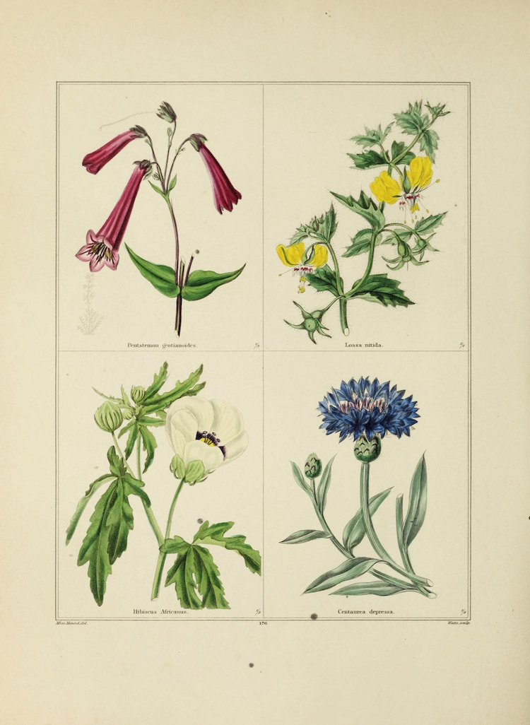
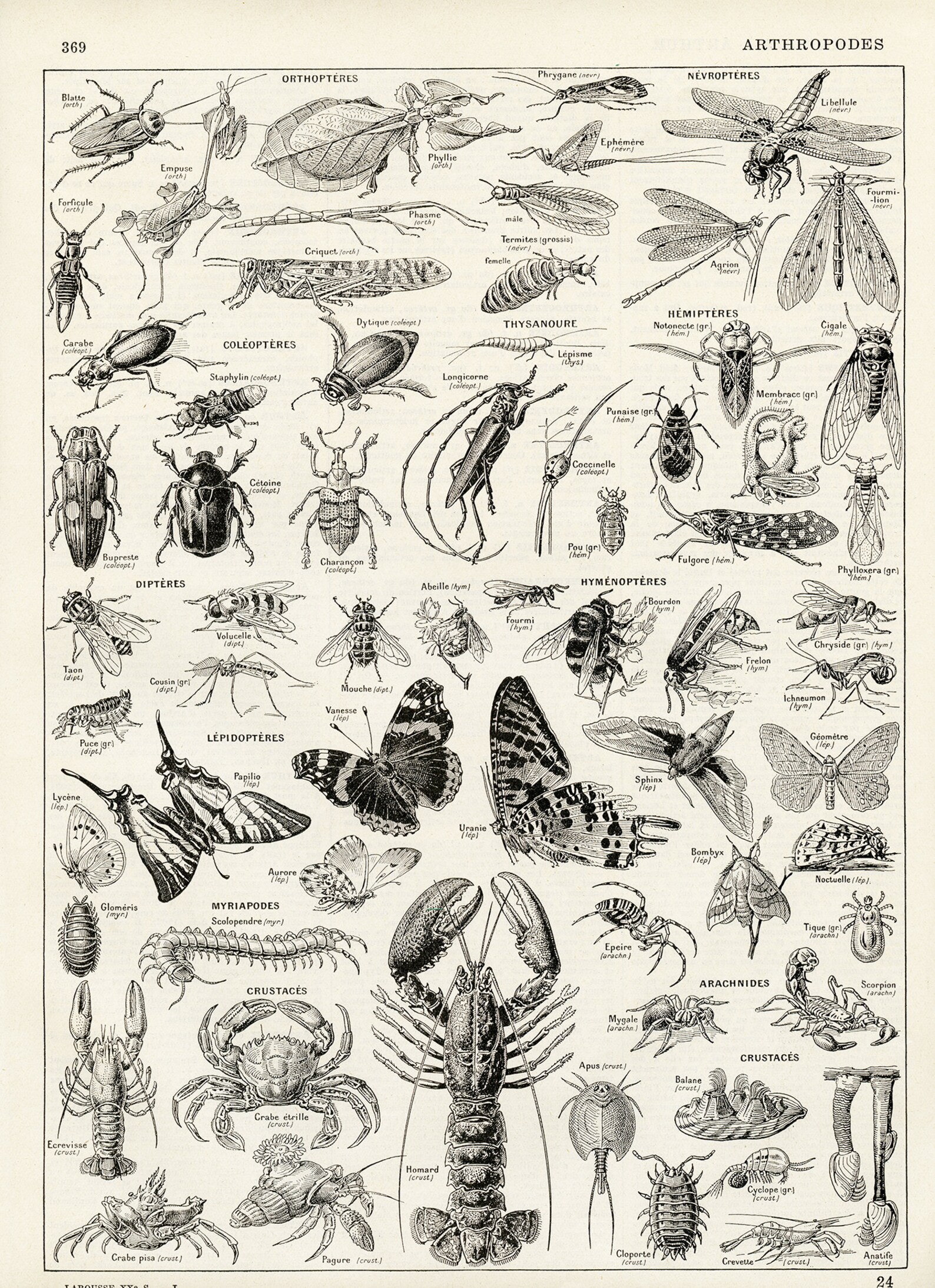
I would call all of your examples "scientific illustration," maybe specifically 19th century-ish scientific illustration? But that refers more to the content than the layout.
posted by mskyle at 5:59 AM on October 24, 2021 [1 favorite]
posted by mskyle at 5:59 AM on October 24, 2021 [1 favorite]
I think you’re seeing two things here. Agree with the comments above about the technology and content being a key factor to the look, spacing and typography. However, as to the proportions and symmetry there is clear influence from neoclassical design, which would obviously be a factor in most 19th century graphic design. Modern typography developed in parallel with modern developments in art and architecture, so I’d look to these parallel arts to see if you can group the approach into a wider artistic movement.
posted by q*ben at 7:20 AM on October 24, 2021
posted by q*ben at 7:20 AM on October 24, 2021
I see plenty of modern scientific Illustration with the same layout style, fwiw. There's certain formal and pedagogical reasons to want clean, symmetric, semi-grid like layout, independent of technology or visual aesthetics.
posted by SaltySalticid at 7:29 AM on October 24, 2021 [2 favorites]
posted by SaltySalticid at 7:29 AM on October 24, 2021 [2 favorites]
Probably worth noting that the New Typography movement starting in the 1920s was characterized by asymmetry.
posted by grouse at 8:02 AM on October 24, 2021 [1 favorite]
posted by grouse at 8:02 AM on October 24, 2021 [1 favorite]
I've seen Ernst Haeckle's work referred to as mandalas. His diatoms in particular are even more mandala-like than his animal illustrations.
posted by ananci at 9:16 AM on October 24, 2021 [2 favorites]
posted by ananci at 9:16 AM on October 24, 2021 [2 favorites]
If you are looking for a not-yet-existing term, I’d suggest Field Guide Style; modern field guides I have still have a similar look.
posted by tchemgrrl at 9:24 AM on October 24, 2021 [2 favorites]
posted by tchemgrrl at 9:24 AM on October 24, 2021 [2 favorites]
« Older Recommendation for books/intro materials about... | WatchFi - where can I find the wristwatch seen in... Newer »
This thread is closed to new comments.
But there were some technological constraints with typography (and by extension illustrations) that took place in the mid 19th century that can be identified. So maybe this helps?
The 1860s and 1870s were the peak of using wood type for layout, the limitations of this technology favored grouping separate elements into rows. (Although there were ways to get around that, they were very time-consuming though).
Around that time, lithography was in direct competition with wood type. Lithography allows the designer more flexibility, you can overlap typography with other typography, or typography with illustration.
So for a while there was a bit of an "arms race" between the practitioners of the two technologies. The wood-type folks pushed the limits of what was possible and the lithographers flexed their layout muscles - as a result ALL layouts became more and more complex, but the use of symmetry was important for reigning all this complexity in.
So, maybe the best you can get is "early commercial lithograph" style and/or "peak wood type" style.
posted by jeremias at 5:31 AM on October 24, 2021 [11 favorites]