Source of "Soviet-style" posters on DC Metro?
June 9, 2005 10:29 AM Subscribe
Jason Kottke, BoingBoing and a couple other places have picked up the story of a Soviet-style poster that's been spotted on the DC-area Metro. Looking at it carefully, I just can't believe that this is genuine; for one thing, the poster's artwork just doesn't fit (take a glance at the hand just behind the head of the man in the foreground -- this is obviously a hand holding a flag, not someone grasping a pole in a Metro car). I've been looking through galleries of old Soviet propaganda posters all morning to see if I can find a source it could have been Photoshopped from, but without luck.
Does anyone know more about this poster and whether it is genuine? Or if it isn't, what the actual source is?
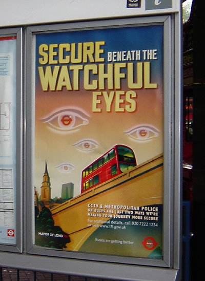
From smackfu's link, this London poster is even scarier. Boston (pdf). New York.
posted by rafter at 11:12 AM on June 9, 2005
posted by rafter at 11:12 AM on June 9, 2005
That London one is GREAT. I mean, I don't think it could possibly be any more Orwellian, do you?
posted by keswick at 11:22 AM on June 9, 2005
posted by keswick at 11:22 AM on June 9, 2005
Get. The. Fuck. Out. The NYC and Boston ones are pretty innocuous, but wow, the London and DC ones are... WOW.
posted by mkultra at 11:24 AM on June 9, 2005
posted by mkultra at 11:24 AM on June 9, 2005
wow is right ... american artists using soviet posters as inspiration ... sarcasm? ... an in joke that lets the viewer know that it's not as frightening as it may seem? ... but why would we need to be reassured of that?
it's creepy ... just creepy
posted by pyramid termite at 12:36 PM on June 9, 2005
it's creepy ... just creepy
posted by pyramid termite at 12:36 PM on June 9, 2005
Incidentally, the sign is from the MARC (commuter train run by the Maryland Transit Administration) not the DC Metro.
posted by clarissajoy at 1:00 PM on June 9, 2005
posted by clarissajoy at 1:00 PM on June 9, 2005
Heh, that's nothing. Look at the design for the log of my home town: Madison.com. You can't really tell, but that star on the logo is part of a campaign they've been running on the beltline that looks like propaganda for a Communist worker's party or somesuch. At one point, the local NBC affiliate did a spoof on it showing the weatherman in place of the guy on the poster. It's all gone batshit insane.
Ah, found a sample: here
posted by thanotopsis at 1:29 PM on June 9, 2005
Ah, found a sample: here
posted by thanotopsis at 1:29 PM on June 9, 2005
I'm sure I'm over-reacting, but those posters are totally squick-making. I'm guessing they don't realize that a lot of people don't know the history of that type of art.
A person at one of those links suggests that the poster in the original post (heh) is taken from a Soviet Olympics poster.
posted by deborah at 5:51 PM on June 9, 2005
A person at one of those links suggests that the poster in the original post (heh) is taken from a Soviet Olympics poster.
posted by deborah at 5:51 PM on June 9, 2005
This isn't that creepy, it's actually a little re-assuring.
If you were a graphic designer commissioned to make a poster for something that sounded like it was from Orwell's 1984, wouldn't you go completely over the top with a height-of-communism style graphic in an attempt to highlight how insane this was?
And would you really be that surprised if your PHB signed off on it?
posted by krisjohn at 6:21 PM on June 9, 2005
krisjohn ... but what if part of the intention is to re-assure us by going over the top with it? ... that's what i find creepy about it
posted by pyramid termite at 7:14 PM on June 9, 2005
posted by pyramid termite at 7:14 PM on June 9, 2005
Reassure us by going over the top with it? City government officials don't think that way. The london poster, at least, fucking has to be the work of a pissed-off graphic designer pulling the wool over his/her employers' eyes.
posted by Tlogmer at 12:21 AM on June 10, 2005
posted by Tlogmer at 12:21 AM on June 10, 2005
Actually, I kind of take that back after looking at the madison billboard. That one's self-aware enough to be discomforting.
posted by Tlogmer at 12:23 AM on June 10, 2005
posted by Tlogmer at 12:23 AM on June 10, 2005
Geez I got the shivers just looking at that london poster. The MTA one is just funny.
posted by Mitheral at 7:43 AM on June 10, 2005
posted by Mitheral at 7:43 AM on June 10, 2005
but those posters are totally squick-making. I'm guessing they don't realize that a lot of people don't know the history of that type of art.
No way. No way any graphic designer could not know the connotations of that art. No way anyone capable of making that poster would be unaware of the history of that kind of poster - you think they just randomly reinvented a whole style of art?
But at the same time, I don't really get it. I assumed the DC one was a spoof on official posters, which would presumably be more like the NYC ones (i.e., a little discomfiting, but not blatantly orwellian). But if it's an official poster, I don't know what to make of it. And the london one is just plain creepy. It's not as obviously spoof-y as the DC one, and it certainly seems official. So that's just plain old scary...
posted by mdn at 8:41 AM on June 10, 2005
This thread is closed to new comments.
posted by smackfu at 10:52 AM on June 9, 2005