Use Photoshop to fix a photo to photocopy
June 11, 2007 11:27 AM Subscribe
PhotoshopFilter: How do I adjust a photo so that it looks okay going through a photocopier?
I have a black-and-white photo that I am going to put on a postcard and printed at Kinko's. It looks like crap when photocopied. I know there has got to be a way to fix this in Photoshop, but I don't know how! I have CS2.
I have a black-and-white photo that I am going to put on a postcard and printed at Kinko's. It looks like crap when photocopied. I know there has got to be a way to fix this in Photoshop, but I don't know how! I have CS2.
You could try adjusting the levels to push the contrast wider. You want to bring up the lighter portions closer to white, make sure the darkest bits look good and dark. Aim to get a nice strong white/black contrast on the bits that need it.
A lot of photocopiers don't do greyscale much justice. Getting rid of the midtones and focusing on a contrasty dark-and-light looks like it'll work okay for that image, and get rid of some of the wash-of-noisy-grey you might be encountering.
posted by cortex at 11:43 AM on June 11, 2007
A lot of photocopiers don't do greyscale much justice. Getting rid of the midtones and focusing on a contrasty dark-and-light looks like it'll work okay for that image, and get rid of some of the wash-of-noisy-grey you might be encountering.
posted by cortex at 11:43 AM on June 11, 2007
If things are going to be photocopied, go to your Adjustments sliders on the menu and up the brightness and then the contrast. Pictures like that go dark when photocopied. Unfortunately, your blacks are pretty black already. There might not be enough detail to bring out even doing what I said. But give it a go.
posted by lpsguy at 11:43 AM on June 11, 2007
posted by lpsguy at 11:43 AM on June 11, 2007
Radioamy, there's almost no tonal range in this image -- there's a short spectrum of muddy dark gray and a short spectrum of dusty light gray. In other words, there's no tonal variation that any "fixing" could amplify to the extent you'd need for a pretty photocopy (which is essentially a toneless process -- black dots on a white field, no grays).
Any energy you might spend doctoring this photo would be much better spent taking a new picture of the item or digging up the original image (looks like someone else already "Photoshopped" a lot of tonal detail out of this version).
posted by gum at 11:47 AM on June 11, 2007
Any energy you might spend doctoring this photo would be much better spent taking a new picture of the item or digging up the original image (looks like someone else already "Photoshopped" a lot of tonal detail out of this version).
posted by gum at 11:47 AM on June 11, 2007
I don't agree, gum. You are looking at a jpg optimized for web, I assume. You have no idea what the original looks like. In photoshop there might be plenty of room in those blacks and whites to get some detail in a photocopy. I would use levels - go for being able to see detail in your blacks and a little bit of underexposure in your whites (which you already have) and it might work. I would NOT go for MORE contrast..I'd go for LESS because the photocopier will add lots of it.
posted by spicynuts at 11:51 AM on June 11, 2007
posted by spicynuts at 11:51 AM on June 11, 2007
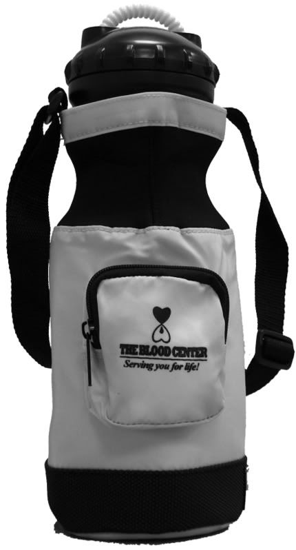
Response by poster: I took the original photo. The rest of the recruitment team really wanted a photo of the stupid waterbottle on the postcard, even though I explained that it's not as easy as snapping a photo and slapping it on the card!
I have a crappy camera and crappy lighting and minimal PS skills...I'm a PR Manager, not a graphic designer! I tried to isolate the image from the background, and I know it looks kinda jagged.
Gum, if I take a new photo, any tips?
posted by radioamy at 11:52 AM on June 11, 2007
I have a crappy camera and crappy lighting and minimal PS skills...I'm a PR Manager, not a graphic designer! I tried to isolate the image from the background, and I know it looks kinda jagged.
Gum, if I take a new photo, any tips?
posted by radioamy at 11:52 AM on June 11, 2007
This sounds like a job for Drew3D's Super Sneaky Halftoning Trick. Basically you want to pre-dither the image into a bitmap. Many copiers are too dumb to do it properly, so let's let PhotoShop do it for them.
Image > Mode > Grayscale (if necessary).
then
Image > Mode > Bitmap with Method = Diffusion Dither and pixels/inch equal to or less than the DPI of the copier.
Try making a few different pixels/inch masters (e.g. 450, 300, 200, 150) if you don't know the copier DPI.
If the diffusion-dithered masters don't seem to show enough detail, start over and use Curves to lighten/darken/tweak the image prior to conversion to Bitmap.
You may want to do a few lightened/darkened versions anyway just in case, since it's a lot easier to do this beforehand than doing it at Kinko's.
Then print out all your master pages. Make sure when you print them out that more dithering or other weirdness is not applied. Then, at Kinko's, do a test page of each one to find the best match for that copier. Then do the big batch.
This is not with CS2 but the exact commands are probably similar with CS2.
I've done this before and it works great.
posted by drew3d at 11:56 AM on June 11, 2007
Take the picture again, five or six times, with a whole lot more light, and pick the resulting image that shows all the shadowy detail of the dark regions of the photo without completely blowing out the details of the light regions. The challenge for photocopying is preserving detail at the dark end -- don't worry about much else.
Don't run it through Photoshop's or any other application's auto-adjust routines. If you want to do any tonal tweaking, make small, manual adjustments (see hints above).
Also: What are you photocopying? If you're printing this onto a piece of office paper and taking that to Kinko's, you're leaving 75% of your information at the office. Make sure to bring the image file to Kinko's so that the photocopy machine is dealing with all your data.
posted by gum at 12:11 PM on June 11, 2007
Response by poster: I upload the file onto Print Online. I don't know how they do it exactly...
posted by radioamy at 12:20 PM on June 11, 2007
posted by radioamy at 12:20 PM on June 11, 2007
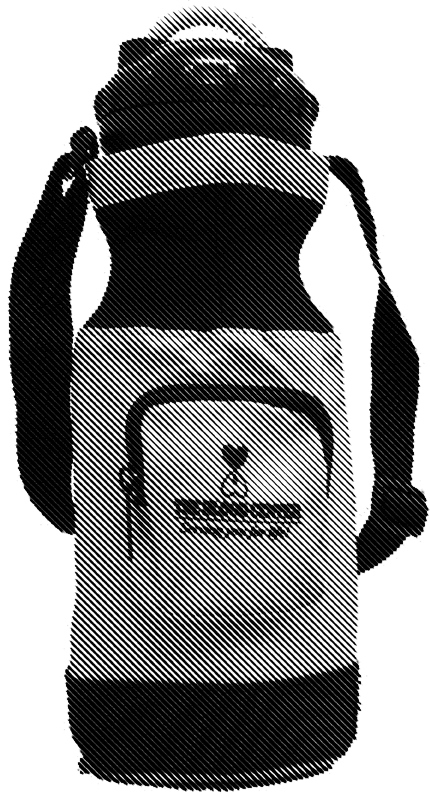
To photocopy nicely, you want tones kind of like this -- achieve something close to that with your camera and you can leave Photoshop alone altogether.
posted by gum at 12:25 PM on June 11, 2007
posted by gum at 12:25 PM on June 11, 2007
Drew3d is right on with the basic method of printing this as a bitmap instead of a grayscale. Making it a bitmap effectively removes any levels of gray and converts everything to either black or white.
The only thing I would do differently is to not focus so much on the DPI (which should be in the 300 range) and use one of the halftone screen methods experimenting with a series of low LPI (lines per inch) settings. You can get some good effects with the traditional round halftone dot, but a 45degree line is also nice. Here's an example at 15 LPI. It would work better with a higher resolution original (the logo needs definition) but you could insert a corrected, sharpened logo in the final version.
posted by Jeff Howard at 12:29 PM on June 11, 2007
can you explain why this needs to be photocopied at all to go on a postcard?
posted by white light at 12:49 PM on June 11, 2007
posted by white light at 12:49 PM on June 11, 2007
Response by poster: white light: What do you mean? How else would it go on a postcard? Our postcards are double-sided, black-and-white pieces of cardstock that are cut in half or quarters.
posted by radioamy at 1:11 PM on June 11, 2007
posted by radioamy at 1:11 PM on June 11, 2007
There are at least two other ways to get your image on a postcard. The way you describe results in a second-generation image (your printer to the photocopier).
You could get a first-generation image by running the cardstock directly through the printer. (You can do this at Kinkos if you bring a digital file of the 4up layout). This takes more preparation and is more expensive, but results in higher quality. The other first-generation way is much more expensive, but higher quality still. Instead of using your home printer or Kinkos, give the digital image to a professional printer and have them print it directly on postcard stock using a higher resolution output than your home printer or Kinkos' printer is capable.
posted by Jeff Howard at 1:39 PM on June 11, 2007
Don't Kinko copiers have an option to automatically apply a halftone pattern on photos? If not, then use the Photoshop halftone filter to put one on the jpeg.
posted by JJ86 at 1:41 PM on June 11, 2007
posted by JJ86 at 1:41 PM on June 11, 2007
Response by poster: Jeff: we're a nonprofit...we're poor!
posted by radioamy at 1:52 PM on June 11, 2007
posted by radioamy at 1:52 PM on June 11, 2007
I was only addressing your "how else would it get on a postcard?" question. Photocopying isn't the only way, but it's probably the most cost-effective for your purpose.
If you're only making a couple dozen postcards, then printing directly onto the cardstock from your own printer is the cheapest way to go. If you're doing hundreds, then photocopying at Kinkos is probably best because it doesn't wear out your printer or waste your toner. If you're doing many thousands of postcards, then the professional printer becomes the cheapest way to go in the long run because it's the same initial setup cost no matter how many you do.
posted by Jeff Howard at 3:02 PM on June 11, 2007
Best answer: To expand on what Jeff's said, if you give Kinko's a digital file, you're having them print it, not photocopy it.
Photocopying involves scanning an original from the glass platten. It's true you lose image quality, but you don't have to worry about that in your case, because you've given them they digital file, right?
Kinko's will print your job directly from the file you send them. Well, not directly--if it's not done already, they'll set up a new file with multiple images per page (2-up or 4-up) and put the fronts and backs together in the same file. They'll print that on 8 1/2 x 11 cardstock, then cut the prints up in stacks of 100 or so in their paper cutter into postcard size. The printer they use will have a platen for photocopying, but they won't be using it.
Kinko's charges by impression--it's the same cost whether you're printing or photocopying. When I worked there, setting up the job was free.
Ask for a proof before they run your job. They should offer them anyway, if you've been talking to them. ("Should" meaning it's company policy, not that it's actually standard practice.)
posted by hydrophonic at 4:08 PM on June 11, 2007
Response by poster: Hmm...so hydrophonic, I've been worrying about this for nothing?
posted by radioamy at 7:08 PM on June 11, 2007
posted by radioamy at 7:08 PM on June 11, 2007
Can't say without seeing a proof back from Kinko's, but the tonal quality in the image on the postcard you linked to isn't too bad.
The photo could use some cleaning up of those jagged edges. (And what's that sticking out from the bottom left?) Here are some tutorials about removing backgrounds--be sure to check out the quick mask tool (page 2 of the magnetic lasso method.)
For more about tonal adjustment, this thread has some tutorials on adjusting tonal quality in Photoshop; the link in the first answer is a good basic introduction. Here's a more in-depth explanation of the Curves tool, which is more powerful.
posted by hydrophonic at 10:07 PM on June 11, 2007
This thread is closed to new comments.
Could it be your/Kinko's copier?
posted by niles at 11:38 AM on June 11, 2007