What font should I pick for my tattoo?
September 1, 2006 9:38 PM Subscribe
TattooFilter: I'm going to get a tattoo of the word "Tattoo" on my bicep. I have a few aesthetic questions: most importantly, I need a good font suggestion.
1) I'm looking for a font that is at once modern and staid, with perhaps a splash of cartooniness. No scripty-type fonts please. I'm no font geek; the closest font that Word includes to what I'm looking for is Monaco, but this is not very close indeed.
2) Should the tattoo run from the shoulder towards the elbow, or cut horizontally across the bicep? Alternately, one friend has suggested that I get the word repeating around the circumference of the upper arm, in the style of those barbed wire tattoos that are popular with some young men. I don't have any strong feelings here.
3) Exclaimation point ("Tattoo!") or not ("Tattoo")? I'm leaning towards the exclaimation point, but I thought I might as well take a poll.
I am a 24 year old straight white male graduate student, 6'2", 205. My upper arms are pretty unimpressive. This will be my first, and most likely last, tattoo. Editorial comments regarding what a stupid idea this is will be cheerfully ignored. Thanks!
Holy crap. I said this EXACT idea to my wife today. Actually, I was thinking of getting the words "I have a tattoo" on my bicep.
I would get it in "Century Gothic" font, horizontally around the circumference.
Another idea I have is to find out what the chinese characters for "I have a tattoo" are and get that on your bicep. It will be funny only to those that can read chinese.
posted by pencroft at 9:44 PM on September 1, 2006
Since irony is the thing, I would opt NOT for the exclamation point. Funnier, subtler without.
And why are you nixing any script-type fonts? I think an elaborate scripty-type font could be nice...especially if it was really fancy, like people had to really work at it to see that it said tattoo. But maybe that goes against your whole point.
posted by chococat at 9:51 PM on September 1, 2006
And why are you nixing any script-type fonts? I think an elaborate scripty-type font could be nice...especially if it was really fancy, like people had to really work at it to see that it said tattoo. But maybe that goes against your whole point.
posted by chococat at 9:51 PM on September 1, 2006
Hee this is surely a meta discussion. I say no exclamation point.
posted by ClaudiaCenter at 9:57 PM on September 1, 2006
posted by ClaudiaCenter at 9:57 PM on September 1, 2006
Best answer: no exclamation point. it works better without one. run it horizontally across the bicep. why not use something like century schoolbook or book antiqua?
posted by sdn at 9:58 PM on September 1, 2006
posted by sdn at 9:58 PM on September 1, 2006
If I was you, I'd go for a handwritten kind of font, and no exclamation, I think the irony is rich enough without it.
Well actually I would copy this guy, who copied this comic.
posted by scodger at 9:59 PM on September 1, 2006
Well actually I would copy this guy, who copied this comic.
posted by scodger at 9:59 PM on September 1, 2006
Response by poster: This is intended to be less of an ironic, above it all, type statement, than a celebration and source of laughter and conversation starts. This is why I think that the exclaimation point is key: It will say, I hope, "I support and celebrate body art and self-expression, but at the end of the day I am most committed to going to extreme lengths to amuse you" This connects well with my personality. But it seems the the tide is turing against.
chococat, I don't want people to have to work at it, and I suspect that scripty-things are a bit too hard to read, including Old English. I want it to be immediately obvious, with as little subtext as possible. Century Gothic is good, but a bit too skinny.
I like Century Schoolbook the best out the suggestions so far.
posted by Kwine at 10:08 PM on September 1, 2006
comic sans.
posted by judith at 10:10 PM on September 1, 2006 [1 favorite]
posted by judith at 10:10 PM on September 1, 2006 [1 favorite]
Vote Prison Olde English here, myself. Like slightly hard to read.
posted by oflinkey at 10:12 PM on September 1, 2006
posted by oflinkey at 10:12 PM on September 1, 2006
TATTOO
(I like that better than the all-filled "tattoo" font.)
posted by neda at 10:13 PM on September 1, 2006
(I like that better than the all-filled "tattoo" font.)
posted by neda at 10:13 PM on September 1, 2006
How about "This Is Not A Tattoo", after Magritte?
posted by spacewrench at 10:28 PM on September 1, 2006
posted by spacewrench at 10:28 PM on September 1, 2006
Have you considered having a tattooed bicep inked on your bicep? (When you travel abroad, everyone'll get it.)
posted by rob511 at 10:28 PM on September 1, 2006
posted by rob511 at 10:28 PM on September 1, 2006
You should definitely use this character.
Seriously. THE BICEP! THE BICEP!
posted by effugas at 10:32 PM on September 1, 2006 [1 favorite]
Seriously. THE BICEP! THE BICEP!
posted by effugas at 10:32 PM on September 1, 2006 [1 favorite]
Response by poster: I like the idea of comic sans, but everyone seems to hate it-there was a thread on the blue a while back that I am too lazy to search for where everyone just stomped on it in the comments.
Got to go to bed. Thanks for suggestions thus far.
On preview: Damned interesting, spacewrench. I'll sleep on it.
posted by Kwine at 10:33 PM on September 1, 2006
Got to go to bed. Thanks for suggestions thus far.
On preview: Damned interesting, spacewrench. I'll sleep on it.
posted by Kwine at 10:33 PM on September 1, 2006
Um, but it IS a tatoo, unlike a painting of a pipe which is not actually a pipe. You can't just substitute "this is not a foo" and have the joke work.
posted by Rhomboid at 10:44 PM on September 1, 2006
posted by Rhomboid at 10:44 PM on September 1, 2006
Feel free to disregard this negative comment.
I have several tattoos - and I'm quite happy with them. On the other hand, I don't even think about them or even notice them most of the time. They are just a 'part of me'.
They have significance to me. They have meaning. They take a part of my inner self and display it to those who are curious enough to ask their meaning. Or more importantly... they serve to remind me of things about myself and aspects of my life. They are not a billboard. Maybe they're a statement, but never an advertisement.
If you don't know what YOU want in a tattoo without having to ask others what YOU should do, then I highly recommend that YOU hold off on the tattoo until YOU can make a heartfelt decision on your own.
posted by matty at 11:00 PM on September 1, 2006 [1 favorite]
Yeah, thats like magritte painting 'this is not a painting.' You could get tatu on there and the text 'these are not russian lesbians' i guess.
posted by damn dirty ape at 11:01 PM on September 1, 2006
posted by damn dirty ape at 11:01 PM on September 1, 2006
Helvetica Medium. There is no other option here.
posted by cathodeheart at 11:42 PM on September 1, 2006
posted by cathodeheart at 11:42 PM on September 1, 2006
Best answer: Comic sans looks *nothing* like cartoon lettering. Also, when tattooed, it will not look intentional. It will look like a sloppy tattoo job (due to the curves and edges).
If you want to go the cartoon font route, check out blambot
I'm partial to Bottix, Gorilla Milkshake and Fanboy Gothic, but you'd probably want something more subtle from there. They're all better choices than comic sans.
If you want modern, slightly cartoony, without being comic book, I might look at a slab serif like Modula. More straightforward? Chalet New York.
Stay away from solid block letters like Impact – every tattoo I've seen in those looks jailhouse ghetto, no matter how good the artist. Also, quirky fonts that are too fine (without elegant thick & thins) look like a drunk tattoo artist.
Me? I wouldn't do it. But if I did, I'd use the font and blue stripe from 80s generic packaging, a la REPO MAN (shown poorly in this shot).
(And avoid the exclamation. The world has too many fake superlatives already.)
posted by Gucky at 11:56 PM on September 1, 2006
No exclamation point!
posted by exceptinsects at 12:02 AM on September 2, 2006
posted by exceptinsects at 12:02 AM on September 2, 2006
I love the idea, and I appreciate the levity of the exclamation point.
Before choosing your font, you must flip through this book. It will give you an idea of what fonts are typically used in tattoos, and (better) which fonts tend to look best on skin.
You may want to give your artist some leeway, show him/her an example of several typefaces you like and have them come back with something original. The good ones like that kind of challenge.
Or you may look at events or aspects of your life that may point to fonts that represent you. I know a librarian with a tattooed alphabet on her bicep. She chose Times New Roman because that's what all the card catalogs were once written in.
posted by nadise at 12:04 AM on September 2, 2006
Rather than "this is not a pipe" (Rhomboid is right - this time it IS a pipe) I'd interpret the tattoo as something more similar to "this proposition is true". Which I find very appealing. The tattoo as a description of itself and nothing more. Without the description there is nothing there to be described, no content.
Following this I'd keep it as simple as possible, no exclamation mark and no conspicuous font. A font that signals objectivity and that we have a neutral fact, some sanserif I suppose. This way you'll put the focus on the sole content of the proposition - which actually isn't there. Sort of.
posted by pica at 2:36 AM on September 2, 2006
For a similarly impressive effect, and for a trial period only, why not start with the words Temporary Tattoo written on your bicep in biro?
posted by booksprite at 2:39 AM on September 2, 2006
posted by booksprite at 2:39 AM on September 2, 2006
Don't forget no matter font you go for, the tattoo will blur over time. The body metabolizes ink in the body so despite what people say they do change. Your best bet is to use a simpler font with as little fine detail as possible. It will look good for longer. Tattoos that are heavily filled in can also have an erratic pattern of fading over time. A bold font like Helvetica Medium is a good suggestion. Nix any idea of scripts; they blur over time and in twenty years may well look like they were done in prison with biro ink and a shiv.
And as with any tattoo, take the time to find an tattooist whose work you like. Talk to friends with ink and use their experiences to track down an artist who will do you right. Show them what you want on paper first and get their opinion, too. They are the professionals, after all.
posted by Jilder at 3:31 AM on September 2, 2006
No exclamation point!
And I know you're against it, but I've been thinking about getting this done for years, and always envisioned it in a Gothic font - I think it has to be very traditional in style for it to work, which I guess you do too, given the bicep placement?
in twenty years may well look like they were done in prison with biro ink and a shiv.
I wouldn't see that as a downside in the case of this particular tattoo.
posted by jack_mo at 5:36 AM on September 2, 2006
If you've got a good hand, why not just write it yourself and have the artist copy it? I like the fact that my tattoos were all written by me, even if they aren't as "professional".
posted by Meatbomb at 6:11 AM on September 2, 2006
posted by Meatbomb at 6:11 AM on September 2, 2006
I think the appropriately modern-yet-ironic typeface for this would be good old Helvetica.
posted by Thorzdad at 6:45 AM on September 2, 2006
posted by Thorzdad at 6:45 AM on September 2, 2006
Response by poster: Thank you all for your contributions.
I am wavering on the exclaimation point, mostly by Gucky logic: "The world has too many fake superlatives already." I agree. Shame on me. Shame.
My favorite font is still Century Schoolbook. I like it even more today than I did last night. I also like Exocet, but it remains a little too flowery. In any case, it will be horizontal across the bicep, in the traditional male fashion.
I likely won't be back to the thread before it is pushed off the front page, but I will still consider new fonts and reasoned arguments for or against the exclaimation point.
When I get the work done, in a few weeks, I will post a link here to a picture.
posted by Kwine at 8:39 AM on September 2, 2006
I don't know if you're a PiL fan, but you are kind of following in their footsteps quite a bit. They were making fun of the generic craze mentioned in Gucky's post when they released Album.
So keep in mind that if you do go this route, aging Johnny Rotten fans will constantly be asking you if you're a PiL fan. You may not want that!
posted by popechunk at 9:10 AM on September 2, 2006
So keep in mind that if you do go this route, aging Johnny Rotten fans will constantly be asking you if you're a PiL fan. You may not want that!
posted by popechunk at 9:10 AM on September 2, 2006
Not to be annoying but the muscle is actually named biceps with an s on the end. So you'd say, I'm going to get a tattoo on one of my biceps, or my left biceps or my right biceps. Anyway, lovely idea. Getting bodyart in the name of a joke is brilliant. I love the idea of a picture of your biceps on your biceps, but wouldn't that cause a problem of infinite recursion? Oh, and I vote for a block font like Gotham.
posted by raconteur at 9:41 AM on September 2, 2006
posted by raconteur at 9:41 AM on September 2, 2006
Copperplate, no exclamation point, horizontal.
I really, really like your idea, Kwine.
posted by deborah at 1:51 PM on September 2, 2006
I really, really like your idea, Kwine.
posted by deborah at 1:51 PM on September 2, 2006
Something my g/f just suggested: Instead of the word "tattoo", get the name of the font, like the preview you get when selecting a font. "Century Schoolbook" across your biceps would be wayyy cool.
posted by notsnot at 2:02 PM on September 2, 2006
posted by notsnot at 2:02 PM on September 2, 2006
OK, building off of what pencroft mentioned above, what about a tattoo reading "I Have a Tattoo On My Bicep."? Then, your conversations will go something like this:
1: "I have a tattoo on my bicep."
2: "Oh yeah? What is it of?"
1: "I Have a Tattoo On My Bicep."
2: "Right. A tattoo of what?"
1: "I Have a Tattoo On My Bicep."
(Show tattoo. Hilarity ensues.)
posted by MrZero at 3:07 PM on September 2, 2006
1: "I have a tattoo on my bicep."
2: "Oh yeah? What is it of?"
1: "I Have a Tattoo On My Bicep."
2: "Right. A tattoo of what?"
1: "I Have a Tattoo On My Bicep."
(Show tattoo. Hilarity ensues.)
posted by MrZero at 3:07 PM on September 2, 2006
1. Watch Memento for some different type ideas.
2. How about a period? TATOO.
posted by kirkaracha at 3:15 PM on September 2, 2006
2. How about a period? TATOO.
posted by kirkaracha at 3:15 PM on September 2, 2006
What about getting it done in kanji or something? I guess then it might be lost on most of the intended audience.
I really like this idea. I might steal it in addition to my kanji tattoo that says "stupid white guy" which I will eventually get.
posted by ODiV at 3:19 PM on September 2, 2006
I really like this idea. I might steal it in addition to my kanji tattoo that says "stupid white guy" which I will eventually get.
posted by ODiV at 3:19 PM on September 2, 2006
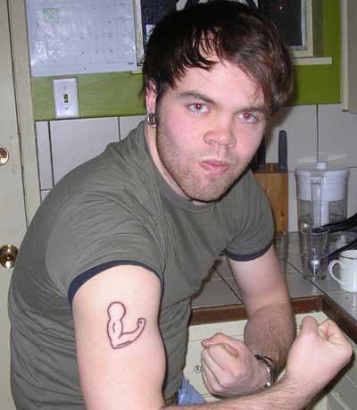
Response by poster: Here is a link to the finished product. It's about three weeks old and I'm quite happy with it. Thanks to everyone who offered ideas!
Tattoo
posted by Kwine at 7:03 AM on October 8, 2006
Tattoo
posted by Kwine at 7:03 AM on October 8, 2006
This thread is closed to new comments.
posted by robbie01 at 9:41 PM on September 1, 2006