How Can I Make This Chart in Excel 2010?
April 24, 2011 8:02 PM Subscribe
Can you help me change the color on part of a chart in Excel 2010?
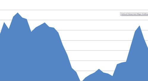
Here's the chart I have:
Current chart
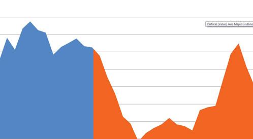
I'd like to make it visually obvious that something happened at a certain point, separating the chart into before and after sections, like this:
Ideal chart
Is this possible with Excel 2010?
Here's the chart I have:
Current chart
I'd like to make it visually obvious that something happened at a certain point, separating the chart into before and after sections, like this:
Ideal chart
Is this possible with Excel 2010?
I can't think of a direct way to do this in Excel. You could do a paste-special of the chart as a picture -- twice -- then recolor the second picture to change the fill color. Crop either one to the point where you want to show the change, and super-impose it over the other. Then group them.
posted by prenominal at 9:00 PM on April 24, 2011
posted by prenominal at 9:00 PM on April 24, 2011
Best answer: You could change the function into two separate functions (ie just add a row of blank boxes where you want the data split up). Then move the second half of the data into a separate column from the first. This should allow you to make two models and thus two different colors.
Alternatively, try right clicking on your chart. Select "select data.." and it should allow you to define the data you want to use for particular series (aka models so that you can assign them different colors).
posted by fuzzysoft at 9:39 PM on April 24, 2011 [1 favorite]
Alternatively, try right clicking on your chart. Select "select data.." and it should allow you to define the data you want to use for particular series (aka models so that you can assign them different colors).
posted by fuzzysoft at 9:39 PM on April 24, 2011 [1 favorite]
Response by poster: Fuzzysoft: Ah, thanks! I was stuck thinking of ways to change the appearance of a single data set. It didn't occur to me to break it into two data sets with blank spaces to preserve alignment.
posted by Bugbread at 11:00 PM on April 24, 2011
posted by Bugbread at 11:00 PM on April 24, 2011
This thread is closed to new comments.
posted by misanthropicsarah at 8:28 PM on April 24, 2011