Is there a name for this script-imitation font phenomenon?
June 21, 2017 7:57 AM Subscribe
A once-common practice at ethnicity-specific restaurants (in America) seems to be the use of a font that evokes some aspect of the native script of that ethnicity. Three questions about this: (1) Is there a name for this phenomenon? (2) Is it generally regarded as appropriation? (3) Does it occur in scripts other than Roman (or near-Roman scripts like Greek and Cyrillic) as well? Like, are there Japanese Indian restaurants with names written in Devanagari-imitating katakana, or British pubs in Israel which have especially "Roman" Hebrew letterforms, or somesuch?
Examples of the sort of thing I'm talking about:
"Chinese" lettering with angular, tapering lines imitating brushstrokes as seen here
"Indian" lettering hanging from horizontal overbars with Devanagari-style rounding on the letterforms like this
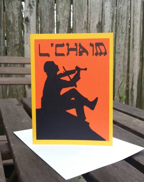
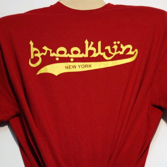
"Hebrew" letters with straight wide lines, rounded corners, and diagonal pointed serifs like this.
"Arabic" script with joined-up letters, diamond-shaped embellishments/vowels, and rounded letterforms like this.
Examples of the sort of thing I'm talking about:
"Chinese" lettering with angular, tapering lines imitating brushstrokes as seen here
"Indian" lettering hanging from horizontal overbars with Devanagari-style rounding on the letterforms like this
"Hebrew" letters with straight wide lines, rounded corners, and diagonal pointed serifs like this.
"Arabic" script with joined-up letters, diamond-shaped embellishments/vowels, and rounded letterforms like this.
These are called mimicry (or apparently simulation*) fonts, and they're not exclusive to the US.
* On preview, pipeski just got this one.
posted by ernielundquist at 8:27 AM on June 21, 2017
* On preview, pipeski just got this one.
posted by ernielundquist at 8:27 AM on June 21, 2017
Oh, hey, so reading the links on that page pipeski just posted, I found this, which answers question three:
a katakana font (named “ゴウラ”) designed to look like Olde English fancy print
posted by ernielundquist at 8:30 AM on June 21, 2017 [27 favorites]
a katakana font (named “ゴウラ”) designed to look like Olde English fancy print
posted by ernielundquist at 8:30 AM on June 21, 2017 [27 favorites]
Specifically regarding Hebrew letters, Jeffrey Shandler talks about this as a part of the commodification of Yiddish (/how it relates to Yiddish's change from, in some parts of the US Jewish community, a language of communication to a more symbolic thing). "Appropriation" doesn't really fit here, because it's often members of the community doing this.
posted by damayanti at 8:32 AM on June 21, 2017 [1 favorite]
posted by damayanti at 8:32 AM on June 21, 2017 [1 favorite]
I've seen the Chinese version referred to as "chop suey font" - which I think might be a specific font but also a name used more generally for fonts of the same type. There are a lot of people who dislike it or have complicated feelings about it because of how it is often used in racist ways. Wikipedia calls it "wonton font" and mentions criticism of the racism as well.
Here's a piece from the WSJ about it - I can't read the full thing, but hopefully that will at least show it's not only a few angry people on the internet, but something that's actually been discussed in mainstream media. The author of this piece calls them "yellowface fonts."
I think I've seen similar criticisms re: imitation of devanagari, but I can't remember the right keywords to find them.
On the other hand, the biggest reaction I've seen to fake Cyrillic fonts is that they look stupid and turn your words into unpronouncable gibberish. There may be people who feel it's stereotyping them, too - especially with rising Russophobia - but not having seen it I don't want to say yes or no. But I sure have seen lots of criticism of them for other reasons.
There isn't a clear "yes" or "no" answer to questions of cultural appropriation. Some people don't even think that cultural appropriation exists. (I disagree, but.) It's going to depend on whose writing is being intimated, who's using the font, how they're using it, and who's doing the evaluating and what criteria they're using. But personally, as a white lady, I never use them myself - I struggle to think of a situation where I don't have a better design choice.
posted by Kutsuwamushi at 8:43 AM on June 21, 2017 [1 favorite]
I have an friend who wrote this bit about faux devangari as a font and references this article in PrintMag where Paul Shaw looks at a lot of these fonts.
posted by jessamyn at 8:52 AM on June 21, 2017
posted by jessamyn at 8:52 AM on June 21, 2017
One more term: ching-chong font. The critiques I've read about them have gone from recognizing these fonts as being appropriation, to outright decried as racist, to now being used again in some sort of ill-advised hipster irony.
posted by Nelson at 9:18 AM on June 21, 2017
posted by Nelson at 9:18 AM on June 21, 2017
Irish pubs worldwide use various "Celtic" fonts which are based on the Irish Cló Gaelach which was used in printing Irish until the 1960s. The best-known of these is the Colmcille font which was designed in the 1930s for Monotype by Colm Ó Lochlainn.
I've never seen anyone get anyway bothered about cultural appropriation in the use of Celtic fonts, though it can be a bit of a tribal marker in Northern Ireland.
posted by Azara at 9:34 AM on June 21, 2017
I've never seen anyone get anyway bothered about cultural appropriation in the use of Celtic fonts, though it can be a bit of a tribal marker in Northern Ireland.
posted by Azara at 9:34 AM on June 21, 2017
I think Celtic fonts may be a bit different though, in that they are a Roman alphabetic font. It's more a stylistic variant of a way to write Roman characters than a straight-up appropriation of some other script like Hebrew or Chinese.
The Celtic typestyles definitely have strong cultural associations though. See also Papyrus, which seems somehow culturally appropriative until you look closer and realize its problematic for much more complicated reasons.
posted by Nelson at 9:50 AM on June 21, 2017
The Celtic typestyles definitely have strong cultural associations though. See also Papyrus, which seems somehow culturally appropriative until you look closer and realize its problematic for much more complicated reasons.
posted by Nelson at 9:50 AM on June 21, 2017
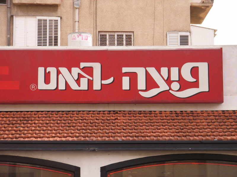
I don't know if "American fast-food" counts as ethnicity-specific, but there's this Pizza Hut signage in Israel that tries very hard to look like roman lettering.
These Indian restaurants seem to be trying this, but not very successfully. Chinese has examples too. I've never seen anything like that for Arabic or Russian in Israel, I guess they're not exoticised enough.
posted by vasi at 6:16 AM on June 22, 2017 [1 favorite]
These Indian restaurants seem to be trying this, but not very successfully. Chinese has examples too. I've never seen anything like that for Arabic or Russian in Israel, I guess they're not exoticised enough.
posted by vasi at 6:16 AM on June 22, 2017 [1 favorite]
a katakana font (named “ゴウラ”) designed to look like Olde English fancy print
That font is amazing. I've never seen anything like it. If anyone is interested, it can be downloaded here.
posted by Faint of Butt at 6:54 AM on June 22, 2017 [2 favorites]
That font is amazing. I've never seen anything like it. If anyone is interested, it can be downloaded here.
posted by Faint of Butt at 6:54 AM on June 22, 2017 [2 favorites]
A friend pointed me at this link: http://istizada.com/blog/arabic-logos-of-big-global-brands/ . There's an Arabic logotext for Fujiyama that is clearly trying to look Chinese.
posted by vasi at 6:33 AM on June 24, 2017 [1 favorite]
posted by vasi at 6:33 AM on June 24, 2017 [1 favorite]
« Older Separated co-parenting with an alcoholic | How to structure bank accounts to make them... Newer »
This thread is closed to new comments.
posted by praemunire at 8:04 AM on June 21, 2017 [1 favorite]