T-Shirt Designs on Shirts for Women
October 19, 2016 10:13 AM Subscribe
I can't believe I'm using a question for this, but... women of Metafilter, when you purchase a T-shirt how cognizant are you of how the design might interact with your chest?
I'm planning to have one of my designs printed up on some t-shirts. My previous shirt has made its money back, but one of the big bits of feedback I've received is a desire for womens sizing when it comes to shirts. Given the complaints I've heard from my wife about band shirts only coming in unisex sizes and not fitting great, I really want to accommodate this desire and am looking into American Apparel womens shirts as an option.
The design in question has sold really well to a female audience in its hand printed to wood form. The design (linking to it seems self-linky?) features a character staring at an object in the sky. In asking friends about it's viability as a shirt, the biggest note I got was to make sure said object does not land on a nipple location.
Given that I've never had to worry about a shirt showing off anything but my love of beer and declining metabolism, I'd like to listen to your thoughts about your process for deciding whether or not a shirt design works for you. Is there actually a Danger, Nipple location? zone? that I should avoid? Are certain overall design shapes (oval logo vs square, etc) preferable over others? Are certain shirt manufacturers better?
It matters to me a lot, but the only way I can tell if a particular design will work is trying it on, though it definitely helps a lot if the upper portion of the image is wide enough that it covers the nipples and then some. I am very large-busted, however, so it matters more to me than it might someone else.
I avoid anything with a strong, simple shape, by the way. Borders are not my friend.
posted by SMPA at 10:23 AM on October 19, 2016 [2 favorites]
I avoid anything with a strong, simple shape, by the way. Borders are not my friend.
posted by SMPA at 10:23 AM on October 19, 2016 [2 favorites]
Put the big image on the back and make small logo image for the front.
posted by doctor_negative at 10:27 AM on October 19, 2016 [20 favorites]
posted by doctor_negative at 10:27 AM on October 19, 2016 [20 favorites]
I consider this literally any time I buy a shirt with something printed on it - which, admittedly, is rare, because I'm busty and that distorts pretty much any image across the chest. Crew necks are worse for this than v-necks, certainly, but also I would want the image to be, say, closer to shoulder height than possible nipple height.
posted by SeedStitch at 10:29 AM on October 19, 2016 [16 favorites]
posted by SeedStitch at 10:29 AM on October 19, 2016 [16 favorites]
I'm very large busted and I avoid any designs that highlight the nipple/boob area. All over patterns are fine, designs on the midriff also fine, but nothing that has a focus on the boobs. People stare at them enough without my encouragement.
posted by Helga-woo at 10:31 AM on October 19, 2016 [10 favorites]
posted by Helga-woo at 10:31 AM on October 19, 2016 [10 favorites]
Yes, I pay attention to that.
Is there actually a Danger, Nipple location? zone? that I should avoid?
The... nipples? I'm not sure quite what you're asking. If I try on a shirt and there's a star or circle or other small design element that's on or near-enough-to-look-on my nipple that makes it look like "Here's my nipple!", I tend not to buy the shirt. Some overall bigger design that went across my chest would be different.
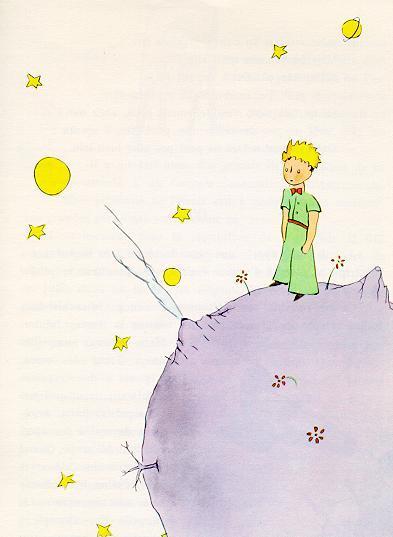
The image that popped to mind when you described your design was something like this from The Little Prince. I would want any of the surrounding planets and stars firmly on my upper chest or stomach.
posted by lazuli at 10:31 AM on October 19, 2016 [7 favorites]
Is there actually a Danger, Nipple location? zone? that I should avoid?
The... nipples? I'm not sure quite what you're asking. If I try on a shirt and there's a star or circle or other small design element that's on or near-enough-to-look-on my nipple that makes it look like "Here's my nipple!", I tend not to buy the shirt. Some overall bigger design that went across my chest would be different.
The image that popped to mind when you described your design was something like this from The Little Prince. I would want any of the surrounding planets and stars firmly on my upper chest or stomach.
posted by lazuli at 10:31 AM on October 19, 2016 [7 favorites]
I wear t-shirts as much as I can, and this has only really been an issue for me once or twice (once back in high school when those heat-sensitive "Hypercolor" shirts were popular - my choice of one with a color-changing bar right at chest level was ... unfortunate). While I wouldn't wear a design that obviously featured something that landed right on my boob in a conspicuous way (as in, there's an image on my boob and not much else on the shirt), I otherwise don't give it too much thought - one of my favorite shirts now has a map on it that people tend to stare at as they work out what it is; it's right on my chest but I realize what's going on so it doesn't bother me. I should probably note that I don't normally have people staring at my chest, which no doubt contributes to why this doesn't bother me.
One thing I DO look for in a t-shirt is fabric that is NOT tissue-thin or see-through - all too damn common with women's shirts. Especially with white or light-colored shirts - I will not buy a shirt I can see my damn bra through. If the fabric isn't as thick as it is in the men's version I'm not buying it.
posted by DingoMutt at 10:32 AM on October 19, 2016 [14 favorites]
I am very aware of it, it's generally the #1 decision-maker for buying a shirt.
If there are words or a wide image, it's good if it doesn't start at or just below nipple level, as SeedStitch says. I am small chested (like, IBTC small) and i feel that anything that is just below my boobs will make them look lower (read: drooping) than they actually are.
Any large design that was just on the midriff I would avoid because it would de-emphasize my tiny boobs and emphasize my stomach, which I do not want.
posted by 8dot3 at 10:34 AM on October 19, 2016 [7 favorites]
Nthing everyone else re: the whole nipple thing.
Also, I don't know if I'm in the minority on this, but I absolutely hate that the fabric on women's tees is thinner (and therefore clingier, and also less comfortable) than the fabric used to make men's tees.
posted by Tamanna at 10:34 AM on October 19, 2016 [15 favorites]
Also, I don't know if I'm in the minority on this, but I absolutely hate that the fabric on women's tees is thinner (and therefore clingier, and also less comfortable) than the fabric used to make men's tees.
posted by Tamanna at 10:34 AM on October 19, 2016 [15 favorites]
I'm a woman, and I am so so so so so so infinitely SO picky about t-shirts.
Among many other important criteria, yes I absolutely do consider image placement and my chest.
In my experience women do this with all clothes. I tried on a wedding dress with a lace pattern that looked like bunny ears over my breasts, and thus no I did not "say yes" to that one. It didn't even need to be said: I came out of the dressing room and my mom, future mother-in-law, and I were all like "bunny ear boobs, no" and I went right back in.
posted by Sara C. at 10:39 AM on October 19, 2016 [8 favorites]
I'm a D-cup and have never thought about this before.
posted by metasarah at 10:39 AM on October 19, 2016
posted by metasarah at 10:39 AM on October 19, 2016
i hate it when women's shirts that fit my chest are baggy maternity wear on the rest of my torso.
posted by poffin boffin at 10:42 AM on October 19, 2016 [16 favorites]
posted by poffin boffin at 10:42 AM on October 19, 2016 [16 favorites]
I pretty much don't buy t-shirts with writing or designs on them for this reason.
posted by ArbitraryAndCapricious at 10:42 AM on October 19, 2016 [7 favorites]
posted by ArbitraryAndCapricious at 10:42 AM on October 19, 2016 [7 favorites]
I usually only consider it when it's two objects that might make my boobs look like they're staring at someone, but I DO consider it.
And agreed that American Aparel tshirts are awful because they don't come in normal human sizes. Nothing is worse than being an average middle aged lady size and told that that makes you XXL.
posted by MsMolly at 10:43 AM on October 19, 2016 [18 favorites]
And agreed that American Aparel tshirts are awful because they don't come in normal human sizes. Nothing is worse than being an average middle aged lady size and told that that makes you XXL.
posted by MsMolly at 10:43 AM on October 19, 2016 [18 favorites]
I have a fairly large chest and definitely consider placement of a t-shirt design. Not specifically about nipples, but more generally about to what extent it's going to highlight that whole area, give people an excuse to stare at my chest in the guise of reading it, etc. There are a lot of great shirts I will never buy because of this. (Although I have great love for some sites - I think RedBubble might be one? - that let you choose whether the design goes on the front or the back. Sometimes a t-shirt can be saved for me by shifting the design to the back.
I don't allow myself to be picky about fabric because being a plus-sized woman who's already being picky about design, and ideally neckline, if I also got picky about fabric I'd never have any shirts to wear at all. But in a perfect world, yes, a less thin/clingy fabric would be great too.
posted by Stacey at 10:45 AM on October 19, 2016 [3 favorites]
The first time I ever thought about it was when a (older, male) coworker kept giggling at another (older, female) coworker in a Spongebob t-shirt, where Spongebob's eyes were as big as the woman's breasts, like this one. The nipple thing doesn't bother me as long as there aren't two nipple-placed nipple-ish objects.
posted by jillithd at 10:49 AM on October 19, 2016 [1 favorite]
posted by jillithd at 10:49 AM on October 19, 2016 [1 favorite]
I almost never buy T-shirts. The whole logo/image design intersecting with my large-boobed, short-framed body is a key reason. The part where they're almost always GDMF choking crewnecks that make my chest look saggy is the other key. Nthing whoever said "if you must, simple small logo on the front, polo-style placement; larger more complex stuff on the back," but as a significant design contributor, do please also consider alternative necklines that are more flattering to people with non-flat chests, like V-neck and scoop-neck or at least jewel-neck.
posted by Pandora Kouti at 10:57 AM on October 19, 2016 [14 favorites]
posted by Pandora Kouti at 10:57 AM on October 19, 2016 [14 favorites]
Very aware of this. I'm chesty, sort of a middle-aged chesty. Early MeFi shirts had the logo just a little high on the chest so that it was riding just above my breasts which was really not great. I talked to the screen printer who said they did that intentionally because they didn't want the words going from nipple to nipple which was ... thoughtful but wound up backfiring. I said "Yeah, no, don't do this anymore" and they changed the way they did the wording somehow and it was a lot better.
I appreciate the HELL out of people who offer women's shirts however (unisex is bullshit!), so try to do the best you can here but thanks for trying.
posted by jessamyn at 11:00 AM on October 19, 2016 [2 favorites]
I appreciate the HELL out of people who offer women's shirts however (unisex is bullshit!), so try to do the best you can here but thanks for trying.
posted by jessamyn at 11:00 AM on October 19, 2016 [2 favorites]
Nthing all of the above.
posted by matildaben at 11:03 AM on October 19, 2016
posted by matildaben at 11:03 AM on October 19, 2016
Yeah, another one here who pretty much completely avoids shirts with designs because of bustage issues.
posted by holborne at 11:19 AM on October 19, 2016 [1 favorite]
posted by holborne at 11:19 AM on October 19, 2016 [1 favorite]
Another person here who is very aware of this issue and it greatly affects my decision whether to buy a tshirt. Also nthing the complaint that the fabric for women's tshirts is normally too thin or see-through. Do your best to deal with these two common issues. You might have to make a handful of shirts first to let women test out the design placement. I only really know if a design will be a problem after I try on the shirt.
posted by FireFountain at 11:25 AM on October 19, 2016 [1 favorite]
posted by FireFountain at 11:25 AM on October 19, 2016 [1 favorite]
I am a chunky lady with medium-large boobs. If a T-shirt isn't tight, designs on it generally won't call attention to my chest, unless there are large circles in boob-adjacent places. So, like, not this. Closer-fitting shirts present more of a problem.
I don't really care for shirts with back prints; they're not really in style and I wear a lot of open cardigans/hoodies/etc. that would hide them.
And, oh, please do look into suppliers with a wide size range. Women's tees fit me much better and look much better on me - if they fit at all. I am on the border of straight-size/plus-size and it's a crapshoot whether women's graphic tees will fit me. So I find myself making the choice between a "unisex" tee that will have room but feel awkward, or a women's tee that may turn out to be a sausage casing.
posted by Metroid Baby at 11:28 AM on October 19, 2016 [3 favorites]
I appreciate the HELL out of people who offer women's shirts however (unisex is bullshit!), so try to do the best you can here but thanks for trying.
UNISEX IS SUCH BULLSHIT. All "unisex" means is that we've decided that it's socially acceptable for women to wear shirts designed for men's shapes, even if it bunches up around the hips and doesn't accommodate boobs. Also, every time someone tries to pawn a men's XL promo t-shirt made of the world's scratchiest cotton off on a woman by claiming "You can use it as a sleep shirt," a kitten cries itself to sleep. But I digress...
I am a fairly busty lady who likes the occasional women's graphic tee, and logo placement, texture and t-shirt cut is something I take VERY seriously. Here are the things that will keep me from purchasing a shirt:
-Anything with very straight or geometric borders (perfect squares, rectangles, circles, etc.) My boobs are definitely going to distort the shape of whatever it's supposed to be.
-If the logo ink is too thick. You know when you get a really cheap screenprinted shirt and the logo is like...a completely different texture from the rest of the shirt because the paint is so thick? Like it's almost a patch at that point? Not only will my boobs distort the heck out of it, it's also CRAZY uncomfortable.
-"Heathered" t-shirts. They are garbage. They're an excuse to make flimsier t-shirts by chalking their transparency up to a design choice. Please stick to solid color tees, preferably not white (I've never owned a white shirt you couldn't see my bra through), and the softer/thicker the better!
-If a logo extends too far horizontally. Example: I got a t-shirt for being a volunteer at an event called "Picklesburgh", where the word was right across my boobs. It is a good thing people knew what event we were at, because IDK if folks would have known what "cklesbur" was without having to read my boobs and rotate. Please leave some room for word wrap at the edges of your design!
-If a logo is awkwardly placed. I can make allowances for larger logos that start high enough up on the shirt that people can see more or less what it is even with boob distortion, but if a logo starts too low and ends up like under the boobs? Or if, like others have said, it's a design that draws weird attention to the nipple area (circles, stars, arrows, etc.)? That can be a deal breaker.
FWIW, I actually really like the AA 50/50 tees, but I know they can run a little small. I love how soft they are, and they tend to be a thicker, higher quality material.
Thanks!
posted by helloimjennsco at 11:30 AM on October 19, 2016 [25 favorites]
Response by poster: Thank you so much for your feedback everyone and please keep it coming. I can see why many shirt makers just shrug and give up on women's sizes but I really want to do the best I can. This is a sample of the design, minus the big red watermark. It'd be printed in a discharge ink on a black shirt. The discharge ink bleaches then redyes the cloth so you don't end up with that raised plasticy feeling design. If this design doesn't work, I have others that have proved popular that I can try.
If people have other non-AA shirt manufacturers that they like, please let me know so I can see what my printer can get.
posted by robocop is bleeding at 11:51 AM on October 19, 2016 [1 favorite]
If people have other non-AA shirt manufacturers that they like, please let me know so I can see what my printer can get.
posted by robocop is bleeding at 11:51 AM on October 19, 2016 [1 favorite]
I definitely pay attention to design elements that highlight nipples or invite someone (dudes, let's be real) to spend a lot of attention reading/deciphering my chest, and I'm spectacularly unflattered by crew necks so you can add me to the mob of other folk demanding other neckline options.
posted by janell at 11:53 AM on October 19, 2016 [2 favorites]
posted by janell at 11:53 AM on October 19, 2016 [2 favorites]
Design on the front for folks without breasts, design on the back for folks with?
posted by Hermione Granger at 11:56 AM on October 19, 2016 [1 favorite]
posted by Hermione Granger at 11:56 AM on October 19, 2016 [1 favorite]
On looking at your test print, I think you might want to try the placement out with a buddy (like maybe print it out at the real size in reversed colors, cut it out, tape it onto your buddy and look at it). It's a super cool print and I would be interested in wearing it, but I think there are two potential pitfalls that will depend strongly on the size/placement details:
a. The placement of the sun (moon?) drawing attention to one breast
b. Separating (and thus emphasizing) the breasts with the curvy boundary between the negative space (the sky) and the detailly building.
The other artwork you're proposing would be a non-issue, I think.
posted by janell at 11:59 AM on October 19, 2016 [2 favorites]
Very cognizant, bless you for asking. It's a major dealkiller.
For me, it's about whether the shape/location is flattering. Especially unflattering: design starts mostly on the underside of my chest. Also, sharply outlined rectangles make it look as if my curves are a design flaw. I'm not sure which shapes are most flattering, but probably shaped something like a guitar pick.
In general, I agree with people who've said American Apparel shirts are too small, clinging, and diaphanous. BUT have a Sleater-Kinney t-shirt that's AA and I love, but I can't figure out which AA t-shirt category it corresponds to. If I could figure it out, I would order a zillion plain shirts all in that style.
Oh, and I just looked up the shirt, and the image is indeed roughly guitar-pick-shaped!
posted by feral_goldfish at 12:02 PM on October 19, 2016
(Note: not meaning your proposed image is a dealkiller. Posted my comment before seeing image.)
posted by feral_goldfish at 12:08 PM on October 19, 2016
posted by feral_goldfish at 12:08 PM on October 19, 2016
I'm a C and it never occurred to me that there are women who don't consider image placement when buying t-shirts. I pretty much avoid prints on my chest because (not all) men rarely need a reason to look so why give them one? If I was going for one, the print would have to be big enough to cover the whole of my front from just below the neckline to belly button level, and not highlight any particular areas. So while your design is really cool the sun/moon is a definite "looks like a nipple" reason for ruling it out, sorry.
It really is a hard one, and fair play to you for asking, because there is no "woman's size" or "woman's shape" that you can factor in. I could wear your shirt and buy one for every boob-owner I know and the pattern and its placement would look different on all of us. I like the idea mentioned above of having the pattern on the back instead. Plus added marks for originality as well as thoughtfulness. And yes to thicker material, v-necks not crew necks, and no to boxy/rectangular shapes that manage to be unflattering to both boobs and hips in one fell swoop.
posted by billiebee at 12:19 PM on October 19, 2016
I'm busty AND plus-sized so I very rarely wear T-shirts with graphics on them. Nipple interaction is a valid concern, but the bigger concern for me is the way my curves distort the design and warp it all to pieces. I'd just rather avoid the awkward stares while people try to make out what it's supposed to be!
posted by jhope71 at 12:22 PM on October 19, 2016
posted by jhope71 at 12:22 PM on October 19, 2016
when you purchase a T-shirt how cognizant are you of how the design might interact with your chest
Not at all, because I wear women's Tall shirts and nobody makes t-shirts with designs printed on them in women's Tall sizes.
*walks off kicking a stone down the street*
posted by The corpse in the library at 12:22 PM on October 19, 2016 [9 favorites]
Not at all, because I wear women's Tall shirts and nobody makes t-shirts with designs printed on them in women's Tall sizes.
*walks off kicking a stone down the street*
posted by The corpse in the library at 12:22 PM on October 19, 2016 [9 favorites]
While I wouldn't buy a t-shirt that drew attention to my chest area, I don't think your design would be an issue if it was placed a bit lower than chest height.
I don't think womens' tees should be as thick as men's ones because thicker fabric doesn't tend to 'sit' well. Thinner fabric is fine as long as it isn't diaphanous. Also, some womens' shirts tend to be too long, which always befuddles me. A comfortable t-shirt would, on average, hit just below hip length.
AA shirts are hit or miss for me my ex used to print t-shirts from AA and some of them fit great, especially the softer, thinner ones. They didn't use to be so see-through a few years ago. Threadless uses AA and they are awesome!
The most perfect t-shirt I've found are from Project Social T, and the ASOS brand (the latter serves curvy, tall and petite in addition to standard.) I would think those dimensions - if you found them in a t-shirt available wholesale - would fit most women.
posted by Everydayville at 12:25 PM on October 19, 2016 [1 favorite]
Heh, and I have the opposite problem as Corpse, because short and most portrait-oriented designs on shirts, like the one you posted, get cut off at the bottom for me if I tuck, and the shirts themselves run to my knees, so yeah, another contributing factor to "If you'd just put this on a nice, durable tote bag instead of a friggin' tee, I'd buy it, even if I shouldn't buy any more tote bags ..."
Seconding janell's "b" - the black negative space is definitely boob-shape reminiscent, and could look awkward depending on placement [overly emphasizing right boob if placed in one way, making boobs look uneven/saggy if placed another].
posted by Pandora Kouti at 12:39 PM on October 19, 2016
Seconding janell's "b" - the black negative space is definitely boob-shape reminiscent, and could look awkward depending on placement [overly emphasizing right boob if placed in one way, making boobs look uneven/saggy if placed another].
posted by Pandora Kouti at 12:39 PM on October 19, 2016
First thing I think of is the fit/style of the T-shirt itself; the graphic design is secondary: if the shirt won't fit comfortably, why bother considering how the graphics will place?!?
For fit/style, if it's not a V-neck I don't even bother giving it another glance --- crew necks are tight and uncomfortable, not to mention looking crappy on me. Next comes how it'll drape: men's shirts are usually straight, and as a boob-possessing person I'm not built straight, so a straight shirt is often both too tight and too loose at the same time.
After that, yeah, where the graphic design lands does matter: it's neither cutesy nor attractive to have a design that highlights nipple locations. (Ditto for breast logos, for example the Ralph Lauren polo pony for instance: if that sort of thing falls right on a nipple, the shirt goes back on the rack. Watch where women like Madeline Albright or Hillary Clinton place their pins for hints for proper logo placement.) Big designs covering the back with a small breast logo on front are preferred, but heck yes tote bags would be even better.
posted by easily confused at 12:41 PM on October 19, 2016
I buy probably too many band tshirts and about half the time they don't change the size of the image for the women's shirts.
So the 10"x12" print sits perfectly in the middle of the men's large shirt, but wraps around my boobs and tucks into my armpits on my much smaller shirt.
So have a busty person try on a shirt to see where the "front" image area is that doesn't end up with part of the image in the armpits.
posted by littlewater at 1:09 PM on October 19, 2016
heh, second time today my former career in screenprinting and embroidery comes to the fore:
- yes, it was something I learned to think about, esp. after doing a logo for a customer (I did not design it; the company already had it) featuring a round device with lines running through it like spokes on a wheel, and the left chest size logo made that round part about the size of a nickle, and the client was an MRI/mammogram clinic... the more square, the less unintentionally problematic it tends to be.
- it goes without saying that the Hooter's design, for example, along with a local restaurant's former shirt design they had their female servers wearing with a mug of beer and an entree with "what a pair!" emblazened loudly on the front is intentionally problematic and the bastards know exactly what they are doing in these cases.
- If you must have a bunch of words, like a slogan, that have to be read rather than just noticed and observed, put it on the back of the shirt if you can. Otherwise to actually read the slogan you have to stare at someone's chest, which is potentially rude regardless of gender, but especially for women.
Being a dude, I cannot improve on the comments the women in-thread have made on the horrors of unisex sizing, other than to say that you really need the actual women involved in buying/wearing the shirts in question to be involved in picking them, if at all possible. There is basically one or maybe two sizing curves for male/"unisex" tees and probably at least 4-5 in women's tees. One more horror story from my embroidery days: the woman selecting and ordering shirts for an office was young, athletic and wanted a snug fit, and everyone else in the office was older, many of them were fuller-figured, and most of them wanted a looser fit in general. And there are few things people hate worse than being told "just go up a size." It's discouraging to people to be pushed into "plus sizes" to accommodate a garment that is "juniors size" and/or designed to be a tight fit.
posted by randomkeystrike at 1:28 PM on October 19, 2016 [4 favorites]
Thank you for considering those of us with big bosoms and curves! Placement is, well, Mötörhead had an awesome graphic that ended up putting a spade directly on each breast (probably on purpose, oh Lemmy).
Alternative Apparel shirts are like slightly thicker American Apparel without the creep factor. I found a review of blank shirt brands here that gives the pros and cons of a bunch of brands.
Another vote for a wide size range. Some lines make the women's sizes starting at waif and ending at ten year old girl. I end up hoping the unisex size is more than a thick cotton box. Consider your market, I guess.
posted by mrcrow at 1:56 PM on October 19, 2016
I rarely buy graphic tees for the reasons stated above - being busty, the combination of crew necks and poorly-placed graphics are deal-breakers. But on the back isn't fun - what's the point of a graphic tee?
I actually don't mind American apparel, but I've also had look luck with Bella tees. I find that Out of Print Clothing has done a good job with necklines and graphic placement. In an ideal world, it would be great if you could offer thinner, more form-fitting tees with scoop or v necks and crew necks with thicker fabric for women.
posted by umwhat at 1:59 PM on October 19, 2016
Picture of an example t-shirt which I love but will never wear again.
posted by jessamyn at 2:03 PM on October 19, 2016 [4 favorites]
posted by jessamyn at 2:03 PM on October 19, 2016 [4 favorites]
I cannot favourite helloimjennsco's comment enough, and fwiw I'm built like a surfboard.
I'd be concerned about the moon, and like hermionegranfer's suggestion to put it on the back.
Aside from the above complaints about American Apparel, many people don't buy from them now due to some issues with the owner being sexist/creepy. Google alternatives to American apparel and I'm sure you'll find something suitable.
posted by jrobin276 at 2:08 PM on October 19, 2016 [1 favorite]
I see tees I'd like to buy all the time, but can't/don't because they are too boxy or oversized. Tee shirts never fit me right. And yes, "unisex" IS bullshit. Unisex means "boxy."
Many upthread have mentioned larger chests, but I'd like to speak up for those of us who are smaller, too (and no, we're not waifs or ten-year-old girls, thank you very much). It's equally difficult for healthy, thin women to find something that fits.
I practically throw a party when I find any top that fits me right, let alone a tee-shirt.
posted by onecircleaday at 2:47 PM on October 19, 2016 [4 favorites]
Brand recommendation. Nice longer length, decent sleeve, super soft.
posted by Drosera at 3:35 PM on October 19, 2016
posted by Drosera at 3:35 PM on October 19, 2016
I buy graphic tees all the time! I'm not very busty though. But I appreciate a printed tee, as I live in t-shirts and there's only so many blank tshirts you can own. And of course I care about the placement of images/neckline/quality of shirt like everyone else.
To be remotely helpful I thought maybe I'd give you an example? I own a bunch of shirts from Out Of Print which have novel covers printed on them. They deal with a variety of shapes of design, but in my experience are always extremely well laid out. (with the exception of the metamorphosis shirt, but that's on purpose I think). So if you're looking for help with placement, they might have some good examples.
(I also love the fit and quality of their shirts, but I have no idea who their manufacturer is, sorry.)
posted by euphoria066 at 3:38 PM on October 19, 2016 [1 favorite]
I got the only video game company t-shirt that EVER fit last summer - the base shirt they used was this one and I proceeded to buy four more unprinted in different colors because it accommodated my boobs better than anything crew-neck-y ever had.
posted by restless_nomad at 4:00 PM on October 19, 2016 [5 favorites]
posted by restless_nomad at 4:00 PM on October 19, 2016 [5 favorites]
I'm okay with a design that takes up most of the front or logos that fall between the neckline and nippleline. (The Metafilter logo shirt is a good example of one that works.)
The most useless shirt i ever bought was an Aperture tank top that not only s-t-r-e-t-c-h-e-d the logo across my boobs but actually cracked vertically over the ribbing. (It was like this one, but only a single layer, normal tank.)
It makes it harder to find printed shirts I like, but as mentioned above, I'm totally over the "unisex" boxy cut or compromising with a men's boxy cut.
posted by Room 641-A at 4:37 PM on October 19, 2016
Good comments so far and yes, thanks for asking, I,
- don't buy "unisex" shirts for the above stated reasons
- do allow images on the front, but careful about distortion on the chest area.
- don't allow shapes on the potential boob area including circles! stars, flowers, whatever. too much attention.
I like your design but would hesitate with your moon placement. it would need to go up or maybe on the sleeve.
Good luck!
posted by perrouno at 5:05 PM on October 19, 2016
This is a major concern of mine because if the shirt fits poorly or is too tight across the chest, it will stretch the design and also not last very long. (Unless it is screen printed or similar, but it will still look bad all stretched out).
"Unisex" means boxy but that also means usually that the shirt will allow for boobs w/o ruining the print. Unisex AA is actually my favorite, I do not think that the "average" M size female is an "XL" in AA ... I am "average" M in female and "average" small (fits) or medium (quite large, useful if I'm esp concerned about retaining the design long term) in AA unisex shirts. I don't mind looking like I lack a waist though, something many women are concerned about.
My boobs fall out the top of v necks, I can't imagine liking a shirt where all the design is below the boobs. Like a v neck that fit, that would mean the design starts right at the peak of my boobs, goes to underboob territory, and then is on my belly? Eh, no thank you.
YBMV (your boobs may vary) but mine are both high (see above) and low (hangs lower than the average chesticles). I think it will be very hard to accommodate every variation out there, but if you offer both female shirt styles (tighter, shorter arms) and male shirt styles (or unisex!! even better!) you can please most people. (And yeah no weird circles highlighting or things pointing directly at 50% of female nipples pls). Thank you for caring about us poor 51 percenters.
posted by shownomercy at 6:19 PM on October 19, 2016
One thing I notice people who have large(r) chests having to do a lot is deliberately tug their shirt down/out so other people can see what's printed between roughly their navel and nipples without starting awkwardly. So no text and/or major design features there, please.
posted by teremala at 7:05 PM on October 19, 2016 [1 favorite]
posted by teremala at 7:05 PM on October 19, 2016 [1 favorite]
One thing I didn't see mentioned, is make sure the T-shirts you're choosing are long enough. T-shirts tend to be barely long enough to be tucked in, which means that when they're distorted by my boobs, they expose my midriff.
I like your design, but I personally wouldn't buy it on a T-shirt, because it's rectangular and my boobs would distort it. I prefer rectangular designs on the back of zipped hoodies.
posted by snakeling at 5:36 AM on October 20, 2016 [1 favorite]
I like your design, but I personally wouldn't buy it on a T-shirt, because it's rectangular and my boobs would distort it. I prefer rectangular designs on the back of zipped hoodies.
posted by snakeling at 5:36 AM on October 20, 2016 [1 favorite]
I'm an F cup and on the chubby or luscious side depending on how you want to describe it. I pay attention to this ever since getting a really great Gary Numan shirt with a triangle pointing up on it. This is awkward and was not designed for women. I wear it anyway because fuck yes Gary Numan, but it's not my best look.
I like dead center circular designs, or big square designs like you get on a lot of shirts for concerts, or a design for the upper chest that doesn't go across the nipple line, but I tend to like this last one on looser shirts.
I like shirts that are shaped for women, but only if they don't think women should be about a C cup and thin - this isn't more helpful for me than just getting a larger men's size. "Vanity" sizing is also terrible, because it means "not for you, fatty." I would also rather have a shirt that's slightly loose than one that shows off my gut (which is totally luscious, but not for everyone).
posted by bile and syntax at 5:51 AM on October 20, 2016 [2 favorites]
Lots of great ideas already. I did want to note that I think the "heathered" style that helloimjennsco mentioned is actually what's called "slub" knit. It's this weird burnout style. It's really unflattering. It doesn't really show up well on any of the photos online, but here's an example.
I generally like Next Level's other women's tees.
posted by radioamy at 8:05 AM on October 20, 2016 [1 favorite]
I generally like Next Level's other women's tees.
posted by radioamy at 8:05 AM on October 20, 2016 [1 favorite]
I like the design a lot! It's rectangular, but because the borders are not sharply defined solid lines, it looks like there is some wiggle (or, forgive me, jiggle) room on image distortion. Also, because it's tall and narrow, with the right logo sizing, you won't have to worry about half of your artwork ending up in women's armpits.
Like others have said, it could be tough to put this design on a v-neck t-shirt without having to place the image low enough that the moon might end up in nipple territory. I really like janell's suggestion of printing it out in different sizes and finding a test buddy to help determine the most optimal size and placement of the logo on the shirt to help avoid this problem.
If the logo is placed high enough up on the shirt, you may be able to avoid sad nipple syndrome. Alternately, leaving the main part of the logo in the middle of the shirt and maybe migrating the moon up and over some (think Star Trek comm badge closer-to-collarbone placement, not Lacoste gator top-of-boob placement) might be another way to approach it if you're okay with tinkering with the design a little.
And follow up caveat: I would CONSIDER a "unisex" shirt IF AND ONLY IF the shirt were of a super soft, malleable fabric that molds around the body and stretches to accommodate rather than being too thick/stiff/scratchy to drape properly. I agree with some of the other folks that some women's shirt brands are cut waaaaay too short (and I say this as a lady who shops in Petites) or have those godawful super-short cap sleeves with the giant armholes that show half your armpit always, so really, step one is definitely going to be finding a kick-ass t-shirt brand before moving onto logo placement. Good luck!
posted by helloimjennsco at 10:22 AM on October 20, 2016
Yeah, I'm the one in the first photo here. Admittedly, I knew what it looked like at the time, but didn't consider photos appearing on the internet. http://shirt.woot.com/blog/post/gencon-2009-internet-famous
This is definitely something you need to consider, and for women of different heights and sizes. It's possible this would have looked completely different on someone who wasn't 5'0 tall.
posted by thejanna at 12:00 PM on October 20, 2016 [1 favorite]
This is definitely something you need to consider, and for women of different heights and sizes. It's possible this would have looked completely different on someone who wasn't 5'0 tall.
posted by thejanna at 12:00 PM on October 20, 2016 [1 favorite]
Our company produced women's Tees with the logo on the back of right shoulder - quite small and tattoo-style positioning. Was much appreciated. I've not seen many like that but maybe that means they're hidden most of the time (by clothes or hair). Make sure they're distributed at the beginning of summer.
posted by guy72277 at 7:29 AM on October 21, 2016
posted by guy72277 at 7:29 AM on October 21, 2016
Would you be selling these shirts online or in person? I'm asking because women's sizing is incredibly inconsistent. (In a women's cut t-shirt I've worn anything from a medium to XXL). If online, you might want to go with one of the better known brands/ styles (like American Apparel), so folks may have a better sense of what size they are. That being said, my perception is that American Apparel runs small and does not fit over curves. I would appreciate it if a vender could tell me (when asked) how much the shirt will shrink in the wash since there isn't a large margin between "just right" and "too snug."
Also, I'd look for a material that is thick enough to a) not be see through b) last more than a few wearings.
I am also someone who prefers to have the design on the back of the shirt, for several reasons. As long as the design does not go into the butt region, it sidesteps much of the placement issues. I like that a t shirt with a logo in the back is less likely to look "weird" or "unflattering" in photographs*, and could be more easily covered up with a sweater if I needed to dress up a t-shirt a bit. And maybe this is a me thing, but I don't like to wear shirts with a lot of text/ a busy design on the front since people tend to stare right there.
*One of my classmates once wore a t-shirt that said "get high [airplane clip art] on yourself" to school picture day. Naturally, the school photo is taken from the chest up, so the school photo just says "get high." I'm pretty sure that if someone more flat chested wore the shirt, the clip art would have provided some additional context in such a photo.
posted by oceano at 2:22 PM on October 22, 2016
« Older Hillary Cilinton knew that Iraq had no WMD? | The Monetary Value of Connecting the Dots Newer »
This thread is closed to new comments.
Thank you for thinking of this.
posted by cgg at 10:23 AM on October 19, 2016 [25 favorites]