my accent is not so good (what rhymes with orange?)
May 20, 2015 3:44 PM Subscribe
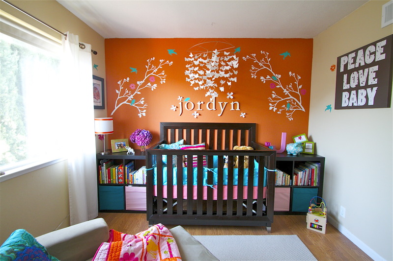
Was going to paint the baby's room orange, now realize that it's TOO orange. So now we have an orange accent wall. What goes with orange? I fear I've painted myself into a corner...
I am horribly bad for color choices. This is the color in question (Joyful Orange by Behr). We were going to paint the whole room that color but realized it's a LOT of orange, and the room isn't big enough to be all that color. So now we have one orange wall. What should the main color be?
Constraints
- flooring is dark hard wood (it looks great with the orange)
- crib & furnishings will also be dark wood (more brown than black)
- trim is white
- crib will go on the orange wall side
- red couch (something between this and this) will go in the room, so it should match with the main color
- hoping to put a mirror with a dark eggplant purplish frame in the room also (we were originally thinking a vibrant moroccan style room, hence the orange/red/purple feel), again on the main color wall not by the crib
What colors go with this assortment? A light grey like this? To me that screams "office" and "graphic designer has a kid" ie too modern for me. I don't want white (too 60s mod). Orange and peachy? Light blue? I'd like the room to feel bright but also cosy & comforting... like a baby's room should feel. Save me from my own lack of color sense! Thanks metafilter.
I would use any of the colors in this palette.
posted by janey47 at 3:48 PM on May 20, 2015 [1 favorite]
posted by janey47 at 3:48 PM on May 20, 2015 [1 favorite]
Along the Moroccan theme, you could go for a pale terracotta-ish yellow?
posted by yesbut at 3:51 PM on May 20, 2015 [2 favorites]
posted by yesbut at 3:51 PM on May 20, 2015 [2 favorites]
Best answer: I'd go with gray. It's a great color combo - Check THIS out
posted by TurquoiseZebra at 3:52 PM on May 20, 2015 [10 favorites]
posted by TurquoiseZebra at 3:52 PM on May 20, 2015 [10 favorites]
Can you mitigate the orangeness by putting up a vinyl design and turning that into the focus rather than the painted wall? Or stencils, or posters, or paintings??
If that works, then perhaps a very pale yellow on the remaining walls, with a white trim, would make this a sunny sort of room. And then you can have contrasting colours in the furnishings (aqua or lilac pillows for example)?
posted by ninazer0 at 3:54 PM on May 20, 2015
If that works, then perhaps a very pale yellow on the remaining walls, with a white trim, would make this a sunny sort of room. And then you can have contrasting colours in the furnishings (aqua or lilac pillows for example)?
posted by ninazer0 at 3:54 PM on May 20, 2015
Cream for the other walls. Or very light chartreuse green, maybe? Hmmm, that might be too busy with the white trim.
Actually....
I would redo the trim Cream color in an Eggshell or Gloss or Semi-Gloss. Walls Flat Cream. I think.
IDK. That seems like a lot going on!
Wait!! Maybe keep trim and do all walls a lighter version of the orange on all the walls? Or keep the one vibrant orange wall and the other three in a lighter version of the vibrant orange??
Yes. I think just paint the other 3 walls a lighter version of the vibrant Orange. Flat paint. Done.
posted by jbenben at 3:55 PM on May 20, 2015 [1 favorite]
Pale pink or peach
posted by travertina at 3:57 PM on May 20, 2015 [3 favorites]
posted by travertina at 3:57 PM on May 20, 2015 [3 favorites]
Gray goes very well with orange! My daughter's room is gray, her rug and rocking chair are orange, her crib and dresser are walnut. Most accents in her room are pale blue which also work great with the orange (sparingly).
posted by lydhre at 3:58 PM on May 20, 2015 [1 favorite]
posted by lydhre at 3:58 PM on May 20, 2015 [1 favorite]
I'd go with a lighter, less saturated orange. Bring in some pale green textiles like blankets and pillows (curtains?) to keep it from being overly hot but still warm. With the darker purple accent (maybe get a purple lamp or some art, too) you'll have a pretty balanced triadic color scheme that will support the red couch.
posted by Mizu at 4:07 PM on May 20, 2015 [3 favorites]
posted by Mizu at 4:07 PM on May 20, 2015 [3 favorites]
How about a shade of purple that's very, very light, to match the mirror frame? Like this, but lighter.
Or, a lighter, brighter shade of orange like this (third picture down).
I also wouldn't put the mirror with the purple frame on the orange wall.
As an aside, your couch is very close to Pantone's color of the year for 2015!
posted by Everydayville at 4:12 PM on May 20, 2015
Or, a lighter, brighter shade of orange like this (third picture down).
I also wouldn't put the mirror with the purple frame on the orange wall.
As an aside, your couch is very close to Pantone's color of the year for 2015!
posted by Everydayville at 4:12 PM on May 20, 2015
Best answer: The tool that janey47 used is exactly what I was going to suggest (but pop "Joyful Orange" into the search bar; it actually suggests the same pale yellow).
That said, if you don't love the color, eat the cost and time and paint over it before the baby comes. I had just painted my home office a deep red when, surprise, my son was conceived and that became his room. Even in nesting mode, I didn't like the idea of repainting so soon, but I lived to regret that choice.
Orange is my favorite color, but I agree that is very, very orange. It's a zillion times easier to repaint when you (and the room) are already in that mode.
posted by whoiam at 4:19 PM on May 20, 2015
You could always put in a chair rail and paint the upper or lower half another color, if that's just too much orange.
I think if you're going to have brown-black wood, gray will look weird. I think the yellow or blue suggestions are better, as both look good with brown.
posted by Lyn Never at 4:28 PM on May 20, 2015 [2 favorites]
I think if you're going to have brown-black wood, gray will look weird. I think the yellow or blue suggestions are better, as both look good with brown.
posted by Lyn Never at 4:28 PM on May 20, 2015 [2 favorites]
Light grey, lavender, or a robin's egg blue. All look so good with orange.
posted by quince at 4:34 PM on May 20, 2015
posted by quince at 4:34 PM on May 20, 2015
You could easily tone down the brightness of the orange by adding a light texture over it in cream, or pale yellow. I wouldn't suggest using a sponge - if that's not done really carefully it can look dreadful - but a neat way to add texture is to use a thick plastic bag, crumpled up. Basically you put the bag on your hand, crumple it, paint a bit of paint onto the bag and then dab dab dab it onto the wall. It goes pretty quickly and doesn't use up a lot of paint. The texture is really interesting, lots of little pointy bits and random rough areas. Definitely test it out on a piece of cardboard first to get the hang of it.
posted by 5_13_23_42_69_666 at 4:40 PM on May 20, 2015
posted by 5_13_23_42_69_666 at 4:40 PM on May 20, 2015
I think you can keep the vibrant Moroccan feel but mellow it out a little by going for a medium light golden caramel. I think gold is an underappreciated option for wall colors. Something like this (Behr's widget doesn't let me change furniture colors so I've used a red on the trim to help your eye see what your couch might look like).
posted by drlith at 4:47 PM on May 20, 2015 [1 favorite]
posted by drlith at 4:47 PM on May 20, 2015 [1 favorite]
Best answer: Hi there. My son's room has an orange accent wall. The orange color is Benjamin Moore Sharp Cheddar and the other three walls are also BM, but the color is gray, specifically Bunny Gray. Other colors in his room are turquoise (on the rocking chair) and chocolate brown (some pictures on the wall featuring owls).
In our home, we have lots of colors everywhere. Both my spouse and I gravitate to bright colors and vibrant patterns, which we know are not for everyone. But we like it, and our son likes his orange wall, which he calls his "mac and cheese" wall. YMMV. I support your orange wall!
posted by ThaBombShelterSmith at 4:54 PM on May 20, 2015 [1 favorite]
Best answer: I think an accent wall looks best when the other walls are kept fairly unremarkable. An actual color on the other walls, especially a complementary one, would excite the eye too much, not give the cozy/comfortable vibe you want. I would go neutral or at least keep the color a very light almost-neutral tint - maybe a very light warm gray (this gray, BM Gray Owl, is my FAVORITE neutral) or a much paler shade of orange as jbenben suggests. Then you can add pops of eggplant and the red couch, maybe some canary yellow, without it feeling hectic.
posted by peachfuzz at 4:58 PM on May 20, 2015
posted by peachfuzz at 4:58 PM on May 20, 2015
I think neutral brown earth tones. I would paint the other walls off-white or a light beige/sand color. The accent wall is supposed to stand out so the other walls should be muted.
Or go the opposite direction and make the room a Latin American-inspired color explosion. Bright oranges, greens, reds, etc. can make a place feel really bright and festive!
posted by AppleTurnover at 5:26 PM on May 20, 2015 [2 favorites]
Or go the opposite direction and make the room a Latin American-inspired color explosion. Bright oranges, greens, reds, etc. can make a place feel really bright and festive!
posted by AppleTurnover at 5:26 PM on May 20, 2015 [2 favorites]
Pegboard is coming back and looks like a fairly cheap and most importantly useful way to set up a big storage system that can be styled well (add some coordinating trim to frame it, some art prints and toys here and there, spray paint it a great neutral) and that would turn your orange wall into a bright frame for a big feature in your room.
posted by dorothyisunderwood at 5:49 PM on May 20, 2015 [1 favorite]
posted by dorothyisunderwood at 5:49 PM on May 20, 2015 [1 favorite]
Light grey. I've painted two rooms grey with accent walls--one with a pink accent wall and one with a bright red. Neither looks officey at all. Grey is also a super trendy nursery color.
posted by PhoBWanKenobi at 6:41 PM on May 20, 2015
posted by PhoBWanKenobi at 6:41 PM on May 20, 2015
Orange is awesome!! Yay! You could pair it with a medium gray OR a deep brown. Then choose another accent color in bedding, throw pillows, art or what-have-you. Sage green works. So does a bright mid-blue.
Also a good combo is orange, a lighter orange, and purple. It manages to be both a sophisticated color palette, and a bit whimsical.
posted by missmary6 at 7:13 PM on May 20, 2015
Also a good combo is orange, a lighter orange, and purple. It manages to be both a sophisticated color palette, and a bit whimsical.
posted by missmary6 at 7:13 PM on May 20, 2015
Orange and Green is a classic (Indian) combination. For example, see this saree.
posted by dhruva at 8:37 PM on May 20, 2015
posted by dhruva at 8:37 PM on May 20, 2015
Best answer: Cream/off-white (ivory, even) or a light, warm, yellow-beige for the other walls, with robin's egg blue or turquoise accents.
posted by cotton dress sock at 9:30 PM on May 20, 2015 [1 favorite]
posted by cotton dress sock at 9:30 PM on May 20, 2015 [1 favorite]
They way I would decide is to look at some art or prints or fabric you might choose (or have already chosen) that has this same orange and some other colors, and build the room around that. Otherwise I lean toward light blue, turquoise, or black and white.
posted by oneirodynia at 10:12 PM on May 20, 2015
posted by oneirodynia at 10:12 PM on May 20, 2015
I would do a half and half paint job. Here are some lovely examples. You don't even need a chair railing. Yes, you will have to take the top off of the already painted wall but it won't take that long. It could look very charming in a nursery.
posted by Foam Pants at 2:08 AM on May 21, 2015
posted by Foam Pants at 2:08 AM on May 21, 2015
I second the idea of off-white or a light beige/sand color.
posted by Too-Ticky at 2:23 AM on May 21, 2015
posted by Too-Ticky at 2:23 AM on May 21, 2015
White and teal. You could turn it into a joyous outdoors theme by painting the white outline of a tree on the orange wall and either paint or decal little birds and such.
A less fresh but more cozy option would be pairing orange with white and olive as in this example.
posted by Fallbala at 2:35 AM on May 21, 2015
A less fresh but more cozy option would be pairing orange with white and olive as in this example.
posted by Fallbala at 2:35 AM on May 21, 2015
It's beautiful.
(And orange is my least favourite colour so my saying it is beautiful means a lot.)
I would do the other walls in a neutral pale yellow that is close to cream, preferably wall paper so that you can get some subtle patterning or textures in.
Having done that I would find a couple of small focal points, such as a vase, a small lamp, a box where you store the diaper bag clutter, a cushion or the like, which is the same shade of orange. I would pair that orange with a deep bright green, The objects should be quite small and there should be only two or three of them. And they should all be that same striking shade of orange. (You could paint a couple of items using the left over orange paint.)
I would then pair the orange items with items that are a deep green, just a shade lighter than pine green, to add contrast to the orange and the cream, and to be even stronger than the orange.
If you can get an orange tree in a pot that you paint the same shade of orange that would be ideal.
posted by Jane the Brown at 4:24 AM on May 21, 2015
Teal, light yellowish green and purple provide great contrast. It would still be rather eye popping, though! If you paint over it in white you could make it paler.
posted by Omnomnom at 10:45 AM on May 21, 2015
posted by Omnomnom at 10:45 AM on May 21, 2015
Part of my kitchen is this color orange. It works well as an accent with dark gray, bright light blues, and a cool white.
posted by cmoj at 2:37 PM on May 21, 2015
posted by cmoj at 2:37 PM on May 21, 2015
Response by poster: Thanks everyone, I appreciate the help and inspired links. The Benjamin Moore suggestions were great - apparently there are hella more than 50 shades of grey and so far the front runners are this and this (they look more grey IRL in than on the screen) but the final winner remains to be chosen.
posted by St. Peepsburg at 5:51 PM on May 21, 2015
posted by St. Peepsburg at 5:51 PM on May 21, 2015
Response by poster: We ended up with an even lighter version of grey owl and it looks great!! Thanks again metafilter.
posted by St. Peepsburg at 3:45 PM on June 20, 2015 [3 favorites]
posted by St. Peepsburg at 3:45 PM on June 20, 2015 [3 favorites]
This thread is closed to new comments.
posted by Marie Mon Dieu at 3:47 PM on May 20, 2015 [1 favorite]