color me!
November 15, 2005 3:27 PM Subscribe
Tomorrow I'm giving a lecture about color -- specifically, I'm talking to designers about how to create color palettes. The talk is more concerned with aesthetics (i.e. what color combinations are striking) than tools (i.e. how to pick colors in Photoshop). But there will be some tools talk. Since there are many designers here, I'd love to know all your color-related tips. As the Xmas season is coming, I am sharing one of my own tips inside...
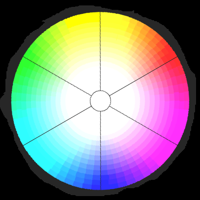
Here's my tip: I like complementary colors. Complementary colors are color "opposites," by which I mean they lie on opposite sides of the color wheel from each other. As you can see from the wheel here, cyan is the opposite of red. Using these opposites together, in the same design, can often lead to striking effects. The trouble is, if you have a base color, how do you find its complement (more precisely than eyeballing it on a color wheel)? Here's how I do it in Photoshop:
1) Pick your base color (the color for which you want to find a complement) with the eyedropper tool, so that the color is loaded into the foreground-color chip. Or just pick any color you want to be the base.
2) Click on the background-color chip. The color-chooser dialogue will appear. Leave the dialogue open, but roll your mouse outside of it and you'll see the eyedropper cursor again. Click it on the foreground color clip (that you set to the base color in step one). Now your background color will be the same as your foreground color.
3) In the dialogue, look at the Hue number. If it's LESS THAN 180, add 180 to it and type the resulting number into the Hue field. If it's GREATER THAN 180, subtract 180 from it and type the result into the Hue field.
Example 1: Hue = 20. (Less than 180.)
20 + 180 = 200.
So type 200 into the Hue field.
Example 2: Hue = 210. (Greater than 180.)
210 - 180 = 30.
So type 20 into the Hue field.
Click Ok to close the dialogue. Now the colors in the foreground and background chips are complements.
Note: This step works because Hue is a degree (of the color's position around the color wheel). The complement, being at the opposite end of the color wheel, is 180 degrees away from the base color. You can get 180 degrees away by either adding (moving clockwise around the wheel) or subtracting (moving counter-clockwise) 180 from the original number. But you must make sure that the result isn't greater than 360 or less than zero. This is why you must add or subtract, depending on the degree of the base color.
4) Select the gradient tool and the option to make a gradient using your foreground and background colors. Drag a linear gradient across your document. You can prove that this is a gradient between two complements, because complement-gradients always meet in the middle at 50% gray. Eyedropper the middle and check that it's 50% gray.
5) The middle area of the gradient (the third of it that's to either side of that 50% gray part) is generally the best part to find good colors. At the extreme ends, the colors are unmixed. But nearing the middle, you'll see all sorts of interesting mixtures of the two original colors.
6) Save this document and whenever you need to find another complement, just open it and apply the Hue/Saturation effect to it. In Hue/Sat, drag the Hue slider. This will rotate the gradient around the color wheel, showing you tons of cool complements.
From my own bookmarks:
Color Scheme Generator 2.
Color Schemer Online.
colr.org.
And, the Web Developer's Handbook has a whole section on color tools.
posted by Gator at 3:46 PM on November 15, 2005
Color Scheme Generator 2.
Color Schemer Online.
colr.org.
And, the Web Developer's Handbook has a whole section on color tools.
posted by Gator at 3:46 PM on November 15, 2005
maybe not quite what you wanted...
Prepress Colour Lab
Web Color Theory
Color Scheme Generator
Pantone - colorteam
General Color Tutorials
Color, Contrast and Dimenson
Color in Motion
posted by nimsey lou at 3:52 PM on November 15, 2005
Prepress Colour Lab
Web Color Theory
Color Scheme Generator
Pantone - colorteam
General Color Tutorials
Color, Contrast and Dimenson
Color in Motion
posted by nimsey lou at 3:52 PM on November 15, 2005
I'm not a trained designer but sometimes am asked to pretend to be one at work. I really like Dynamic Graphics magazine's monthly feature on color; they put together palates based on different themes/looks. It has really helped me learn about color in a more macro sense.
Doesn't really answer your question but might be a nice resource for others interested in the topic.
posted by SashaPT at 4:11 PM on November 15, 2005
Doesn't really answer your question but might be a nice resource for others interested in the topic.
posted by SashaPT at 4:11 PM on November 15, 2005
Not to threadjack, but thank you specklet, for that amazing link. I can't believe it's all Javascript, except that it is and I can. Gorgeous algorithm he has, really.
posted by disillusioned at 4:17 PM on November 15, 2005
posted by disillusioned at 4:17 PM on November 15, 2005
My bright red purse goes with NEARLY any outfit. Really.
posted by exceptinsects at 5:06 PM on November 15, 2005
posted by exceptinsects at 5:06 PM on November 15, 2005
Probably not in time for your lecture, but I've found Josef Albers books good for this subject.
posted by Slothrop at 5:38 PM on November 15, 2005
posted by Slothrop at 5:38 PM on November 15, 2005
Best answer: Our original experience of color harmony is through our experience of nature. I like to take pictures of nature / gardens / flowers, and then, in photoshop, use the eyedropper tool to pick out harmonious palettes.
posted by extrabox at 5:43 PM on November 15, 2005 [1 favorite]
posted by extrabox at 5:43 PM on November 15, 2005 [1 favorite]
Response by poster: Thanks for the tips so far. Don't worry too much about the timing (tomorrow's lecture). I'd like your ideas for the future, too.
posted by grumblebee at 6:15 PM on November 15, 2005
posted by grumblebee at 6:15 PM on November 15, 2005
Not exactly what you want, but while we're talking color, I cannot pass up the opportunity to suggest taking a look at this color blender.
posted by pwb503 at 6:19 PM on November 15, 2005
posted by pwb503 at 6:19 PM on November 15, 2005
I don't have a specific answer for you but I use these tools:
Color SynthAxis (read the tutorial)
ColorWhore
posted by dobbs at 6:59 PM on November 15, 2005
Color SynthAxis (read the tutorial)
ColorWhore
posted by dobbs at 6:59 PM on November 15, 2005
Colour Lovers is a good site to find the one really cool color to base your scheme around.
I won't lie to you though, finding a color palette is always the hardest part of designing a site for me. My only advice would be: 1) Pick one or two harmonious colors 2)Pick one more striking color for accents, and 3) Don't discount the usefulness of white, black and grey.
posted by Hildago at 8:48 PM on November 15, 2005
This is a question I've needed to ask for ages. Thanks for asking it, grumblebee.
posted by krix at 10:13 PM on November 15, 2005
posted by krix at 10:13 PM on November 15, 2005
a couple of other color picking web doohickies:
one, two.
posted by juv3nal at 10:38 PM on November 15, 2005
one, two.
posted by juv3nal at 10:38 PM on November 15, 2005
This thread is closed to new comments.
posted by Specklet at 3:41 PM on November 15, 2005 [1 favorite]