Cursive is weird.
November 9, 2013 6:33 PM Subscribe
Why doesn't a cursive capital G look like "G" or "g"?
Because cursive developed separately from the Roman alphabet (see italics, uncial, half-uncial, lowercase vs upper, etc).
posted by rikschell at 6:45 PM on November 9, 2013
posted by rikschell at 6:45 PM on November 9, 2013
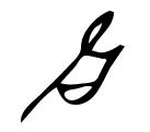
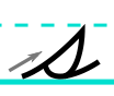
Best answer: The gesture for a traditional cursive G is actually related to a g-shape: this example shows how the narrow loop on the upper left side is really analogous to the open loop of the g, and then the bar on the right side that comes down and hooks across itself is just a fancier version of the stem-hook shape that comes down on the right side of the g. But it's initially hard to read it that way at first because of the strong upward stem on the left side that starts the cursive G (which is the same gesture of the traditional cursive S).
While we're on the subject, how bout them Qs?
Cursive Q's that look like 2's are basically just a stylized/open way of writing an O by starting at the bottom (rather than the top) and adding in the tail on the lower right side.
posted by scody at 6:47 PM on November 9, 2013 [11 favorites]
While we're on the subject, how bout them Qs?
Cursive Q's that look like 2's are basically just a stylized/open way of writing an O by starting at the bottom (rather than the top) and adding in the tail on the lower right side.
posted by scody at 6:47 PM on November 9, 2013 [11 favorites]
Here's an example of Bloser Cursive in which the connection to print G can be seen more easily. I don't know why G was squished into the ugly thing it was in the Palmer Method- perhaps because big, elegant loops are harder to make.
posted by oneirodynia at 9:50 PM on November 9, 2013 [3 favorites]
posted by oneirodynia at 9:50 PM on November 9, 2013 [3 favorites]
I used to wonder the same thing about lower-case cursive "s". But it makes sense if you think of it as "I want to write quickly, so I'm not going to bother going all the way over to the upper right corner to start my 's', I'll just get about half the way there and then start making the last half of the swishy part in the middle, do the entire bottom tail, and then head off to the next letter".
posted by benito.strauss at 11:33 PM on November 9, 2013
posted by benito.strauss at 11:33 PM on November 9, 2013
I think the written capital G looks like a little ship sailing. But I do not use it; I use a large lower case g
posted by Cranberry at 11:36 PM on November 9, 2013 [1 favorite]
posted by Cranberry at 11:36 PM on November 9, 2013 [1 favorite]
The basic reason is that writing systems developed around the available technology of the day. For roughly the period of the Renaissance to the modern era, this was a quill or its close derivative, the fountain pen, and the necessity of inking the pen (as well as leaving as few blobs of wet ink as possible) required a certain type of flow in letter forms.
To me, it would be really strange to think of cursive as being directly imitative of the "original" semitic or stone-carved letters. While there's an obvious relationship [chart] there is also a great deal of variation. And of course, we're quite able to handle that variation, particularly given the breadth of potential typefaces available today. In other words, within the context of a particular face we can understand and read quite effectively, so it doesn't seem to matter that much that cursive creates highly stylized versions of what for some reason you're implying is the actual Platonic, international, gold standard "G" or "g".
posted by dhartung at 11:46 PM on November 9, 2013 [2 favorites]
« Older My aunt has a mystery ailment. YANHD, but the hive... | Is you is or is you ain't a possiblity? Newer »
This thread is closed to new comments.
posted by JujuB at 6:45 PM on November 9, 2013 [1 favorite]