For f's sake
August 14, 2012 7:52 PM Subscribe
How do you write your lowercase 'f's? All above the line or partly below? I'm trying to work out if this is a US/UK-specific thing.
I was recently astounded to discover Americans write their lowercase 'f's completely above the line, whereas I, brought up in UK, have always written them (and thought I'd seen them written) going below the line, like a lowercase 'p'.
Is this a thing? Or just an odd thing occurrence in my handwriting? I googled and nothing came up. I must know in order to settle an argument!
US. Same as stopgap.
posted by Nolechick11 at 8:03 PM on August 14, 2012
posted by Nolechick11 at 8:03 PM on August 14, 2012
All above the line; I'm from the US.
posted by coupdefoudre at 8:04 PM on August 14, 2012
posted by coupdefoudre at 8:04 PM on August 14, 2012
Same as stopgap. US.
posted by trip and a half at 8:05 PM on August 14, 2012
posted by trip and a half at 8:05 PM on August 14, 2012
US, nthing stopgap.
posted by vegartanipla at 8:05 PM on August 14, 2012
posted by vegartanipla at 8:05 PM on August 14, 2012
Cursive handwriting: top loop above, bottom loop below.
"Print" handwriting: like a shepherd's crook with a short right-facing horizontal line about halfway down.
A lot of Americans write "print", i.e. in a sort of mishmash imitation of printed writing, which results in the "above the line" f.
posted by Sara C. at 8:05 PM on August 14, 2012 [1 favorite]
"Print" handwriting: like a shepherd's crook with a short right-facing horizontal line about halfway down.
A lot of Americans write "print", i.e. in a sort of mishmash imitation of printed writing, which results in the "above the line" f.
posted by Sara C. at 8:05 PM on August 14, 2012 [1 favorite]
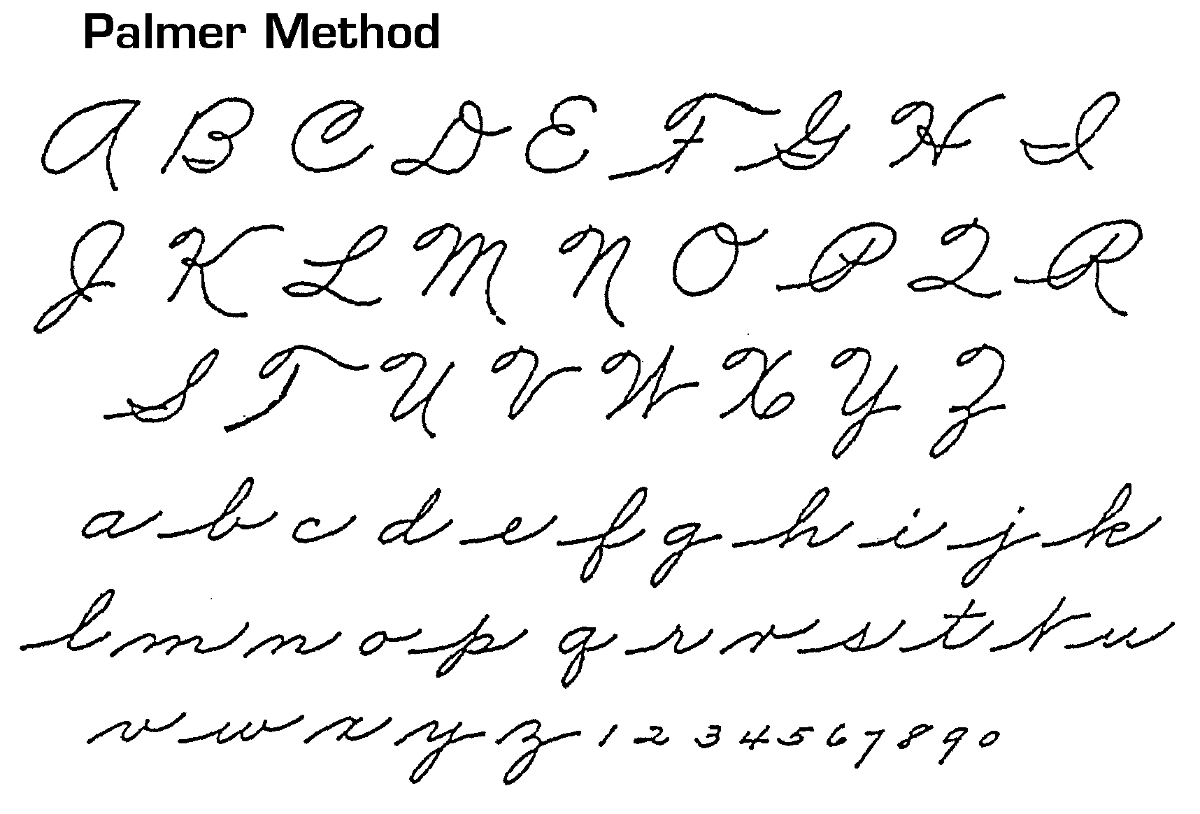
In cursive as taught in most US schools, the lower-case f goes below the line. Look at the charts here, for instance.
posted by Sidhedevil at 8:06 PM on August 14, 2012
posted by Sidhedevil at 8:06 PM on August 14, 2012
I think you're missing the age data point; there have been some changes in the way handwriting is taught in US schools over the past few decades. But in any case, I grew up in the US, and though I don't know if I was officially taught The Palmer Method per se, it looks the most similar to the handwriting I learned in school (and thus my handwritten lowercase f is above and below the line).
posted by theatro at 8:08 PM on August 14, 2012
posted by theatro at 8:08 PM on August 14, 2012
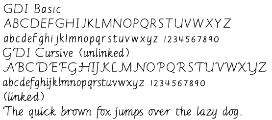
A different style of cursive, also for US schools, but still with a line-spanning lower-case f.
Compare it to the printing letter styles above on the web page.
posted by Sidhedevil at 8:09 PM on August 14, 2012
Compare it to the printing letter styles above on the web page.
posted by Sidhedevil at 8:09 PM on August 14, 2012
Yet a third style of cursive, for the US market, also with a line-spanning lower-case f.
posted by Sidhedevil at 8:11 PM on August 14, 2012
posted by Sidhedevil at 8:11 PM on August 14, 2012
Below the line when writing in cursive, but above the line almost touching the hook part of the letter "f" when writing in printing format.
posted by livinglearning at 8:12 PM on August 14, 2012
posted by livinglearning at 8:12 PM on August 14, 2012
I'm from the US. I was taught that an f is entirely above the baseline. However, my f's extend below the baseline. I'm in my early 30s.
I spend more time handwriting (printing, not cursive) than most people I know. Also, in pairs of f's ("off", "effective") only the second f gets a descender.
posted by fantabulous timewaster at 8:14 PM on August 14, 2012
I spend more time handwriting (printing, not cursive) than most people I know. Also, in pairs of f's ("off", "effective") only the second f gets a descender.
posted by fantabulous timewaster at 8:14 PM on August 14, 2012
One more cursive method.
I think the answer might be that fewer people you encounter from the US use cursive. I have beautiful penmanship in cursive, but I always print.
posted by Sidhedevil at 8:22 PM on August 14, 2012
I think the answer might be that fewer people you encounter from the US use cursive. I have beautiful penmanship in cursive, but I always print.
posted by Sidhedevil at 8:22 PM on August 14, 2012
US - Mine does the above below thing, but I use the exact same f in my 'print' and 'cursive' stylings. I used to have mine just above when I 'print' but I now think the cursive 'f' looks better.
posted by Geppp at 8:23 PM on August 14, 2012
posted by Geppp at 8:23 PM on August 14, 2012
Okay, I lied. Here's one more cursive method. Last one, I promise.
I am semi-amazed that this is such a cottage industry.
posted by Sidhedevil at 8:24 PM on August 14, 2012
I am semi-amazed that this is such a cottage industry.
posted by Sidhedevil at 8:24 PM on August 14, 2012
American, and my lowercase fs fall partially below the line in both cursive and print.
posted by srrh at 8:32 PM on August 14, 2012
posted by srrh at 8:32 PM on August 14, 2012
Also, every US child I have ever known, including my 5-year-old private-schooled goddaughter, my 5-year-old homeschooled godson, and my 8-year-old public-schooled nephew---all in different states---was taught to print. You'll see penmanship charts for printing methods that accompany the cursive methods on some of my links. It's not an improvised thing; schools teach it with some care. See these worksheets, for instance.
posted by Sidhedevil at 8:32 PM on August 14, 2012 [1 favorite]
posted by Sidhedevil at 8:32 PM on August 14, 2012 [1 favorite]
I was taught above the line for printing, below the line for cursive. I don't use cursive anymore, but my printing has some elements of it -- my Fs go below the line, I usually loop the bottom of my Gs, etc. Canadian.
posted by Felicity Rilke at 8:43 PM on August 14, 2012
posted by Felicity Rilke at 8:43 PM on August 14, 2012
Above the line - New Zealand. Can't say that I've ever seen someone write a lowercase 'f' below the line.
posted by Paragon at 8:54 PM on August 14, 2012
posted by Paragon at 8:54 PM on August 14, 2012
I'm in the US and mine have tails that end below the line when I'm printing.
posted by pullayup at 9:06 PM on August 14, 2012
posted by pullayup at 9:06 PM on August 14, 2012
The recommended handwriting style where I live (Victoria, Australia) has effs with descenders.
posted by flabdablet at 9:11 PM on August 14, 2012 [1 favorite]
posted by flabdablet at 9:11 PM on August 14, 2012 [1 favorite]
Australian, and we were taught the same method as stopgap.
posted by malibustacey9999 at 9:12 PM on August 14, 2012
posted by malibustacey9999 at 9:12 PM on August 14, 2012
I'm in the US, had teachers from the UK growing up. My cursive "f" is just a straight line, going below the line.
posted by The corpse in the library at 9:12 PM on August 14, 2012
posted by The corpse in the library at 9:12 PM on August 14, 2012
When I'm doing calligraphy I go below the line (I primarily use italic forms,) when I do cursive (which is semi-Spencerian) I go below the line, when I'm printing I apparently go to exactly the line. Which is a tad unusual for me - I'm looking at a random paragraph I wrote out just a few minutes ago, and the f's are unusual for always exactly hitting the line, when many other letters go slightly above or below depending on neatness or flightiness or whatever. My f's are also more completely crossed than my t's are. I'm checking out some other random bits of printing I have and it seems like it's pretty consistent - my lower-case f is one of the most standardized of all my letters. Wacky.
I sometimes get into a halfway cursive sort of style - then the f's definitely dip a little (and curl backwards, like the italic linked above,) the g's and y's loop, and so on. I rarely manage to pull this off for more than one or two lines of text; it tends to be a "Sarah isn't sure whether she's doing cursive or printing today, oh, now she's decided to type" kind of deal. Short notes on Post-Its are the most likely to feature this handwriting style.
posted by SMPA at 9:14 PM on August 14, 2012
In cursive, partly below the line like a lowercase p, as you say. In print, uh, mostly above. (I'm not winning any awards for great or consistent penmanship!)
US, and I'm in my late 30s.
posted by desuetude at 9:45 PM on August 14, 2012
US, and I'm in my late 30s.
posted by desuetude at 9:45 PM on August 14, 2012
British. Mine don't go below the line.
posted by NailsTheCat at 9:56 PM on August 14, 2012
posted by NailsTheCat at 9:56 PM on August 14, 2012
Canadian here. In cursive, an f that doesn't go below the baseline is a b. In printing, it looks like this: f.
posted by Sys Rq at 9:57 PM on August 14, 2012 [1 favorite]
posted by Sys Rq at 9:57 PM on August 14, 2012 [1 favorite]
Mine are always below the line, cursive or print. US here, and in my mid-40's
posted by patheral at 10:19 PM on August 14, 2012
posted by patheral at 10:19 PM on August 14, 2012
UK (school 1950s): cursive above and below, italic (the main style we were taught) also goes below, print only above the line
posted by anadem at 10:27 PM on August 14, 2012
posted by anadem at 10:27 PM on August 14, 2012
I usually write on blank paper with no lines, and my lowercase fs are completely out of control. They go really high and really low, taking up what I imagine is close to 3 whole line spaces.
However, this is why I write on blank paper, so I have plenty of room to write large if I want to.
Anyway, here is a crappy photo of my handwriting so you can see what I'm talking about. Lived in the US my entire life, except for a short stint in Germany in my early 20s.
posted by King Bee at 10:57 PM on August 14, 2012
US, 1980s, I was taught italics instead of ordinary cursive. (Why? No idea.) The lowercase f crossbar is level with the crossbar in the lowercase t and neither should go below the line. Though mine often do, because I am sloppy.
posted by cmyk at 11:03 PM on August 14, 2012
posted by cmyk at 11:03 PM on August 14, 2012
US, below. I'm weird.
posted by mochapickle at 12:33 AM on August 15, 2012
posted by mochapickle at 12:33 AM on August 15, 2012
UK, below.
posted by pikeandshield at 12:35 AM on August 15, 2012
posted by pikeandshield at 12:35 AM on August 15, 2012
I'm getting super confused by all of this, because there is a major difference here based on whether or not the original question is regarding print or cursive writing (or both).
I can imagine print "f" sometimes dipping below the line, but I can't at all imagine a cursive "f" existing entirely above the line. So I think this question is about print handwriting.
In which case, I was taught to have them above the line, but I sometimes they dip below and nobody really notices.
posted by dogwalker at 12:35 AM on August 15, 2012 [2 favorites]
Printing, like flabdablet's and King Bee's links, but only if I'm writing quickly. (Calif mid-30s)
posted by MikeKD at 12:50 AM on August 15, 2012
posted by MikeKD at 12:50 AM on August 15, 2012
Not only does it depend on print or cursive, it'll depend further on the type of handwriting used.
In the italicized system I first learned (Getty-Dubay) there's not much difference between letterforms in cursive or print. It's supposed to look like this. So, print f doesn't go below the line while cursive f does - easy to confuse the two.
I switched to a different school that worshipped at the altar of godawful D'Nealian writing; that messed my hands up. I had half-decent italics before that.
posted by cmyk at 1:11 AM on August 15, 2012
Primary school kids in the UK are also taught to write f entirely above the line, but I'm pretty sure I've seen some adults writing printed-style fs with tails that go below the line in a more joined-up-writing style [have just realised this is how my mum writes]. I would consider this a personal style choice, entirely inoffensive, but wouldn't expect it to have been taught that way. My niece and nephew haven't got as far as joined-up writing yet (if it's even taught any more?) so I don't know what the modern thinking is.
And yes, I'm saying joined-up rather than cursive because that's what we called it at *my* primary school. My own fs vary wildly in shape, usually going below the line but mostly in what might be recognised as a cursive style rather than a printed style; I'm pretty sure I picked this up off my grandfather rather than being taught it anywhere.
posted by Lebannen at 1:25 AM on August 15, 2012
I had to find some writing of mine to see - I'd never actually thought about it. So US, below the line.
posted by Partario at 2:55 AM on August 15, 2012
posted by Partario at 2:55 AM on August 15, 2012
UK. Above, though sometimes below if I'm doing fancy joined-up writing.
posted by ComfySofa at 3:11 AM on August 15, 2012
posted by ComfySofa at 3:11 AM on August 15, 2012
New Zealand - entirely above the line, but we were only taught printing, not cursive. (27 years ago). I taught myself cursive as a teenager, from a method with below-the-line fs, but none of my friends had ever seen anything like it.
posted by lollusc at 3:26 AM on August 15, 2012
posted by lollusc at 3:26 AM on August 15, 2012
American --- printed it's totally above the line, cursive half above and half below. (Taught in the '60s, for what that's worth.)
posted by easily confused at 3:41 AM on August 15, 2012
posted by easily confused at 3:41 AM on August 15, 2012
UK, below the line.
Also, I don't know whether switching between 'print' and 'cursive'/'joined-up' is also a UK/US divide - at my primary school joined-up handwriting was something we were taught as the Correct Grown-Up Way To Write from about the age of 8 or so, and lots of primary schools now teach it from reception onwards. So maybe it's 'being taught to write in print' in general, rather than the lower-case f specifically, that's behind the US/UK difference you've noticed?
posted by Catseye at 4:05 AM on August 15, 2012
Response by poster: Fascinating. Thanks for all the data points, folks!
Catseye, I was coming to the same conclusion. In fact, I was completely confused by all the answers referencing 'printing' in lowercase - to me, if someone has ever asked me to 'print' something in handwriting I have written it in capital letters - although Wikipedia tells me this is a common misconception. At school, I was only ever taught cursive for lowercase. I just attempted to write my first-ever word in lowercase print and my fs are still going down. Above-the-line they look so.....naked.
So obviously my handwriting is a mish-mash of printed uppercase and cursive/joined up lowercase. Huh. It looks like the argument was a draw!
(btw, fantabulous timewaster gets the award for most obscure rule regarding fs!)
posted by atlantica at 4:24 AM on August 15, 2012
US -- all of my lowercase fs have tails. I wasn't taught that way, I just think they're nice.
posted by cranberry_nut at 4:29 AM on August 15, 2012
posted by cranberry_nut at 4:29 AM on August 15, 2012
UK, below.
I too was confused by the print/cursive discussion upthread. I can write in both styles if I want but I have a sort of hybrid writing style now that is somewhere between the two.
fwiw, I was taught print (above) then cursive (below) in school and after we'd learned cursive, that's what was expected from us from that point on. So I'm with Catseye: maybe it's a print/cursive US/UK divide.
posted by rubyrudy at 4:31 AM on August 15, 2012
As noted above, a print f is correctly above the line unless you're writing angsty poetry and putting flourishes on all of your letters.
In the US, I was taught print at first, then cursive starting around age 8, required to use cursive exclusively in school at age 10 for a year, and then back to print being allowed/encouraged. Around age 16 almost everyone takes a major standardized test where the honor statement is required to be copied verbatim in cursive with Dire! Consequences! if you don't... this is widely regarded as the hardest portion of the whole test as no one remembers how to write in cursive by that point.
I can't imagine everyone using cursive, I have a difficult enough time reading most handwriting even when it's print.
posted by anaelith at 5:41 AM on August 15, 2012 [1 favorite]
US. We were taught to write in both cursive and print, but I haven't written anything in cursive probably since the last test I had on it in school. I just tried to write a sample sentence in cursive, and besides it being almost illegible, the f was on both sides of the line. In my print writing, it stays above the line unless I'm writing really quickly and then the very bottom of the f sometimes slips below the line.
posted by crankylex at 6:03 AM on August 15, 2012
posted by crankylex at 6:03 AM on August 15, 2012
US, early 30s. Above the line.
Cursive was taught in primary school here but I never made it into the pen & ink club so I always print
posted by TravellingCari at 6:10 AM on August 15, 2012
Cursive was taught in primary school here but I never made it into the pen & ink club so I always print
posted by TravellingCari at 6:10 AM on August 15, 2012
Cursive is dying out in the US. I use a combination of both. When I'm writing in 100% cursive, my f's are below the line. When I'm printing, above. When I'm taking notes in my hybrid script, above.
I'll be 50 in December and I'm in the US.
posted by Ruthless Bunny at 7:03 AM on August 15, 2012
I'll be 50 in December and I'm in the US.
posted by Ruthless Bunny at 7:03 AM on August 15, 2012
US, mid-20s, below the line. Learned cursive near Seattle, WA.
I was taught the above-the-line approach. However, I have a distinct memory of one of the volunteer moms in the classroom who wrote a curly eff extending below the line; I found it so appealing that I adopted her method. She was originally from (I think) Belgium.
posted by bookdragoness at 7:14 AM on August 15, 2012
U.S. I use what I will henceforth call the "stopgap method" - above and below.
posted by randomkeystrike at 8:52 AM on August 15, 2012 [1 favorite]
posted by randomkeystrike at 8:52 AM on August 15, 2012 [1 favorite]
US. my lowercase f in print is entirely above the line. my lowercase f in cursive is both above and below the line.
posted by woodvine at 11:19 AM on August 15, 2012
posted by woodvine at 11:19 AM on August 15, 2012
Canadian, early 30s, below the line... but I was taught to write them above the line as a child and picked up the below-the-line thing as a semi-affectation in Grade 9 because I liked the way a teacher wrote them -- kind of like bookdragoness! My cursive f is below the line, as I was taught.
I also write my capital I's in a different style cursive than I was taught in school (also as a picked-up affectation...) and now am wondering where that I style comes from!
posted by urbanlenny at 12:41 PM on August 15, 2012
I also write my capital I's in a different style cursive than I was taught in school (also as a picked-up affectation...) and now am wondering where that I style comes from!
posted by urbanlenny at 12:41 PM on August 15, 2012
UK (1970s) - below. We were taught using the books by Marion Richardson, whose system is discussed in the middle of this page. Notably for this argument: "the most distinctive forms of the pure Marion Richardson system are the long open /f/ and the open /b/ and /p/".
posted by Jabberwocky at 1:37 PM on August 15, 2012 [2 favorites]
posted by Jabberwocky at 1:37 PM on August 15, 2012 [2 favorites]
This thread is closed to new comments.
posted by stopgap at 7:58 PM on August 14, 2012 [8 favorites]