At least there'd be no comic sans...
March 28, 2010 7:23 AM Subscribe
A question about fonts, handwriting, and alphabets other than our Latin one...
It suddenly occurred to me that there are a vast number of fonts out there for the Latin alphabet. These fonts change almost every element of a letter and yet leave the identity of the intended letter obvious to most readers (normally).
But, looking at Arabic script or characters from the Far East, the letter shapes seem to be much more rigidly specified - in the first case due to the apparent simplicity of the letter shapes and in the later the massively increased complexity.
My incredibly naive questions are these....
1) do you get the same concept of different fonts in all other character sets?
2) do you get the same myriad 'fonts' caused by different handwriting styles or is one person's handwriting more similar to those of his neighbour?
3) If the answer to 2 is no or maybe, how badly does this effect the efforts of the police in identifying a suspect by their handwriting...?
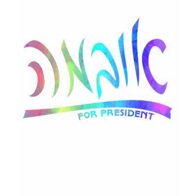
To answer #1 about the only non-Latin alphabet I'm at all familiar with: the Hebrew way to write Coca-Cola is קוקה קולה (reading from right to left, that's roughly Q-vowel-Q-H Q-vowel-L-H). In this image, you can make out those letters in a totally different font. Here's another example: two Obama stickers in Hebrew in two different fonts. Again from right to left, the letters rougly go B-R-Q, vowel-B-M-H.
Finally, written Hebrew is fairly different from printed Hebrew. This is how Obama's last name would look written out by hand in Hebrew. And this is a site containing a bunch of examples of graffiti in Jerusalem.
posted by Ashley801 at 8:01 AM on March 28, 2010
Finally, written Hebrew is fairly different from printed Hebrew. This is how Obama's last name would look written out by hand in Hebrew. And this is a site containing a bunch of examples of graffiti in Jerusalem.
posted by Ashley801 at 8:01 AM on March 28, 2010
In Russian, there is less variation among handwriting and students are more strictly taught the "proper" handwriting, like old-fashioned "copperplate" handwriting in English where everyone's handwriting looked much more similar. I don't have great handwriting in English and can't draw (not so great with a pen) but I was surprised to find that with discipline and no other options, learned a fairly reasonable Russian hand. This makes me suspect had I been forced to learn "copperplate" English writing, I probably could have.
(Interestingly, some letters in Russian crossed into my English handwriting -- I do "o" in the Russian way in particular -- but other letters, like K, I write automatically the Russian way when writing in Russian but in my idiosyncratic English way when writing in English, and my handwriting would be a LOT MORE LEGIBLE with a Russian K in it -- my K is a sloppy mess -- but I can't force my brain to do it!)
I would think you could still recognize different people's writing with practice, even in a more standardized system -- I can certainly recognize my own, and often my best friend's, in Russian. I anything about IDing handwriting, but there does seem to be some individuality even in a pretty standardized system. (Or maybe our handwriting in Russian is just not very good!)
posted by Eyebrows McGee at 8:14 AM on March 28, 2010
Different typefaces generally vary the thickness of the strokes and the slant and proportions of the letterforms. Those can be done in non-Roman scripts.
It's useful to distinguish between different fonts that use the same letterforms (with a few variations), such as Times New Roman and New Century Schoolbook, both based on Roman majuscule and minuscule forms, and fonts that use different letterforms. Blackletter fonts, such as the old German Fraktur, differ from Roman script and it can take effort to learn to read them. (Compare the blackletter often used for the titles of newspapers, such as the New York Times, with the Roman fonts used in the paper's articles.) Kurrentschrift, an old cursive version of German handwriting, is quite difficult to read without practice. But both use the Latin alphabet, just with letterforms that are distinct from Roman majuscule or minuscule forms.
posted by brianogilvie at 8:22 AM on March 28, 2010
Some examples: Arabic fonts, Devanagari fonts, Tamil fonts. All from www.wazu.jp. You can poke around on the site and find plenty more.
This image from Wikipedia shows some calligraphic variants of opening verse of the Qur'an.
posted by nangar at 9:00 AM on March 28, 2010 [1 favorite]
This image from Wikipedia shows some calligraphic variants of opening verse of the Qur'an.
posted by nangar at 9:00 AM on March 28, 2010 [1 favorite]
Like Eyebrows McGee I had much better handwriting in Russian when I was learning it (forgotten most if it now), than I do English. But I was taught handwriting in a very strict, very rigid way at my old-fashioned school. I'm not sure whether it was age, or whether Russian handwriting is taught in a more 'natural' way. But the first week in Russian class I was bouncing off the walls because I'd received my first ever 'A' in a handwriting exercise!
Have Russian Coca-Cola and Russian Irn Bru to demonstrate that Cyrillic is flexible in fonts.
posted by Coobeastie at 9:03 AM on March 28, 2010
Have Russian Coca-Cola and Russian Irn Bru to demonstrate that Cyrillic is flexible in fonts.
posted by Coobeastie at 9:03 AM on March 28, 2010
I know in Islam, art is considered profane if it depicts God or any of God's creatures, so it never includes people, animals or nature. It is always graphic/geometric. For this reason as well, calligraphy is a strong and very old art form in the Islamic world. I do not know Arabic at all, but I do know that it's written form can be quite variable, much the same as our Latin alphabet. The calligraphy can be stunningly beautiful!
posted by wwartorff at 11:29 AM on March 28, 2010
posted by wwartorff at 11:29 AM on March 28, 2010
I would say that Arabic script allows MORE variation than Latin script. I say this as someone who has studied the Arabic language for years. The Arabic script is not confined by the linear rules that Latin script is (that is, one letter coming after another, taking up roughly the same amount of space). Depending on the writing style you are using, it is very common to have some groups of letters in the middle of a right-to-left word to go up to down, or for a word to stretch out connections between certain letters for visual reasons.
And, just continuing what wwartorff is saying, there is a whole tradition of complex art that is made out of the script. The different variations on the letters are so many that it is always a challenge for me to work my way through any of these drawings. These drawings are used in everything from religion to logos for companies. These are words.
posted by kosmonaut at 12:42 PM on March 28, 2010
29Letters is a cool blog by an Arabic typeface designer. My favorites are the ones where an English-language company needs a graphic translated, and he manages to to keep a really amazingly similar feel to the Arabic text.
posted by lauranesson at 2:14 PM on March 28, 2010
posted by lauranesson at 2:14 PM on March 28, 2010
lauranesson's link reminds me of what I think is the coolest adaptation of English to Arabic, and that is the logo for CNN Arabic (in the upper righthand corner). The cool thing is that the letters C-N-N are incorporated into the word for "Arabic" (al-'arabiyya). So you first read "CNN" from left to right, then start at the right and read "al-'arabiyya" from right to left, and the CNN portion is re-interpreted as the "biyya" part of the word. So cool.
posted by kosmonaut at 7:49 AM on March 29, 2010
posted by kosmonaut at 7:49 AM on March 29, 2010
This thread is closed to new comments.
posted by Jelly at 7:45 AM on March 28, 2010 [1 favorite]