3D Charts/Graphs in OSX
October 27, 2006 8:22 AM Subscribe
Help me create awesome 3D graphs/charts in OS X.
I am part of a small graphic design firm that is looking to create 3D graphs, charts, etc on OS X for use in print, web and other media. Excel doesnt allow enough customization and outputting to Illustrator via bitmap doesnt do me any good since i need a high-resolution graph for print. Illustrator graphs/charts but i need a program that will allow me to create more substantial/complex graphs like surface charts similar to topographical charts, radar graphs, etc. Any suggestions?
I am part of a small graphic design firm that is looking to create 3D graphs, charts, etc on OS X for use in print, web and other media. Excel doesnt allow enough customization and outputting to Illustrator via bitmap doesnt do me any good since i need a high-resolution graph for print. Illustrator graphs/charts but i need a program that will allow me to create more substantial/complex graphs like surface charts similar to topographical charts, radar graphs, etc. Any suggestions?
I haven't used Aabel, but it's been on my list of things to try if I need really good plotting (and have a big chunk of money burning a hole in my pocket). There's also JMP, another product I haven't personally used but have heard good things about. I think it's more oriented towards stats than plotting, but it probably has plotting too.
I know you said OS X, but for other potentially interested people with Windows, SigmaPlot is a really excellent piece of software. A little obtuse, but extremely powerful. It also has good eps output for Illustrator post-processing.
I also use MATLAB a lot for high quality plotting and graphing because it has excellent graphing tools, plus great vector eps output so I can still tweak in Illustrator. The same goes for Mathematica and MAPLE, I assume, but I don't have much experience with those.
And I hope hope hope that you're not doing 3D like Excel does 3D with its line charts, bar charts, and pie charts. All of those features make it HARDER to tell what's going on. Use your graphing powers for awesome, not for evil. Good luck!
posted by heresiarch at 8:46 AM on October 27, 2006
Here's an article on using the half-baked extrusion feature in Illustrator CS to fake this effect, it could be useful to you. I used a similar technique in a pinch for a small project.
posted by prostyle at 9:03 AM on October 27, 2006
posted by prostyle at 9:03 AM on October 27, 2006
Here's another vote for R. You'll find great tips for complex graphs here. Very helpful community too.
posted by MetaMind at 9:03 AM on October 27, 2006
posted by MetaMind at 9:03 AM on October 27, 2006
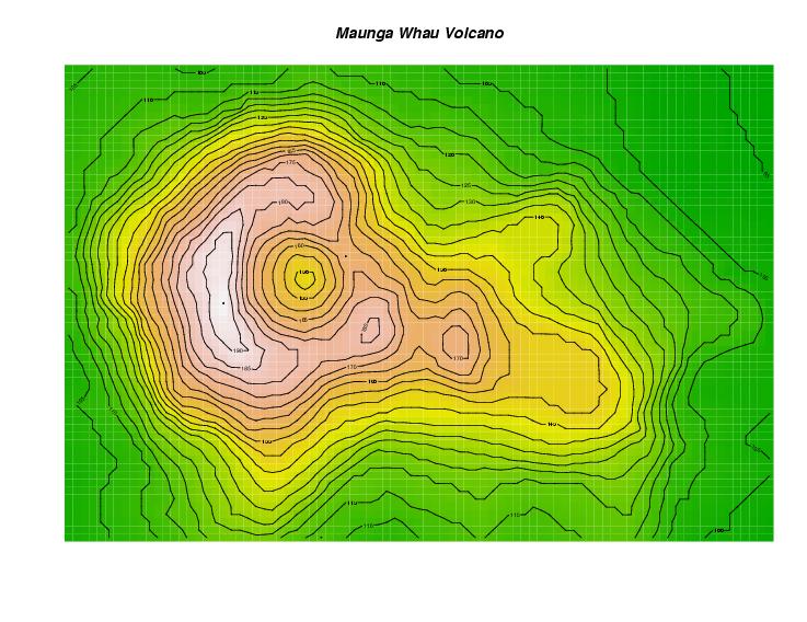
For very sophisticated presentation of graphical data I use R. It can generate topographical charts (example). Some additional samples and corresponding R code can also be found here.
On the other hand, if you want to produce straightforward 3D graphs that look "pretty" take a look at the charting capabilities of Apple's iWork (Pages and Keynote). Both can produce 3D charts with adjustable orientation and lighting styles and export them as PDF vector art. As heresiarch mentioned, these style of 3D charts tend to obfuscate your graphs, not make them easier to use.
posted by RichardP at 9:06 AM on October 27, 2006
RichardP: Sorry, the 3D charts in iWork aren't exported as vectors, just bitmaps. (Textual labels probably won't get changed to bitmaps, but everything else does.)
posted by xil at 9:59 AM on October 27, 2006
posted by xil at 9:59 AM on October 27, 2006
This thread is closed to new comments.
Downside, it's big and complicated and verges on the user-hostile.
Upside, it's free open-source and there's a strong community behind it.
posted by ROU_Xenophobe at 8:46 AM on October 27, 2006