Franco-Russian psychedelia?
October 23, 2009 10:50 AM Subscribe
Is there a name for this late 60s through early 70s aesthetic that was very common in (sort for for) children books and films? And if so, any recommendations beyond what is listed...
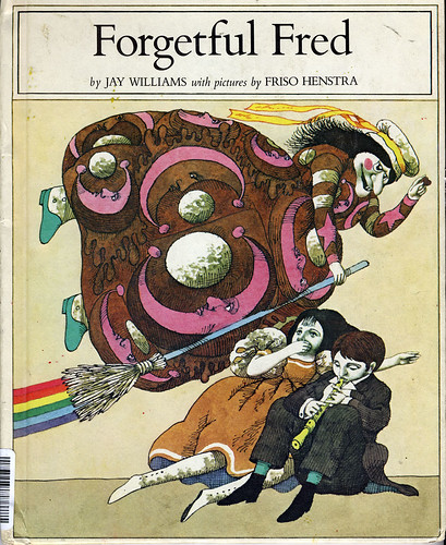
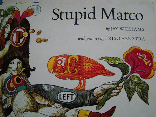
Books especially include those of Jay Williams and Friso Henstra:
Petronella
Forgetful Fred
Stupid Marco
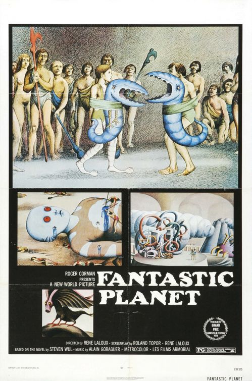
Probably the most famous example of this style in movies is The Beatles' Yellow Submarine but it can also be seen in Fantastic Planet.
It seems also very similar to some of the animations done by Soyuzmultfilm back in the day (like this (semi-horrifying) Winnie the Pooh, and I think Walter Moers does a sort of modern homage to this style in his Zamonia books.
It kind of looks to me like a psychedelic take on eastern European folk art, but what do I know? I'm an epidemiology student, not an art historian!
What other books, movies and print artists use this style? Is there a name for this style? Did my parents do me a terrible disservice by hooking me on an outdated style of illustration? So many questions!
Books especially include those of Jay Williams and Friso Henstra:
Petronella
Forgetful Fred
Stupid Marco
Probably the most famous example of this style in movies is The Beatles' Yellow Submarine but it can also be seen in Fantastic Planet.
It seems also very similar to some of the animations done by Soyuzmultfilm back in the day (like this (semi-horrifying) Winnie the Pooh, and I think Walter Moers does a sort of modern homage to this style in his Zamonia books.
It kind of looks to me like a psychedelic take on eastern European folk art, but what do I know? I'm an epidemiology student, not an art historian!
What other books, movies and print artists use this style? Is there a name for this style? Did my parents do me a terrible disservice by hooking me on an outdated style of illustration? So many questions!
Oh, and you'll love this: I met the Walrus. An animated short film using audio from a 14-year old boy's impromptu interview with John Lennon in 1969. Make sure to watch in HQ.
posted by twistofrhyme at 11:12 AM on October 23, 2009 [2 favorites]
posted by twistofrhyme at 11:12 AM on October 23, 2009 [2 favorites]
I'm kind of a dolt when it comes to "spot the art style," but they all look somehow evocative of the work of Peter Max, or at least like they were inspired by him. Which is also the name of the style right there, I suppose.
posted by EmpressCallipygos at 11:16 AM on October 23, 2009 [1 favorite]
posted by EmpressCallipygos at 11:16 AM on October 23, 2009 [1 favorite]
Best answer: I don't know enough art history to give this a name. However, it's also very much related to the aesthetic of Terry Gilliam's animations for Monty Python's Flying Circus.
To my eye, what they seem to do is take off on Victorian scrapbooking: the images are often direct appropriations or imitations of the kind of steel plate engraving that was a popular method of illustration in the late 19th century. Steel plate engravings were really common in newspapers and magazines. Scrapbooking was also really popular in the late Victorian era, because of the sudden abundance of printed material that pulp-paper technology and a growing literate middle class brought.
What does that have to do with the 60s? Well, one part of the 60s art and design aesthetic was reuse of and reference to Victorian styling. You can see it in fonts and images and stuff like Sergeant Pepper's Lonely Hearts Club band and the Merry Pranksters. One possible reason for this that I've encountered before is that youth culture in both England and America was influenced then, as it is today, by what was available cheaply at yard sales and thrift shops and, at the same time, represented a rejection of contemporary values in favor of a fantastical version of the values of another age. The books, illustrations, fonts, fabrics, trims, and colors of Victoriana are one really strong element of the visual culture of the 1960s. That blended in with influences one might attribute to those related to drug culture and philosophy: the addition of wild colors, juxtaposition of different patterns and images in a not-quite-convincing collage style, games with perspective and unpredictable line, that kind of thing.
I know that isn't the same as having a name for that style, but recognizing the roots of the style helps me grasp it a lot.
posted by Miko at 11:35 AM on October 23, 2009 [9 favorites]
Best answer: I think you would like the Harlin Quist books.
posted by kmennie at 11:41 AM on October 23, 2009 [1 favorite]
posted by kmennie at 11:41 AM on October 23, 2009 [1 favorite]
I had school literature textbooks in elementary school in the early 70s that looked like this. This stuff always gives me a flashback to age 9 or so.
posted by JanetLand at 11:51 AM on October 23, 2009
posted by JanetLand at 11:51 AM on October 23, 2009
The term you're probably looking for is pop art^. At one end it verges into psychedelia, at other end points with a collage focus (such as Gilliam) it does have resemblance to scrapbooking. The root of much of it was commercial illustration, but the scope was multicultural and multimedia, so bringing in earlier styles was deliberate and referential. Lichtenstein appropriated comic book art; the YS Beatles resembled 1920s fashion illustration. At still another point pop art verged on op art such as Vasarely and Escher. Pop art took a great deal of influence from earlier movements such as cubism, expressionism, surrealism, and dada.
I would go so far as to say that YS deliberately appropriated Henstra's unique style, e.g. for the Blue Meanies, among others ("Dunning decided to go for variety, rotating the graphic style with each song, consciously using the film to showcase the wealth of visual techniques available in the late 1960s.") Peter Max came later, but I don't think the connection is quite as direct.
posted by dhartung at 10:30 PM on October 23, 2009 [1 favorite]
Ooh, I love it, too. Puck up a 1970s edition of the board game "Pay Day."
posted by mimi at 5:38 AM on October 24, 2009
posted by mimi at 5:38 AM on October 24, 2009
Best answer: I love Pay Day!
This look also really reminds me of the illustrations of Ellen Raskin.
I'm finding a lot of mentions under the terms "1960s Victorian Revival" or "1970s Victorian Revival" + art, poster, typography, design, etc. A lot of the returns are things for sale, so I won't link to search results - and also, there was another 1980s Victorian revival that went in a different direction, so that gets confusing - but you can page through. A particularly clear discussion of the artistic movement is here:
This page discusses the but is paying attention more to the Art Nouveau flavor that was really popular in poster art.
posted by Miko at 7:26 AM on October 24, 2009 [4 favorites]
This look also really reminds me of the illustrations of Ellen Raskin.
I'm finding a lot of mentions under the terms "1960s Victorian Revival" or "1970s Victorian Revival" + art, poster, typography, design, etc. A lot of the returns are things for sale, so I won't link to search results - and also, there was another 1980s Victorian revival that went in a different direction, so that gets confusing - but you can page through. A particularly clear discussion of the artistic movement is here:
“At the advent of what we now call postmodernism, the doomed Edwardian building inventory that provided bohemia’s living, studio and event spaces also provided an aesthetic opposed to Brutalism, the heavy concrete fortress style of public buildings that had arisen in response to the riots and demonstrations of the 60s. Late Victorian and Edwardian furniture and bric-a-brac furnished communal houses. In these spaces Art Nouveau was revived and deployed to advertise concerts and events. Rejection of the “brutality of the new” was, in essence, a very real concern about the disappearance of places to live, eat, congregate, exhibit and perform. In defnse of a crumbling inventory of modest, poorly built pioneer-era wooden and brick structures, the art community of the day rejected not only the Brutalist idioms of the 1960s and 1970s, but the gentler suburban modernism of the 1940s and 1950s. Or to be more precise, the authoritarian, normalizing, “design for living” modernism, with its unarticulated suppression of libidinal circulation, was an anathema for the generation of the 1960s and 1970s. The hippie movement as appropriated by fashion and popular music adopted Edwardian and Art Nouveau as its style of protest and renunciation of consumer/spectacle society.”That discusses Vancouver, but the same thing was certainly going on in the Bay Area and even on the East Coast...the old, run-down neighborhoods where were the big Victorian houses were that would make a good community living situation for a whole bunch of people.
This page discusses the but is paying attention more to the Art Nouveau flavor that was really popular in poster art.
posted by Miko at 7:26 AM on October 24, 2009 [4 favorites]
Thanks for the Raskin information! Not quite of that style, but of the time and something I fell in love with concurrently -- and had forgotten until this morning -- is the strange and beautiful watercolors from in Mirko Hanák "European Fairytales" edited by Dagmar Sekorova.
posted by mimi at 8:40 AM on October 24, 2009
posted by mimi at 8:40 AM on October 24, 2009
This is not 60's/70's, but it has Edwardian/Victorian style, Eastern European/Russian influences, and that engraved look Miko referenced: Carson Ellis. She has illustrated several children's books and does album art for The Decemberists.
For a 70's children's book that I think fits your criteria really well, one of my childhood favorites was Arnold and Anita Lobel's alphabet book On Market Street, which I actually had forgotten all about until this thread dredged up memories. Gorgeous illustrations.
I love, love, love this style and I am getting a huge kick out of this thread - thank you!
posted by naoko at 11:21 AM on October 24, 2009
This thread is closed to new comments.
posted by twistofrhyme at 11:11 AM on October 23, 2009 [1 favorite]