Credit Card Fonts
July 19, 2004 7:26 PM Subscribe
What are the fonts used to create the raised lettering on credit cards? I may already have them, but can't recall the names. Googling anything with 'credit card' is predictably answer-thin.
Thanks very much!
Thanks very much!
There is in fact a free truetype font floating around out there called "credit" or something similar that I remember being a very tight match, if you look along those lines I'm sure you'd find it.
posted by dong_resin at 7:49 PM on July 19, 2004
posted by dong_resin at 7:49 PM on July 19, 2004
This is kinda sorta like a credit card font...
The font "credit" seems to display various credit company logos rather than characters.
posted by loquax at 8:03 PM on July 19, 2004
The font "credit" seems to display various credit company logos rather than characters.
posted by loquax at 8:03 PM on July 19, 2004
yup..i'd say an OCR font too. (OCR is for Optical Character Recognition)
posted by amberglow at 8:42 PM on July 19, 2004
posted by amberglow at 8:42 PM on July 19, 2004
Indeed -- OCRA for the credit card number and OCRB for everything else.
posted by jjg at 9:11 PM on July 19, 2004
posted by jjg at 9:11 PM on July 19, 2004
Response by poster: It's not OCRA or MICR, although MICR is made for financial processing purposes.
OCRA is pretty close, but the upswinging tail on the numeral one and the bent shaft of the seven do not match the numerals on the plastic in my wallet.
Also, the name and expiry are set in a different all-caps gothic that has features of Futura and Helvetica.
I found that 'credit' logo font, which certainly neat. 'Carbon 14' is a presstape label font, also neat, but not big-league material, alas. Onward!
A client asked me to rework some proposed credit card designs for a pitch to a financial organization. I'm assuming he'll be tapdancing on the boardroom table in front of some very picky people who know what a credit card is supposed to look like.
posted by mwhybark at 9:16 PM on July 19, 2004
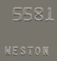
OCR-A is close, but the 7 and 8 are both dramatically different in form.
Here's an image for comparison. The credit card seven has no diagonal stroke. And the eight has an equal upper and lower loop. Looks like the serif on the number one is less complex as well.
Unfortunately, I don't have a better match. I'd start with OCR-A and modify the 7, 8 and 1.
posted by Jeff Howard at 9:45 PM on July 19, 2004
mwhybark... I grabbed a partial image of the first four digits of a card (since they're always the same for certain card types), and did a bit of image processing on it to make the background more uniform so it could be read by What the Font. It came up with OCRJ Bold Square, and OCRK Bold Round, and the later actually looks like a very good fit to me.
I recommend this method if you've got a specific look you're trying to get close to with some cards you've got. The hardest part is making the background uniform. Noise reduction, reducing contrast/ brightness, and even copying the image over itself and then inverting it and giving it an opacity 10-20% of 50% all help somewhat. More exact image scientists might be able to give you better specific advice there.
posted by weston at 9:50 PM on July 19, 2004
If you're just mocking up some images for a presentation, that changes things. OCR-A isn't perfect, but with the exception of 7,8, and 1, it's a dead match. Just don't use those three numbers and you're golden.
And I agree with jjg, OCR-B Size I for everything else.
posted by Jeff Howard at 10:21 PM on July 19, 2004
And I agree with jjg, OCR-B Size I for everything else.
posted by Jeff Howard at 10:21 PM on July 19, 2004
According to this it's OCR A, B and something called Farrington 7B. The latter does not seem to be commercially available.
posted by O9scar at 10:49 PM on July 19, 2004
posted by O9scar at 10:49 PM on July 19, 2004
Response by poster: that's some fine AxeMe-ing, folks.
I went ahead and finished all the rest of the work, and will apply your collective knowledge tomorry. Thankee.
posted by mwhybark at 10:53 PM on July 19, 2004
I went ahead and finished all the rest of the work, and will apply your collective knowledge tomorry. Thankee.
posted by mwhybark at 10:53 PM on July 19, 2004
Response by poster: Farrington 7b is the numeral font. OCR-B is the alphabetic part.
posted by mwhybark at 5:02 PM on July 20, 2004
posted by mwhybark at 5:02 PM on July 20, 2004
This thread is closed to new comments.
(Should I even ask for what nefarious purpose you're going to use this information?)
posted by Asparagirl at 7:44 PM on July 19, 2004