Decorating: Color schemes, design for dark wood trim?
June 3, 2011 8:21 AM
Decorating: We bought an old 1920's American Four-square style home. It is beautiful, well-built, in great condition. The problem is that myself and my girlfriend cannot seem to decide on color schemes that fit with dark wood trim, and I'm talking really dark, original woodwork. Any ideas?
The wood casing around the windows, the "crown molding", more like trim, and the staircase are all dark wood trim, along with some giant pillars of woodwork as you enter the home. It is everywhere, making for a dark room regardless of the white paint. I'm looking for links or examples of some great ways to lighten up the room without painting the original woodwork.
The wood casing around the windows, the "crown molding", more like trim, and the staircase are all dark wood trim, along with some giant pillars of woodwork as you enter the home. It is everywhere, making for a dark room regardless of the white paint. I'm looking for links or examples of some great ways to lighten up the room without painting the original woodwork.
This may be a bit weird, but try watching some episodes of The X-Files for inspiration. Apparently the Vancouver locations they used had a lot of dark wood trim in them; enough that I found it distracting because nothing where I live is built like that. Some of their sets were dark like you'd expect but not all; some were very pretty.
posted by workerant at 8:32 AM on June 3, 2011
posted by workerant at 8:32 AM on June 3, 2011
We've got the same thing going on - 20's Foursquare, lots of natural wood trim (on the first floor) It's gumwood, so it's not DARK DARK, but it's not pale, either.
All the rooms on our first floor have ended up various shades of yellow.
(And if you haven't looked at them already, check out American Bungalow Magazine and Style 1900 Magazine. They're my husband's bibles.)
posted by Lucinda at 8:39 AM on June 3, 2011
All the rooms on our first floor have ended up various shades of yellow.
(And if you haven't looked at them already, check out American Bungalow Magazine and Style 1900 Magazine. They're my husband's bibles.)
posted by Lucinda at 8:39 AM on June 3, 2011
@Lucinda Yeah, it seems like different shades of yellow are a dominant theme among most of the stuff I've seen.
posted by MMALR at 8:45 AM on June 3, 2011
posted by MMALR at 8:45 AM on June 3, 2011
Sometimes you have to embrace the dark.
I would choose a creamy buttery yellow. Sage green also looks fantastic with wood. Here is a sage green by Sherwin Williams Ryegrass. I like Shagreen better. It's on the same paint strip. I think it's one shade lighter than Ryegrass. Ryegrass may have more depth.
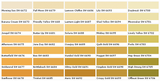
Here is an image of Designers' Favorite Yellows
For buttery yellows look at the row that starts with "Full Moon". Friendly Yellow or Butter Up would be good choices.
Colorcharts.org is a fun website. Here is Friendly Yellow.
Benjamin Moore Creme Brulee, Light Yellow, and Sundance are also popular.
Sherwin Williams Shagreen.
posted by Fairchild at 8:53 AM on June 3, 2011
I would choose a creamy buttery yellow. Sage green also looks fantastic with wood. Here is a sage green by Sherwin Williams Ryegrass. I like Shagreen better. It's on the same paint strip. I think it's one shade lighter than Ryegrass. Ryegrass may have more depth.
Here is an image of Designers' Favorite Yellows
For buttery yellows look at the row that starts with "Full Moon". Friendly Yellow or Butter Up would be good choices.
Colorcharts.org is a fun website. Here is Friendly Yellow.
Benjamin Moore Creme Brulee, Light Yellow, and Sundance are also popular.
Sherwin Williams Shagreen.
posted by Fairchild at 8:53 AM on June 3, 2011
I live in a village chock-full of nineteenth-century homes w/original dark wood trim all over the place, and the usual solution is to go BRIGHT. I mean really, really BRIGHT. The conservative version is the brightest white available, but I've also seen lots of reds, oranges, and yellows.
Another popular option is neo-Victorian wallpaper of various sorts. William Morris-style, for example. Golds, blues, reds, etc.
posted by thomas j wise at 8:53 AM on June 3, 2011
Another popular option is neo-Victorian wallpaper of various sorts. William Morris-style, for example. Golds, blues, reds, etc.
posted by thomas j wise at 8:53 AM on June 3, 2011
I was in a similar situation once with a different wood. What really helped me out was going to the catalogues and websites of furniture or flooring manufacturers like Pottery Barn. I looked for furniture or flooring they were selling in the same tone of wood and then checked out what colors their professional designers had decided to decorate around it with. Pottery Barn was pretty awesome in this regard, since they actually listed what wall colors they're using by brand name of Benjamin Moore. I found a PB catalog layout I really liked, painted my kitchen the same color, and was super-pleased.
posted by Gianna at 9:00 AM on June 3, 2011
posted by Gianna at 9:00 AM on June 3, 2011
How is the wood finished? Do you know if the dark color is intrinsic to the wood, or was added later? It's worth investigating--you might have lighter wood than you think you do.
posted by ocherdraco at 9:07 AM on June 3, 2011
posted by ocherdraco at 9:07 AM on June 3, 2011
My four-square had the same problem. When I moved in, most of the house was painted 'contractor's beige' (and still is). I've had luck with "English Meadow" (a nicer version of what 'hospital green') and "French Silver", which is a really nice, very light steel grey, with a touch of blue in there. Another room is going to be a light sage green.
Basically, light green, grey or blue is going to brighten up the room a lot without being too much of a contrast against the dark wood.
And if your walls are like mine -- matte to satin (at the very most). Let the finish hide the imperfections. Patch and sand as you might, you'll never get rid of them all.
posted by Capt. Renault at 9:19 AM on June 3, 2011
Aside from wall color, other ways you can give your room a lighter feeling is by keeping the scale of your furniture down, avoiding over-stuffing your room, and keeping most of your furniture and accessories light in tone. Put sufficient lighting in, and make sure your windows allow the maximum amount of sun in.
posted by moira at 9:50 AM on June 3, 2011
posted by moira at 9:50 AM on June 3, 2011
Rich, saturated colors look very nice. I have a four square and most rooms have windows on two walls, so they get a lot of light. I have a red room and a room that has a color I can only describe as wet-cement like that looks green on rainy or overcast days. I painted the brickwork around the fireplace (bricks had been painted white) in the room with the cement color an electric blue which I am quite pleased with.
Olive looks nice and also a robin's egg blue would be beautiful with the dark brown.
posted by readery at 9:54 AM on June 3, 2011
Olive looks nice and also a robin's egg blue would be beautiful with the dark brown.
posted by readery at 9:54 AM on June 3, 2011
One more thing -- when I started prepping the walls for painting, I found that the original colours from 90 years ago were very close to what I had picked out (the pale greens, greys and blues). If you can do a test area to see what it was originally, an answer may present itself.
posted by Capt. Renault at 9:55 AM on June 3, 2011
posted by Capt. Renault at 9:55 AM on June 3, 2011
Do you have access to a Sherwin Williams store? When I was deciding on paint colors for my 4-square with chestnut trim and banisters, I found good inspiration in a pamphlet specifically geared toward Arts & Crafts homes. It has color palettes with the paint chips and their names. I ended up having a brick red living room, which I LOVED for that house.
posted by ImproviseOrDie at 11:13 AM on June 3, 2011
posted by ImproviseOrDie at 11:13 AM on June 3, 2011
My early 20th century house also has dark wood trim in the living and dining rooms. I chose a muted green, kind of a sagey-grey, which means the dark wood doesn't appear so stark and formal.
I love color, though, so my furniture, decorative items, and artwork tend to be pretty bright--red couch, bright turquoise chair, etc. As noted above, I have kept the furniture smaller in scale, the window treatments pretty sleek, so as to create an open feel.
Consider painting your ceilings as well, it can really do a lot to create an atmosphere. I'm not super-crazy about the Martha Stewart paint line at Home Depot but I absolutely love that the paint chips include suggested trim and ceiling colors and found them inspiring as I planned our walls.
posted by padraigin at 11:16 AM on June 3, 2011
You can add a lot of contrast and brightness just by using the lighter colors. My front room is a pale taupe-grey and I think it's beautiful. A light sage green in the den, yellow in the bathroom, and a light taupe in the kitchen. The yellows can be really tricky though, my advice is to always go lighter on those because that neon shit is not pretty. For all our colors, we picked the basic shade we wanted and then went as light as possible. It gives the effect of the color but doesn't overwhelm. If you want pics, memail me and I will send!
posted by raisingsand at 3:14 PM on June 3, 2011
posted by raisingsand at 3:14 PM on June 3, 2011
Ooh! This Portland Foursquare just went on the market, love the colors with the dark woods!
posted by cyndigo at 3:59 PM on June 3, 2011
posted by cyndigo at 3:59 PM on June 3, 2011
I bought a four-square with dark wood about seven years ago. My solution has been to refinish it (in chunks) in lighter colors, and then decorate as I will. Some of the walls have been painted light colors, but the floors get stripped one way or another, and then finished with nothing more than clear poly.
It hasn't been quick, but some of the rooms that are done have come out looking pretty dang good, I think:
Stairway, Bottom of the stairs, Custom Built Bed (with a bit of the bedroom around it), Library and bathroom which got new maple wainscoting, shelves, marble tile, and granite vanity top.
It helps to know a guy who does custom woodwork, but the stairs were beautiful once they were pulled and then run through a planer. The floors came out really nice after sanding. And most of that wood was either stained very dark, covered in carpeting, or both.
posted by DaveP at 6:24 PM on June 3, 2011
We just bought a place with dark wood trim, and it was painted yellow. DID NOT LIKE. You can see some pictures here. We are repainting in Dulux White on White, which is a very very pale blue (so pale that it looks white until you put it next to a true white). It looks a lot better, in my opinion.
posted by lollusc at 8:20 PM on June 3, 2011
posted by lollusc at 8:20 PM on June 3, 2011
ImproviseOrDie may be talking about this SW Arts & Crafts palette. When you're looking for inspiration, search out books that feature the interiors of Mission, Prairie, and Arts & Crafts homes.
I had the same problem: foursquare with dark wood trim that I didn't want to paint. I ended up with rich yellows and crimson reds in the living room and loved them. It helped me to think about natural fall colors as warm ways to set off the dark brown trim.
posted by MonkeyToes at 8:21 PM on June 3, 2011
I like white walls, or at least light colors--yellow, rose, sage. Furniture light in color, with strong accent colors for pillows, table lamps, and decorations. Cheat, and put up curtain rods that extend beyond your windows. That way when you open the drapes, the full width of the window is exposed for maximum light. If you use sheers and drapes for privacy or to retain warmth, or because you prefer the more formal look, check the different types of sheers for the ones that let through the most light.
posted by BlueHorse at 10:55 PM on June 3, 2011
posted by BlueHorse at 10:55 PM on June 3, 2011
the "crown molding", more like trim
Check and see if this mystery molding is picture rail! If it is, you can save yourself a lot of heartache that would come from putting holes into freshly-painted plaster walls.
posted by LobsterMitten at 11:17 PM on June 3, 2011
Check and see if this mystery molding is picture rail! If it is, you can save yourself a lot of heartache that would come from putting holes into freshly-painted plaster walls.
posted by LobsterMitten at 11:17 PM on June 3, 2011
I agree with the suggestions to use rich colors. If you have white next to dark wood, the dark wood loses its own richness and just gets blackish. Put rich color next to the wood and the wood will brighten up and actually seem lighter.
We have a 1911 Craftsman bungalow, and the wood still has its original 1911 shellac finish, which is a deep mahogany color. When we moved in, the living room had white walls, and the woodwork looked really dark. We painted the room olive green (and the foyer deep red!) and now the woodwork practically glows! Even though the wall colors are dark, the room doesn't feel dark -- just warm and cozy.
"Check and see if this mystery molding is picture rail! If it is, you can save yourself a lot of heartache that would come from putting holes into freshly-painted plaster walls."
YES! We had "crown molding" that turned out to be picture rail. We had no idea, because the picture rail I saw in magazines was usually not all the way up at the ceiling. But when we were up there stripping off wallpaper, I realized that the top edge of the molding was rounded and it was actually picture rail! It's wonderful to have it. I never, ever put nails in the plaster. The plaster is 100 years old and in great shape, and I'd like to keep it that way. In the link I posted above, you can faintly see the wires that hang the photo from the picture rail.
posted by litlnemo at 6:33 AM on June 4, 2011
Nthing the suggestions of non-light autumnal colors, which will actual lighten up the wood by contrast. Our four-square trim looked nearly black against its white walls, but once we painted them autumnal colors with a medium-level intensity, they looked honey/molasses instead of black, and the grain really popped.
The colors we picked resembled pumpkins, olives, blueberries, gold/wheat, and Heinz ketchup ("Chimayo" color in Ralph Lauren paints.)
For box-beams ceilings, we painted a very lemony off-white called "Saltine" from Behr, and on the ceiling it looked white.
Another thing that worked well was having the paint mixed with a clear base instead of a white one. It's hard to describe, but, for example, with the Chimayo red above, it ended up looking like rich, gorgeous ketchup instead of milky, pastelly tomato soup.
Good luck!
posted by ravioli at 4:05 PM on June 4, 2011
On our box beam ceiling, we used a gold-metallic paint -- an actual period finish. It's more subtle than you would think, and reflects light nicely to add additional brightness to the room.
Oh, by the way, MMALR, the "giant pillars of woodwork as you enter the home" are called colonnades. This search shows quite a few.
posted by litlnemo at 4:00 AM on June 5, 2011
Oh, by the way, MMALR, the "giant pillars of woodwork as you enter the home" are called colonnades. This search shows quite a few.
posted by litlnemo at 4:00 AM on June 5, 2011
@litlnemo Your pictures are inspiring. Your house is almost exactly the same look as ours.
posted by MMALR at 5:46 AM on June 6, 2011
posted by MMALR at 5:46 AM on June 6, 2011
« Older Help us find curtains for our new room! Having... | Wake me up before you...wait, how did YOU wake up... Newer »
This thread is closed to new comments.
posted by JJ86 at 8:27 AM on June 3, 2011