Why does an image have to be cropped?
October 10, 2024 11:59 AM Subscribe
I've been corresponding with a publisher about the design of a book cover, and I'm having a hard time understanding some of what I'm being told. Can someone who knows about publishing, or book design, help me understand what I'm not understanding?
So the book is being hard bound in a printed paper cover, with a colour image on the front cover. We've agreed on a suitable image. So far so good. Unfortunately the image can't be reproduced in full, it has to be heavily cropped along the right-hand margin. This was explained to me as follows:
"The right-hand side ‘bleeds’ off into the turnover on the front of the cover which wraps into the underside of the cover."
I sort of get this, and I sort of don't. I get that the image doesn't just stop at the end of the cover, it has to wrap a little way around the edge. But I don't understand why it has to be so heavily cropped (and we're talking a substantial crop here, not just a few mm). I mean: why not just shift the image to the left, and insert some blank space on the right, so that it doesn't have to be cropped? I'm guessing it might have something to do with the software used to create the cover design -- something the designer sees on the screen, but the reader doesn't see on the final product -- but .. well, really I don't know.
Publishers and designers of MeFi, please explain your craft to me, and help me grasp what is probably a very simple and obvious point!
I'm not a graphic designer, but if the image is too large for the space they want to allot on the front of the book, why can't they use graphic software to resize the image to fit that space, rather than crop it? Resizing smaller usually doesn't result in loss of image quality.
posted by TimHare at 12:15 PM on October 10 [1 favorite]
posted by TimHare at 12:15 PM on October 10 [1 favorite]
Response by poster: jonathanhughes: thank you for that very lucid explanation!
I asked the publisher if they could send me a picture of one of their other books, and they sent me this. So it doesn't look as though the full image will be visible. The bleed is minimal, and it doesn't appear that the image is carried over on the other side.
posted by verstegan at 12:22 PM on October 10
Does the image have the same proportions as the cover (+ bleed and turnover)? If the intention is to have a full-bleed photo but the proportions are different, you might have to crop off an edge. Think trying to print an 8"x12" image on an 8"x10" piece of paper - 2" of the image have to go, somewhere, if you want to maintain the full bleed & not have white space on the top & bottom.
posted by niicholas at 12:32 PM on October 10 [8 favorites]
posted by niicholas at 12:32 PM on October 10 [8 favorites]
I too am having difficulty understanding the entire scope of this as explained and wonder if it has to do with proportions, but having worked in printing I shudder to think of getting your hypothetical blank space lined up exactly correctly on something as visible as a book cover, over and over again, versus the grace that a true full-bleed image offers. Can you share something else with the same dimensions as your agreed-upon image, and the intended finished size of the book?
posted by teremala at 12:49 PM on October 10 [1 favorite]
posted by teremala at 12:49 PM on October 10 [1 favorite]
Came in to say what niicholas just did. It looks from that (terrible, I mean seriously they sent you that?) photo as if the cover photo needs to fit across the bottom of the cover. If the photo you sent is differently proportioned, than in order to prevent white space and keep from stretching or changing the photo, they would have to crop off a big chunk.
I think to get through to them you need to say that the focus on the image is not what you originally had in mind, and can it be resized in such a way as to include a focus on $whatever it is that you find important in the image.
You could also ask them what the dimensions are that they are looking for and resize the image yourself, assuming you have a copy, then send it back. That is what I would be inclined to do. I would go ahead and assume a generous 1/4" bleed on the bottom and right side, because IIRC when hardcover books are printed the cover image is wrapped pretty far around the board and then paper is glued over that.
posted by mygothlaundry at 12:55 PM on October 10
The bleed is minimal, and it doesn't appear that the image is carried over on the other side.
But in the example photo they sent you, the image is indeed wrapping around the edge that is facing the camera and continuing onto the underside of the cover. You can't tell how much the image continues onto the underside in that photo, but from what you've shared here it sound like it probably continues on the back of the front cover a fair bit (plus there is also likely an allowance for bleed of the image beyond that, whether that's extra that gets cut off, folded over or covered by the endpaper).
posted by ssg at 12:57 PM on October 10 [1 favorite]
There's ways to fix this, but it might require 15 minutes in Photoshop, and they'd rather spend that 15 minutes arguing.
Blank space in the bleed would look bad, since it can be seen. But they could easily extend the image. E.g. with that rhinoceros photo, make a copy of the image, flip it horizontally, move it so it seamlessly adjoins the right edge of the original. As it's blurry anyway no one would notice.
If every bit of the picture is key information, maybe that wraparound design is inappropriate and it needs to be printed smaller, with a border all around. Alternatively, maybe you need a different image where the right-hand bleed doesn't lose anything important.
posted by zompist at 1:15 PM on October 10
Response by poster: Thank you for all the answers so far.
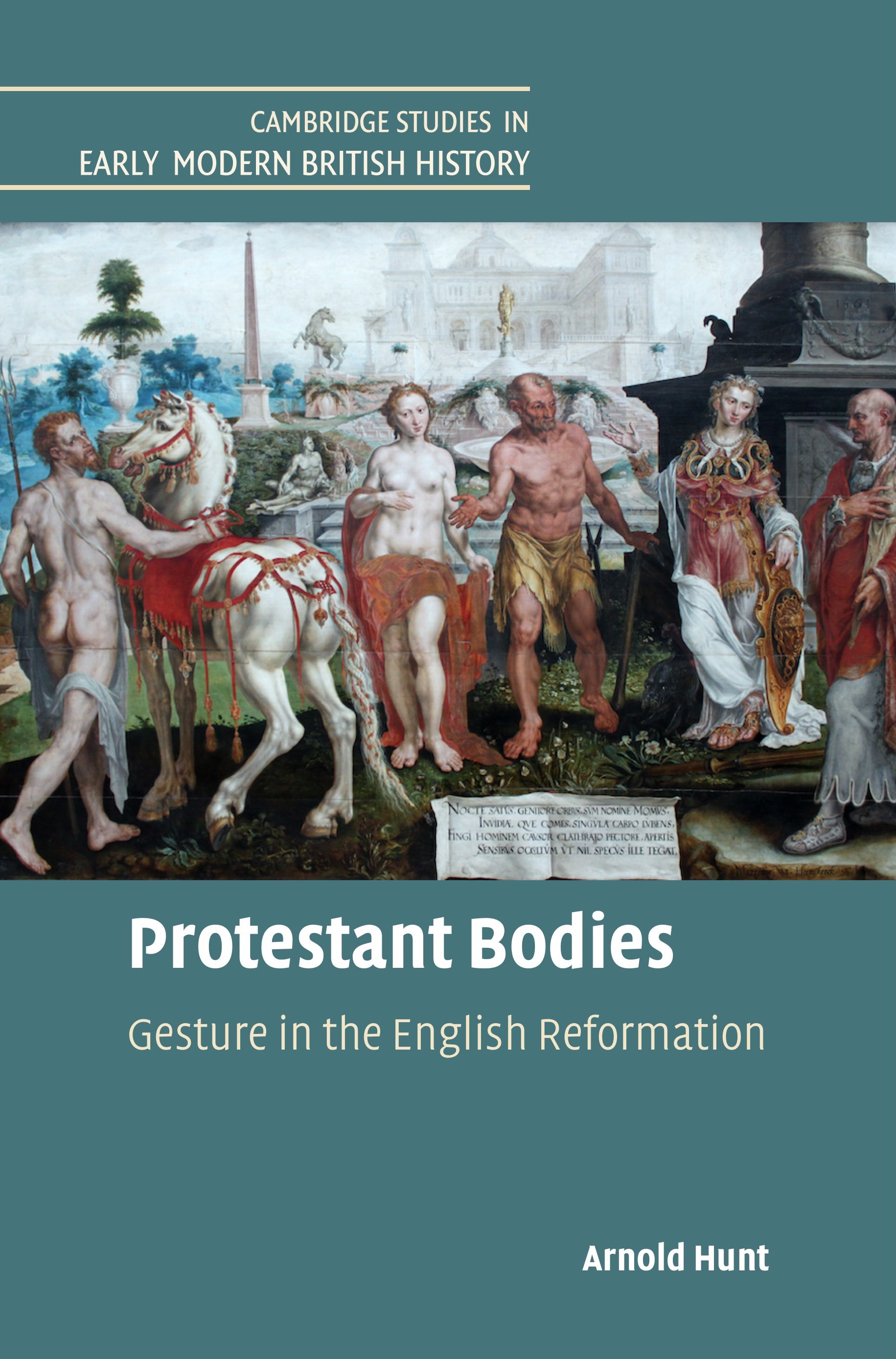
I don't normally make my real-world identity known on here, but on this occasion it seems justified. Here is the image in full, and here is the image as it appears on the cover. As you'll see, the figure on the right is heavily cropped. The publisher tells me there's no way of adjusting the image, and I'd like to understand why.
The book is part of an academic series, and the template is fixed to ensure uniformity among the titles in the series. So the image has to be fitted into that rectangular box, and the proportions can't be changed. This may be part of the explanation as to why the image can't be adjusted.
I'll stop thread-sitting now, but thank you again for all the helpful replies so far.
posted by verstegan at 1:27 PM on October 10
Understanding Bleeds for Book Cover Illustrations
Basically, a hardcover image requires a LOT more bleed, like at least ¾″ instead of the usual ⅛″ you would expect.
posted by 1970s Antihero at 1:30 PM on October 10 [1 favorite]
Basically, a hardcover image requires a LOT more bleed, like at least ¾″ instead of the usual ⅛″ you would expect.
posted by 1970s Antihero at 1:30 PM on October 10 [1 favorite]
So the image has to be fitted into that rectangular box, and the proportions can't be changed. This may be part of the explanation as to why the image can't be adjusted.
Right, that's the issue. You ask, "why not just shift the image to the left, and insert some blank space on the right, so that it doesn't have to be cropped?" but then what are you imagining would happen to the left side of the image? It would be cropped on that side. Maybe that is what you would prefer! If so, that should be possible. But you won't be able to do without cropping somewhere. If you want to change the proportions of an image without distorting it, you either have to trim material from the long dimension or add material to the short dimension. There's nothing to add here, so cropping is the solution.
posted by redfoxtail at 1:45 PM on October 10 [3 favorites]
I think what's happening is that they're saying that part of the, er, house style of this series of books is that (1) there's an image in that rectangular area on the top part of the cover that (2) must wrap over the edge of the cover (rather than stopping short and just having the cover's bluish background, say).
Since your source image has a particular aspect ratio, and the rectangular area has a different one (though to my eyeball they're not radically different ratios), cropping must occur in these places: (1) the top edge, where that top-most bit of the roof of the building in the distance is no longer visible, (2) the left side where a bit of the left-most fellow's elbow is no longer visible, (3) the bottom edge, where since there's that whitish area with some writing on it, they've maneuvered the crop point so that it preserves the writing, and finally (4) the right side where quite a bit of the right-most fellow's body is no longer visible.
There are some other choices that could be made. For example, you might choose not to crop the bottom at all, which would result in even more of the distant building being cut off, perhaps even some of the gold statue in front of it. This doesn't seem particularly good, so I think I would say their choice of cropping the bottom so that none of the writing is truncated is probably best.
More relevant to your original question, you might also choose to crop the left-most fellow even further in, say where his spine is. This would move the cutoff point of the right-most fellow further to the right, perhaps permitting his entire head to show on the cover. However, this might not allow enough "slack" on the right side for the "wrap" onto the inside part of the cover, so they put the crops where they did to ensure there's enough slack.
posted by axiom at 1:46 PM on October 10 [1 favorite]
So the image has to be fitted into that rectangular box, and the proportions can't be changed.
In that case, if it was me, I'd opt to cut in a way that highlights the gestures in the image (given the title), and crop more of the man on the left (say, half of his butt), so that way you get to see at least the full hand of the man on the right.
Or, I'd say screw the guy on the right, and just crop him more - but as is, it's an awkward amount of him - I find the tiny sliver of his face visually distracting. But I'd opt to include more of him.
A final option is to re-size it - they've cropped some from the top and bottom so you could zoom out of the image a touch.
posted by coffeecat at 1:48 PM on October 10 [2 favorites]
"This may be part of the explanation as to why the image can't be adjusted."
That's exactly it. They only allow a certain area fr the image, so if your image doesn't fit that aspect ratio, something i going to get cropped. There's really no good way to crop that image. At that size, you'll cut off one of the people on the sides. If you blow it up, you'll chop off the top and/or bottom, but then probably have just the horse's bum on the left.
Did you decide what image would be on the cover? If they want everything to fit in that space, this seems like something that they'd want more control over, since that's just not an ideal image for the space.
They might be able to blow it up a bit and move it towhee right to show all of the nude guy. This would require a little of the top being chopped off, but also the cut on the right would go through the woman's arm rather than halfway through the guy. That would be a little more intentional looking.
What I'd probably do is move the image to the right and then photoshop out the remaining bits of that guy. No, it wouldn't be true to the original artwork, but unless it's a famous painting, no one would probably notice it.
posted by jonathanhughes at 1:50 PM on October 10 [2 favorites]
The pictures make it much clearer what's going on. It's Heemskerck's fault for putting the focus character (I assume that's Momus) precisely on the right-hand edge.
The image does not facilitate both keeping red-cloak guy and accommodating the bleed.
If red-cloak guy doesn't matter so much to you, then the image could be shifted a little to the right, or zoomed in, such that he isn't cut in half.
posted by zompist at 1:53 PM on October 10 [1 favorite]
The image does not facilitate both keeping red-cloak guy and accommodating the bleed.
If red-cloak guy doesn't matter so much to you, then the image could be shifted a little to the right, or zoomed in, such that he isn't cut in half.
posted by zompist at 1:53 PM on October 10 [1 favorite]
If you mainly want to ensure that we can see red cloak guy's full gestures, I wonder if it's possible to move the image to the left (cutting part or much of nude guy), bring red cloak guy fully onto the front cover, and just cheat the right edge -- add a vertical dummy strip of fake but logical-for-the-image color along the right edge, as an unobtrusive color for the bleed? I'm not sure how bad that would look.
posted by LobsterMitten at 2:01 PM on October 10 [1 favorite]
posted by LobsterMitten at 2:01 PM on October 10 [1 favorite]
It seems like some options are (or should be):
- zoom out a little more: the picture on the cover is slightly zoomed in from the picture in the flickr link.
- zoom in considerably more to focus on fewer figures
- shift the image a bit to the left (assuming this still allows for sufficient bleed) to get a bit more of the guy on the right.
- shift the image to the right to get rid of the guy altogether
- do some cheating for the bleed like LM describes
Whatever is done, as noted in another comment, the guy on the right is currently cut off in an extremely awkward way and that should be improved in the finished version.
posted by trig at 2:05 PM on October 10
I'm with you, verstegan. Your examples show to me a) an image with a lot cropped off on all four sides; b) an indelicate crop on the book cover that doesn't optimize the available real estate. Given the images you shared, this is what you want. Your designer needs to do better.
posted by Mo Nickels at 2:09 PM on October 10 [4 favorites]
posted by Mo Nickels at 2:09 PM on October 10 [4 favorites]
Yes, you either need to add something to fill the space required on the right hand side of the image (block of colour, AI-generated nonsense) so you can zoom out and move more of the right hand figure onto the cover or you need to choose a different image. Given the constraints and the nature of that image, I really can't see any other solutions.
posted by ssg at 2:10 PM on October 10
posted by ssg at 2:10 PM on October 10
Concurring with trig, who's describing the various options really well, but also concurring with Mo Nickels specifically in terms of "your designer needs to do better".
The cynical part of me almost wonders whether they actually have a designer, or whether what they have is a template, and they're just filling in with the specific information (author, title, subtitle, cover image). Would be a reason why they're being so inflexible; the image needs to go in a box of such and such size, and fill it completely, and That's Just How It Is.
posted by sailoreagle at 2:40 PM on October 10 [2 favorites]
Response by poster: The pictures make it much clearer what's going on. It's Heemskerck's fault for putting the focus character (I assume that's Momus) precisely on the right-hand edge.
Yes, exactly. Momus (red-cloak-guy-on-the-right) is the focus character, and I'd happily sacrifice some of nude-guy-on-the-left in order to bring more of Momus into the picture.
Mo Nickels's adjusted image is precisely what I want. So I suppose the question is: would it be unreasonable of me to go back to the publisher and ask them to do better? Which is to say: is it an easy fix, or something more time-consuming?
posted by verstegan at 2:46 PM on October 10 [3 favorites]
Should be a super easy fix, and definitely a reasonable request! We've spent vastly more time in this thread than it'd take to nudge it the other direction, and then the question is just precisely how much bleed they need and can it be faked if there isn't quite enough. But I think there probably is, or very nearly so. I'm guessing whoever did the layout had no idea one figure was that much more important, though cutting him in half really was sloppy compared to basically any other option.
posted by teremala at 2:53 PM on October 10 [3 favorites]
posted by teremala at 2:53 PM on October 10 [3 favorites]
Yeah re-sizing/changing the crop takes a couple of minutes (tops) in Photoshop. I'm not surprised that Cambridge produced this - as you probably know, they're a bit of a publication mill and they really don't provide nearly as much effort on cover design as some other academic presses. But that doesn't mean you shouldn't push them - book covers matter, and you no doubt worked long hours on the text - they can stand to spend a few extra minutes on what will be many people's first impression of your monograph.
posted by coffeecat at 2:57 PM on October 10 [3 favorites]
posted by coffeecat at 2:57 PM on October 10 [3 favorites]
I get that the image doesn't just stop at the end of the cover, it has to wrap a little way around the edge. But I don't understand why it has to be so heavily cropped (and we're talking a substantial crop here, not just a few mm). I mean: why not just shift the image to the left, and insert some blank space on the right, so that it doesn't have to be cropped?
In case it's not clear from others' answers above, the bleed needs to cover not just the bit that wraps around the side edge, but MORE bleed that will, ideally, never show but can accomodate variations in printing and avoid revealing any kind of hard edge.
(It's so hard to describe issues with images through text when we don't have printouts in front of us we can point to and such).
How easy it will be for their designers to recreate Mo Nickels's mockup will depend on exactly how much bleed their specs call for, and/or what tools and policies they have for expanding the bleed. But given that the rightmost figure is the key one and shouldn't be cut, you might as well let them know—they're the ones who know how big an ask it is.
posted by lampoil at 3:00 PM on October 10
Also in case it's helpful the way I would phrase this is simply: "the figure on the far right is the most important one to include. Is it possible to extend the bleed so that he fits on the front cover?"
I ask this question all the time, it's not abnormal—the only problem is that I rarely find out the answer because I'm a work-for-hire writer, so usually if the answer is "no," it's up to them, not me, to find an alternative solution.
posted by lampoil at 3:12 PM on October 10 [7 favorites]
I ask this question all the time, it's not abnormal—the only problem is that I rarely find out the answer because I'm a work-for-hire writer, so usually if the answer is "no," it's up to them, not me, to find an alternative solution.
posted by lampoil at 3:12 PM on October 10 [7 favorites]
Mo Nickels shows that it can work (i.e. all the figures can be on the front cover) if you don't zoom it... This solution probably still leaves the need for adding a strip along the right side for the bleed, but I think they should be able to create a fake unobtrusive coloring there pretty easily.
I see that wikipedia has a large version of the image, if anyone wants to give it a shot. I was able to make an example just now in under 10 minutes by doing the thing I would have done 20 years ago (just repeatedly copy-pasting the last few pixels on the existing right edge), and surely someone who knows what they're doing today could make it look much better.
posted by LobsterMitten at 3:15 PM on October 10 [1 favorite]
Response by poster: I see that wikipedia has a large version of the image, if anyone wants to give it a shot.
The Wikimedia Commons hi-res image is, I'm told, the one that Cambridge are using for the cover. So if anyone feels minded to give it a shot, and add a strip along the right-hand side for the bleed, I can pass it straight along to CUP and see if they can use it ..
posted by verstegan at 3:33 PM on October 10
Response by poster: (Let me just add that if this thread ends up producing a suitable adjusted-for-the-bleed image that CUP can use, I'll make a donation to the MeFi Fundraiser as a thank-you to the hive mind.)
posted by verstegan at 3:52 PM on October 10 [4 favorites]
posted by verstegan at 3:52 PM on October 10 [4 favorites]
If I scale the image to fit the available height, and then don't crop the left side at all, I get this which shows almost all of Momus' head, while preserving 3/8" for bleed as shown by the 'extra' on the right side. This is pretty close to what Mo Nickels had, but it shows you hopefully more clearly what your designer should be doing. I can send along a version of it in Photoshop PSD format with the layers allowing you to remove the yellow line I drew to show where the boundary of the bleed is, just memail me.
posted by axiom at 4:27 PM on October 10 [3 favorites]
posted by axiom at 4:27 PM on October 10 [3 favorites]
Can you "flop" the image right-for-left, to save the guy in red, while sacrificing some of what's originally on the left?
(As a 1990s prepress guy, I am having hot waves of memory here, largely about the covers to the boxes for the computer game series "Lemmings.")
posted by wenestvedt at 6:18 PM on October 10 [1 favorite]
(As a 1990s prepress guy, I am having hot waves of memory here, largely about the covers to the boxes for the computer game series "Lemmings.")
posted by wenestvedt at 6:18 PM on October 10 [1 favorite]
Can you "flop" the image right-for-left
Not without making the (Latin) writing at the bottom look pretty silly. Also the numbers on the base of the statue/pillar behind Momus' head.
posted by axiom at 7:32 PM on October 10 [1 favorite]
Not without making the (Latin) writing at the bottom look pretty silly. Also the numbers on the base of the statue/pillar behind Momus' head.
posted by axiom at 7:32 PM on October 10 [1 favorite]
Yes, Mo Nickels' cover is right, but the image also needs to be extended to the right to include the wrap to the underside. That added piece could be image extended, maybe duplicate Momus, or could just the be solid color.
(I left a white space to attempt to show what's happening, probably don't want any white, and the bottom isn't long enough, but....).
And, yes, totally reasonable to request that it be fixed, 5 minutes in a graphics program. I'll be happy to do it if you get me the *precise* dimensions and original pics.
posted by at at 8:24 PM on October 10
For what it's worth, just looking at both the cover they did for you and Mo Nickels's competently fixed version, I feel more of a pull toward the book with their cover than MN's. It seems that their picture obviously having bits missing is triggering my curiosity, as well as drawing my eye inward in a way that MN's doesn't so much.
Might there be a tiny bit of David Lynch cracking the sads over people disrespecting the cinematic arts by watching his movies on their phones going on here?
posted by flabdablet at 9:23 PM on October 10
Might there be a tiny bit of David Lynch cracking the sads over people disrespecting the cinematic arts by watching his movies on their phones going on here?
posted by flabdablet at 9:23 PM on October 10
Personally I'm unlikely to even see the cover of an academic book before I've already determined that it's of possible interest, and in this case I think it's reasonable to prioritize the OP's preferences for their work over catching a hypothetical browser's interest. There is probably an argument to be made that it's very meta how we see the central figures' body language and gestures oriented towards the right and wonder what's going on over there, but I think sticking with the original composition as much as possible is also valid and certainly the safer choice. For every person who might be subconsciously more drawn in by the cropped version, how many might think nobody cared and just pasted in something thematic?
posted by teremala at 7:02 AM on October 11
posted by teremala at 7:02 AM on October 11
« Older PayPal says, Confirm your US Taxpayer Status...... | Converting my existing social media accounts into... Newer »
You are not logged in, either login or create an account to post comments
So when you say "the image can't be reproduced in full", it; possible that it can't be reproduced in full on the outside cover, but the full image is still visible.
posted by jonathanhughes at 12:06 PM on October 10 [2 favorites]