Not what I asked for.
August 6, 2023 8:47 AM Subscribe
I'm looking for examples of novels which were given a cover ill-suited to the story's genre. Or novels that were published with a summary/cover text which suggested a different genre from the contents. I don't mean deliberate bait and switch, I mean the kind of books where the packaging is so wrong you wonder if anyone at the publishing house had read the story. The kind where, if you recommend them to someone, you have to say "I know what it looks like from the cover, BUT..."
Recent examples are of particular interest but any year or country of publication is fine.
Recent examples are of particular interest but any year or country of publication is fine.
Lolita has been issued with numerous covers, many of them very very wrong, because the general notion of what the novel is about is very very wrong.
posted by LionIndex at 9:00 AM on August 6, 2023 [10 favorites]
posted by LionIndex at 9:00 AM on August 6, 2023 [10 favorites]
50 Very Bad Book Covers for Literary Classics
posted by belladonna at 9:27 AM on August 6, 2023 [9 favorites]
posted by belladonna at 9:27 AM on August 6, 2023 [9 favorites]
The first paperback edition of Orwell's 1984 is just so wrong.
posted by ALeaflikeStructure at 9:46 AM on August 6, 2023 [4 favorites]
posted by ALeaflikeStructure at 9:46 AM on August 6, 2023 [4 favorites]
Response by poster: The thing about out of copyright classics is the covers are clearly terrible on their own terms. I suppose I'm curious about books where the cover definitely meets a competent standard, but doesn't fit the contents. For instance, I remember years ago recommending Prep by Curtis Sittenfeld to people, and kept running into their assumption it was commercial romance. The cover wasn't bad - but it was miscuing people.
posted by Ballad of Peckham Rye at 9:49 AM on August 6, 2023
posted by Ballad of Peckham Rye at 9:49 AM on August 6, 2023
I am admittedly not answering the question because it's a film, but the marketing for Brassed Off has always struck me as horrendously misplaced. (The US DVD cover even more so--it's trying to position it as a rom com, and it's just not.)
posted by hoyland at 10:19 AM on August 6, 2023 [1 favorite]
posted by hoyland at 10:19 AM on August 6, 2023 [1 favorite]
The covers for Elena Ferrante's Neapolitan novels are widely considered to fall under this category although it's arguably an intentional design choice.
posted by eponym at 10:26 AM on August 6, 2023 [6 favorites]
posted by eponym at 10:26 AM on August 6, 2023 [6 favorites]
The paperback edition of Stephen King's Misery had a second cover in the style of a romance novel (featuring a very buff-looking King).
posted by SPrintF at 10:27 AM on August 6, 2023 [1 favorite]
posted by SPrintF at 10:27 AM on August 6, 2023 [1 favorite]
Philip K. Dick books may be cheating since the books are so trippy art for them is just not going to cut it no matter what, but there are some doozies where it's clear the person responsible for the cover art and blurb only had the title to go on. My favorite is the We Can Build You cover that reads "Give us the name and specifications - and our man factory can do the rest!" That is absolutely not what that book is about, like, EVEN A LITTLE BIT.
posted by potrzebie at 10:36 AM on August 6, 2023 [2 favorites]
.jpg)
posted by potrzebie at 10:36 AM on August 6, 2023 [2 favorites]
One frequently mentioned contemporary cover/content mismatch is Sayaka Murata’s Earthlings. The Straits Times review I linked features the English translation’s whimsical cover, with a cute plush hedgehog, and describes the book thusly: “Earthlings is not the easiest novel to stomach. Parents, drawn to the cutesy cover, may be inclined to pick up the book for their children, but should be forewarned that it contains adult themes such as incest - albeit consensual - cannibalism, sexual awakening and child abuse.”
posted by hurdy gurdy girl at 10:43 AM on August 6, 2023 [2 favorites]
posted by hurdy gurdy girl at 10:43 AM on August 6, 2023 [2 favorites]
When I was a kid, I managed to borrow from the library a book that had been mis-shelved in the children's section because the cover was a funny cartoon. On closer inspection, the cartoon was hilariously pornographic and the book was some kind of X rated slapstick comedy. The librarians were pretty embarrassed when I gave them it back and suggested moving it to the adult section.
posted by quacks like a duck at 10:49 AM on August 6, 2023 [1 favorite]
posted by quacks like a duck at 10:49 AM on August 6, 2023 [1 favorite]
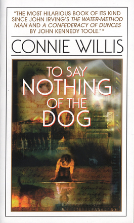
I've always been disappointed in the paperback cover for To Say Nothing of the Dog by Connie Willis, one of my favorite novels. Admittedly, it's not the easiest book to describe or illustrate—a time-travel comedy where a bunch of researchers from 2040s Oxford go on a wild goose chase to 1880s Britain—but the cover is blurry and moody and hard to make sense of, and doesn't suggest anything about what makes the book so fun.
posted by clair-de-lune at 11:03 AM on August 6, 2023 [6 favorites]
posted by clair-de-lune at 11:03 AM on August 6, 2023 [6 favorites]
Apparently you can't buy this anymore, but there was one cover for Anne of Green Gables where the famously red-haired, freckled, somewhat awkward Anne Shirley was presented as a sexy, confident blonde.
posted by mochapickle at 11:21 AM on August 6, 2023 [3 favorites]
posted by mochapickle at 11:21 AM on August 6, 2023 [3 favorites]
I LOVE discovering book covers like this. I don't know why. It's borderline. I will never stop.
Genre titles are a rich vein to mine for this, as you'll get long series that start off with a signature cover style that then goes out of favor. So the whole series gets redone, but then the redone covers look old because they were chasing a trend...and then sometimes they get a movie or show and the covers all get swapped for a screenshot from the show/movie and and and....
One of my favorite examples is Lois McMaster Bujold's hard sci-fi novel A Civil Campaign getting this bonkers you-are-cordially-invited romance cover which is actually very true to the storyline, then the audiobook later getting this lens-flare spacescape that, while accurate to the genre the series is in, looks like a whole lot of nothing.
A more recent example: The early books in Max Gladstone's Craft Sequence look a lot less epic than they actually are. (The same artist did the first editions of Brandon Sanderson's initial Mistborn trilogy, too.) These covers scream "mid-2000s urban fantasy" and honestly that's not entirely wrong. Craft Sequence feels akin to Jim Butcher's Dresden Files (same artist!) in that it is necromantic fantasy that constantly threatens to get out of control. And the first Mistborn trilogy is largely a small heist story that doubles as commentary on epic fantasy tropes. But the covers are definitely of their time. And since both series bloom into much larger epics, the urban-fantasy-style covers makes it feel...weird?...to recommend them to fantasy readers.
posted by greenland at 11:22 AM on August 6, 2023 [5 favorites]
The first book I read by Octavia Butler had a very standard/generic cover featuring a white woman. The book’s main character is a black woman, and it wasn’t uncommon for this sort of thing to happen with books featuring black protagonists. Hopefully it’s not so much the case now.
posted by PussKillian at 12:08 PM on August 6, 2023 [4 favorites]
posted by PussKillian at 12:08 PM on August 6, 2023 [4 favorites]
I really think Lois McMaster Bujold has won the prize on these. In addition to the one mentioned, CORDELIA'S HONOR (in the same series) has a horrible foil-and-illustration cover that looks like it belongs on a fantasy novel of extremely poor quality, not a delightful space adventure...
posted by branca at 1:50 PM on August 6, 2023 [6 favorites]
posted by branca at 1:50 PM on August 6, 2023 [6 favorites]
A Life Without Water comes to mind as a more recent one. The title isn't the best but at least has a connection to the text, sort of–ugh, you didn't ask about titles, so I'm stopping now. The point is, I spent literally the whole entire book waiting for anything resembling the cover imagery and as I recall, the closest was that the kid had indeed had rain boots and, like many children, enjoyed splashing. The issue was legitimately distracting and I'm honestly halfway expecting someone to swing in and tell me I'm wrong and am overlooking something obvious and meaningful, because truly all I'm seeing now is "we need a child and water, and make it a little dark."
posted by teremala at 1:57 PM on August 6, 2023 [1 favorite]
posted by teremala at 1:57 PM on August 6, 2023 [1 favorite]
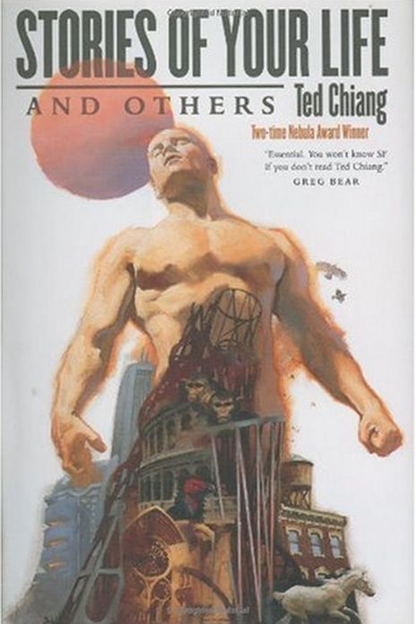
Perhaps not exactly what you're looking for, but the first cover for Ted Chiang's very well regarded "Story of Your Life and Others" had this big buff guy sort of partly made up of a cityscape and some other stuff. It's not that it was so bad (I think it's a cool illustration) but I think Chiang himself was like, "they sorta foisted this cover on me and it really doesn't represent the work well" and it was changed in subsequent editions.
posted by BlackLeotardFront at 3:25 PM on August 6, 2023 [3 favorites]
posted by BlackLeotardFront at 3:25 PM on August 6, 2023 [3 favorites]
The Daughter of Smoke and Bone trilogy is about war and political strife between angels and demons. This version of the cover for book 1 is a woman with a masquerade mask made of blue feathers. It makes it look like an S&M novel or a royal fae type story. Books 2 and 3 in that same version are a bit better. Later they released a much better set of covers, as doors are integral to the plot. Now they seem to have a third odd version that makes me think of adult paranormal romances with all the glowing blue light.
posted by soelo at 3:29 PM on August 6, 2023 [2 favorites]
posted by soelo at 3:29 PM on August 6, 2023 [2 favorites]
Dorothy Dunnett wrote two series of historical novels in the 1960s-1990s, full of political intrigue, trade, mercenaries, battles, and family drama. While they contain romantic relationships, they are not, by genre, romances.
Despite this, the first American paperback edition of the first novel looked like this.
posted by suelac at 3:35 PM on August 6, 2023 [2 favorites]
Despite this, the first American paperback edition of the first novel looked like this.
posted by suelac at 3:35 PM on August 6, 2023 [2 favorites]
Speaking of Lois McMaster Bujold, her novel The Warrior's Apprentice is a suspenseful space opera, but the cover to this edition of the German translation makes it look like a hilarious romp with a goofball protagonist.
posted by Epixonti at 4:55 PM on August 6, 2023 [5 favorites]
posted by Epixonti at 4:55 PM on August 6, 2023 [5 favorites]
I have this edition of Lud-in-the-Mist. It's a classic fantasy about fairies, but the cover makes it look like the dullest economics textbook imaginable.
posted by Prunesquallor at 6:06 PM on August 6, 2023 [3 favorites]
posted by Prunesquallor at 6:06 PM on August 6, 2023 [3 favorites]
The book ‘The Unwilling Warlord’ by Lawrence Watt-Evans was iirc issues with a cover illustration that was supposed to go on an entirely difference fantasy novel being published the same year. The mismatched cover is the second one with the throne.
http://www.ethshar.com/theunwillingwarlord.shtml
posted by bq at 10:15 PM on August 6, 2023 [1 favorite]
http://www.ethshar.com/theunwillingwarlord.shtml
posted by bq at 10:15 PM on August 6, 2023 [1 favorite]
Spot the odd style out in these and these covers for the two-volume omnibus editions of Daniel Abraham's Long Price Quartet. Most of them (along with the covers for the individual books and the four-volume omnibus) accurately reflect the contents (an intricate character-driven secondary world fantasy full of political intrigue and with an ensemble cast of POV characters which IIRC is pretty gender-balanced). Two of the covers suggest that it's an extruded grimdark fantasy about a murderhobo called Loner McBroodypants.
(I'm still salty that they never printed the second omnibus volume that matches the first one that I actually have in dead tree.)
Anyway, if anyone else saw those covers and thought "ew, no thanks", please give the books another shot; they're actually pretty neat.
posted by confluency at 2:11 AM on August 7, 2023 [2 favorites]
Jeanette Winterson recently burnt the reissued versions of four literary novels she'd written because she thought her publishers's new cover blurbs made them sound like third-rate romances. Details here.
posted by Paul Slade at 5:58 AM on August 7, 2023 [1 favorite]
posted by Paul Slade at 5:58 AM on August 7, 2023 [1 favorite]
This thread is closed to new comments.
posted by praemunire at 8:51 AM on August 6, 2023 [5 favorites]