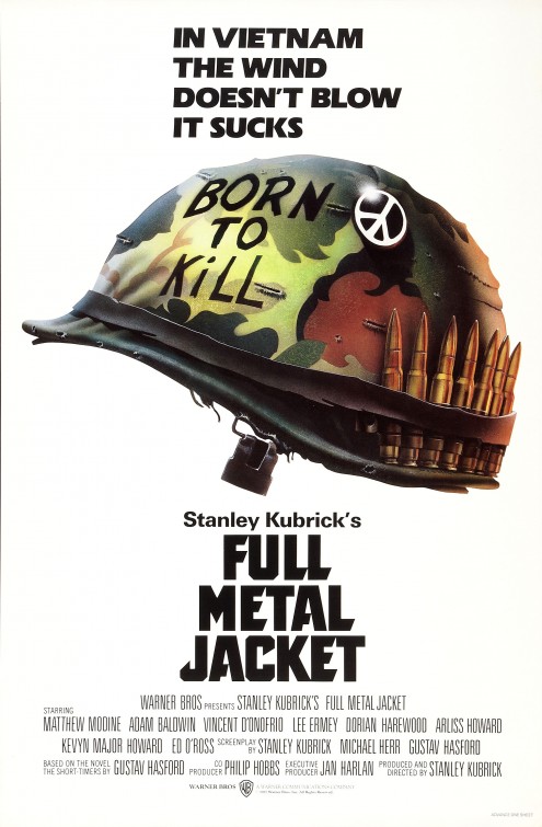
What fonts were used in the poster for the movie Full Metal Jacket?
April 11, 2007 8:52 AM Subscribe
Anyone happen to know what fonts were used in the poster for the movie Full Metal Jacket?
Response by poster: The baby jesus can also click through directly to the page.
posted by fet at 9:01 AM on April 11, 2007
posted by fet at 9:01 AM on April 11, 2007
Top part looks like Arial Black, although the stroke isn't quite wide enough for that. I'd be willing to bet the title words are a custom job.
posted by cosmicbandito at 9:09 AM on April 11, 2007
posted by cosmicbandito at 9:09 AM on April 11, 2007
Definitely not Arial Black. Looks like ITC Eras Ultra for the top part, Univers for Stanley Kubrick.
I'm stumped on the movie title, which is probably the part you really want.
posted by O9scar at 9:34 AM on April 11, 2007
I'm stumped on the movie title, which is probably the part you really want.
posted by O9scar at 9:34 AM on April 11, 2007
The font at the top looks like one of the heavier versions of Frutiger I have no idea what the title text is though, it could be custom like cosmicbandito suggests.
posted by public at 9:41 AM on April 11, 2007
posted by public at 9:41 AM on April 11, 2007
On postview, ITC Eras Ultra looks like a better fit, bah.
posted by public at 9:43 AM on April 11, 2007
posted by public at 9:43 AM on April 11, 2007
Response by poster: I'm hoping that the title itself is a normal font as well, but I'm not feeling encouraged... good spot on the ITC Eras Ultra, though, thanks!
posted by fet at 9:54 AM on April 11, 2007
posted by fet at 9:54 AM on April 11, 2007
I can't remember where I read this now, but apparently Kubrick was such a perfectionist that he even selected the fonts that would be used on the posters. Someone was going through his archives and found references on thousands of fonts, so I wouldn't be surprised if it was something very obscure.
posted by atrazine at 10:03 AM on April 11, 2007
posted by atrazine at 10:03 AM on April 11, 2007
Response by poster: There's a short mention on Kubrick's like for Futura Extra Bold in this article.
posted by fet at 10:28 AM on April 11, 2007
posted by fet at 10:28 AM on April 11, 2007
I almost always mention the typophile forums for this sort of thing. Type geeks are an obsessive and knowledgeable bunch.
I think the movie title is a typeface, not hand/custom lettering.
posted by O9scar at 11:29 AM on April 11, 2007
I think the movie title is a typeface, not hand/custom lettering.
posted by O9scar at 11:29 AM on April 11, 2007
WhatTheFont can sometimes be useful in these matters. Sometimes.
posted by asuprenant at 11:54 AM on April 11, 2007
posted by asuprenant at 11:54 AM on April 11, 2007
It's hard to tell for sure, but are the two T's in the movie title different? The second looks like it might have a longer right side.
Differences in the same letter are an indication of hand lettering.
posted by smackfu at 12:30 PM on April 11, 2007
Differences in the same letter are an indication of hand lettering.
posted by smackfu at 12:30 PM on April 11, 2007
The last "L" in Full and Metal also appear be different. I'm a vote for hand lettering.
I have the soundtrack and upon looking at that, it reinforces my opinion. On the soundtrack's cover it is all on one line and looks like a manual cut and paste job.
posted by sandra_s at 2:26 PM on April 11, 2007
I have the soundtrack and upon looking at that, it reinforces my opinion. On the soundtrack's cover it is all on one line and looks like a manual cut and paste job.
posted by sandra_s at 2:26 PM on April 11, 2007
Eras and Univers (at a glance). “Full Metal Jacket" looks handlettered.
posted by joeclark at 3:07 PM on April 11, 2007
posted by joeclark at 3:07 PM on April 11, 2007
This thread is closed to new comments.
posted by cosmicbandito at 9:00 AM on April 11, 2007