Need examples of typographical mosaics
March 31, 2006 1:40 PM Subscribe
I am looking for examples of typographical layouts, with lots of random or not so random words. I've tried google, but I'm not sure what to search for.
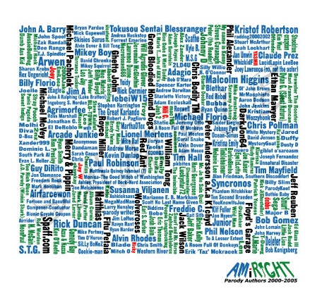
I run a site that has a decent amount of various people who contribute. Last year I made up some cafepress t-shirts with the names of all the people who posted a lot (about 300 people).
Here it is
It's a mosaic of sorts, and I was trying to think of a different way to layout something for this year and wanted to see more examples for inspiration. There is a little over 300 names in last years, and need to design something with even more for this year.
I think the constructivist movement was known for doing stuff of this nature? not sure
Ah, no nevermind. Basically layouts like that are based on graphic designs. Make sketches of colored shapes and translte the one you like best to text.
posted by JJ86 at 1:51 PM on March 31, 2006
posted by JJ86 at 1:51 PM on March 31, 2006
My graphic-designer brother recommends the AIGA Design Archives for general inspirational purposes. There's a category for typographical design (click Archives, then Categories), but it looks like there might be stuff throughout the site that could work.
posted by occhiblu at 1:55 PM on March 31, 2006
posted by occhiblu at 1:55 PM on March 31, 2006
I think you want to look into Paula Scherr and the Russian constructivists.
posted by kensanway at 1:55 PM on March 31, 2006
posted by kensanway at 1:55 PM on March 31, 2006
Best answer: Paula Scher
russians
Obviously there are a lot more examples, since you're basically asking for design that looks cool, but the links above seem close to your mosaic, in terms of dense modular treatment of type.
posted by kensanway at 1:57 PM on March 31, 2006
russians
Obviously there are a lot more examples, since you're basically asking for design that looks cool, but the links above seem close to your mosaic, in terms of dense modular treatment of type.
posted by kensanway at 1:57 PM on March 31, 2006
I always thought this kind of thing had potential, if the words were just a little more legible.
posted by Brian James at 3:21 PM on March 31, 2006
posted by Brian James at 3:21 PM on March 31, 2006
Other than the Constructivists and Futurists, many Bauhaus designers experimented with typography in ways that still look fresh, e.g. Herbert Bayer and Kurt Schwitters.
posted by rob511 at 3:58 PM on March 31, 2006
posted by rob511 at 3:58 PM on March 31, 2006
Not a typographic layout per se but if you could get metrics on the posting frequencies of the 300 members, you could construct something similar to Flickr's and del.icio.us' tag cloud but with member names. List the member names in alphabetical order and then use posting frequency to determine the size of the member's name (most posts = larger typeface size). With most user communities there's something of a power law in terms of posting frequency so you may want to put the members in buckets (0-20, 21-40, 41-100, 101-200, 201-500) or use a log scale. One of the tools in the Wikipedia page should enable you to build a tag cloud based on your data.
posted by junesix at 8:54 PM on March 31, 2006
posted by junesix at 8:54 PM on March 31, 2006
This Paula Scher poster is spectacular. Consider setting an image within the text that has a lot of nooks and crannies (like the dancer in that poster) and you can have a lot of fun with name placement and size.
posted by junesix at 9:00 PM on March 31, 2006
posted by junesix at 9:00 PM on March 31, 2006
Response by poster: thanks, those are all good starting points everyone posted
posted by inthe80s at 7:27 AM on April 3, 2006
posted by inthe80s at 7:27 AM on April 3, 2006
This thread is closed to new comments.
posted by JJ86 at 1:49 PM on March 31, 2006