Are you Photoshop savvy: shiny engraving of a different color?
August 31, 2017 5:19 PM Subscribe
I have a 300 dpi photo of a blank #2 pencil. I would like to use Photoshop to recreate the proper shiny green lettering of a Ticonderoga pencil. My attempts have not gotten me far. Specifics and pics inside.
I am using Photoshop CS4 extended 11.0.2
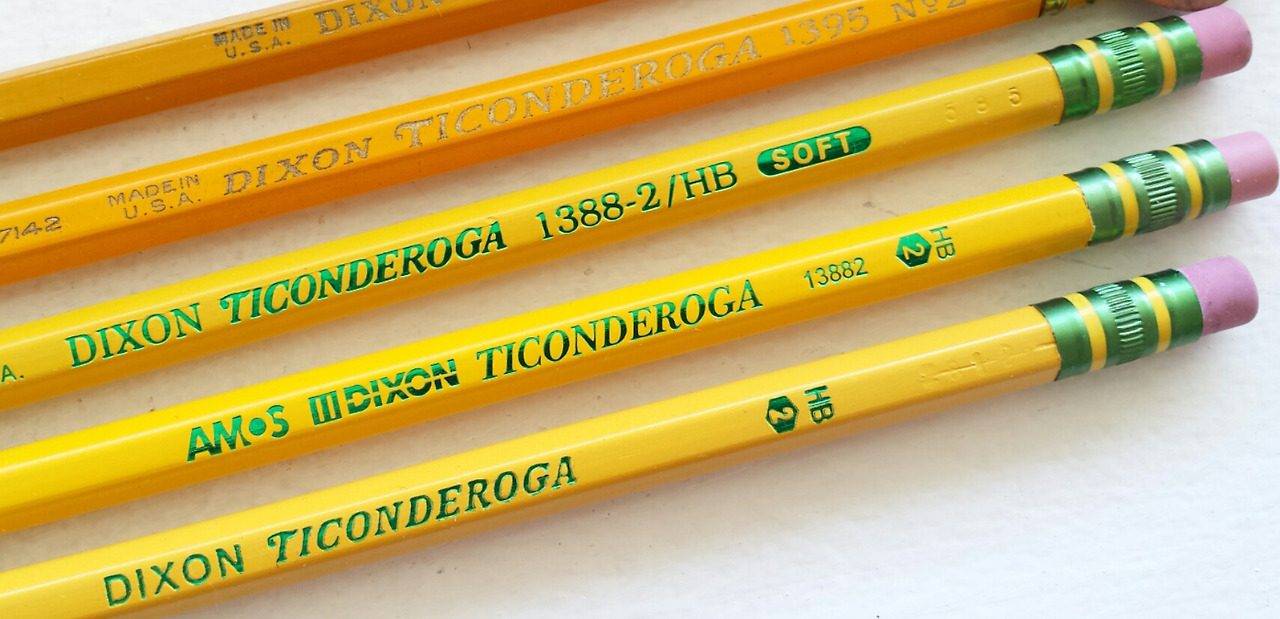
Here is what Ticonderoga pencils look like.
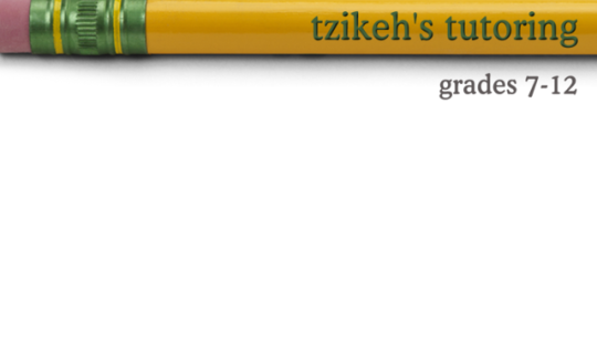
Here is what my attempt looks like. (The pencil photo is from ShutterStock, 300dpi. If it looks off, I'm sure it's because of something I've done in Photoshop.)
I've futzed about with the color picker, choosing different greens from the metal bit by the eraser, and tried the blending options of the text layer in a variety of ways, but I can't get it to look right. I'm sure I'm missing a LOT of info about how to get the shiny metallic look on the words as well as info about how to make it look like the words are carved or stamped deeper into the pencil past the surface.
I've looked on YouTube for "photoshop engraving" and so forth, but they're all about making impressions in the background rather than using another color.
Can someone who is way better at Photoshop than I am explain what steps I'm missing/doing wrong?
(I would have loved to have been able to put this in the "technology" category, as well as "media and arts," but here's hoping.)
I am using Photoshop CS4 extended 11.0.2
Here is what Ticonderoga pencils look like.
Here is what my attempt looks like. (The pencil photo is from ShutterStock, 300dpi. If it looks off, I'm sure it's because of something I've done in Photoshop.)
I've futzed about with the color picker, choosing different greens from the metal bit by the eraser, and tried the blending options of the text layer in a variety of ways, but I can't get it to look right. I'm sure I'm missing a LOT of info about how to get the shiny metallic look on the words as well as info about how to make it look like the words are carved or stamped deeper into the pencil past the surface.
I've looked on YouTube for "photoshop engraving" and so forth, but they're all about making impressions in the background rather than using another color.
Can someone who is way better at Photoshop than I am explain what steps I'm missing/doing wrong?
(I would have loved to have been able to put this in the "technology" category, as well as "media and arts," but here's hoping.)
Seconding gradient!
posted by destructive cactus at 5:51 PM on August 31, 2017
posted by destructive cactus at 5:51 PM on August 31, 2017
Look for "metal chrome effect" tutorials.
posted by TWinbrook8 at 5:57 PM on August 31, 2017 [2 favorites]
posted by TWinbrook8 at 5:57 PM on August 31, 2017 [2 favorites]
1) your text needs to fit on one of the faces of the pencil 2) I would start looking at "layer effects", gradient overlay and emboss. There should even be a preset for a chrome-ish gradient, you could see if that looks shiny enough and then do a hue/saturation adjustment layer applied to the text layer to make it green. I would go softly with the emboss effect but a couple of pixels in depth will probably get you there on that scale.
Then you might want to do a very tiny blur or add noise or something to help that layer blend in with the photo of the pencil, it's hard to tell exactly what you'd need but one/both of those will probably do it. If you go the layer effects route you'll need to "rasterize layer" or "apply effects" I can't remember the actual wording (right-click on the layer name to get the contextual menu).
I think placement/proportion of the lettering will get you a lot of the way there, too, so spend some time tweaking that.
posted by jeweled accumulation at 6:29 PM on August 31, 2017 [2 favorites]
Best answer: The built-in emboss is garbage unless you change the settings. Also, you want an inner emboss, and drop the opacity of the shadow by a fair amount. You won't want much depth. And the angle should be 90 based on the photo you're using.
As for the rest, one of the metal presets in gradient overlay should get you pretty close (steel blue worked reasonably well for me). In the gradient drop-down there's a gear which will bring up additional presets. You also want to drop the opacity of the gradient slightly so the bright parts don't shine quite as harsh.
I couldn't get hue to change the gradient enough so I just duplicated the text layer, made it green and set it to "Overlay." And yes, I made a copy of the gradient text and the color overlay layer, merged them into one and blurred it by .3 pixels.
This is my example.
posted by O9scar at 7:59 PM on August 31, 2017 [3 favorites]
Response by poster: Wow O9scar -- that's incredible. I've tried to follow what you posted, but I think my settings to start with are different than yours, and mine attempts are coming out... bad.
What color did you use for the original text that you applied the settings to? (hexadecimal info would be great)
posted by tzikeh at 8:18 PM on August 31, 2017
What color did you use for the original text that you applied the settings to? (hexadecimal info would be great)
posted by tzikeh at 8:18 PM on August 31, 2017
Best answer: Here's what I'd do:
Take your text layer and put it in a new Group (folder icon at the bottom of the layers panel). Turn off the layer effects you're using on it. As jeweled accumulation said, it's best if you make sure the letters fit completely on one facet of the pencil, but if that ends up making the letters too small you can fudge it and let the letters go over two facets. Get the text sized and positioned.
Next, sample a dark green color from the eraser ferrule. Tap X to switch foreground and background colors, then select the lighter reflection color from the eraser ferrule. You can change these later, it's just convenient to have them ready to go.
Make a new layer in your Group. Fill it with the darker green color you selected before. The color really doesn't matter in this step, you'll override it in the next step.
Now add a Gradient Fill layer style. In the dialog box, make sure the gradient type is Linear, and rotate the gradient so it's vertical. Click in to edit the gradient colors. Make both existing color stops the dark green color. Add a color stop in the middle and make it the reflection color. Move the end (green) color stops toward the center color stop. Look at the gradient layer. Notice that the gradient is getting tighter toward the vertical center.
What you want to do is create the look of a reflection. Move the middle color stop so that the reflection color on screen is under your letters. Then move the end color stops toward the reflection color stop to tighten the gradient up so you see both the top and bottom green within the vertical height of the letters.
The reason I'm having you set up the gradient on a big layer is that it can be really difficult to set up a gradient when it only hits a small area, like on letters. This way you can get the gradient positioned easily, then we're going to knock out the non-letter areas.
To knock out the non-letter areas, disable (eyeball button) the text layer. Ctrl (cmd) click the text layer's layer thumbnail to load the text area as a selection. Now select the Group, then click the Layer Mask icon at the bottom of the layers panel. This will make the area you selected (the text) visible, and the rest of the group's contents will be invisible.
Now you can go in and fine-tune the gradient if you wish. If you shift-click the Layer Mask on the Group, you can turn it off and on.
It looks like the mail reflection band is toward the top of the letters. There's a secondary narrower band of reflections lower down. You could add another color stop with the reflection color to your gradient, with the darker green in-beyween if you wanted to get fancy. The diamond shapes between the color stops is the color halfway between stops. If you move those you can sharpen up boundaries between colors. You can set the positions of the color stops and midpoints numerically if you're having trouble making minute adjustments. Just mess around until you get something you like. Use the reflections on the eraser ferrule as a guide.
Once you have the reflection look the way you want, add a Bevel and Emboss layer style to the Group. In the dialog box there's control for Up/Down, which switches between placing the highlight and shadow as though the base layer is indented into the surface or raised up from it. You want the shadow to be at the top and the highlight to be at the bottom, so I think you'd pick Down. You can achieve a similar result by moving the light source in the settings.
Some of the indentations on the real pencils you shared look like the bevel is pretty straight, there's not a lot of angle to it. On some it looks like the color exists on the bevel side, some don't. You need to decide which bevel type gives the look you want, so try Inner Bevel, Outer Bevel and Emboss to see what you like. Make other settings as you see fit. I'd try Emboss, with a small size, pretty big depth and low softness. I'd keep the shadow black, but for the highlight I think I'd use a yellow. It looks like the shadoes and highlights should be pretty tight and punchy. Adjust the lighing angle and altitude as well to see how those settings change the look.
Also play with Soft, Chisel Soft and Chisel Hard to see what gives you the result you like. Advising on the bevel/emboss settings is kind of hard, you really just need to mess around until it looks right.
When it all looks good, select the top-most visible layer in your stack (or the Group, if that's at the top of the stack) and pres ctrl+alt+shift+E (not sure what it is on Mac, probably cmd-opt-shift-E). This will make a new layer at the top of the stack that is a merged version of all the layers visible when you executed the command.
This way you get a flattened snapshot of your image with any blending modes rendered correctly, but you can go back and adjust everything else later if you want to make changes.
posted by under_petticoat_rule at 8:20 PM on August 31, 2017 [7 favorites]
The text layer with the gradient and emboss effects was #2b9f15, as was the additional text layer with overlay mode. I totally eyeballed that green color, but it looks pretty close to the real thing.
Let me know if you have any further questions or memail me if you don't want to keep going back and forth in this thread.
posted by O9scar at 8:22 PM on August 31, 2017
Let me know if you have any further questions or memail me if you don't want to keep going back and forth in this thread.
posted by O9scar at 8:22 PM on August 31, 2017
Here I am with a total hack approach, but all the letters in TUTORING are actually in TICONDEROGA, except for the U, but that's easily just two I's with a small connector at the bottom (perhaps taken from the bottom of the D). I don't know what the real name of your group is, but if it has a similar degree of overlap, you could try to just do a bunch of copying and pasting, with careful alignment (by careful, I just mean, do it while zoomed way in), and use the stamp tool to cover up the other letters.
posted by salvia at 8:55 PM on August 31, 2017 [1 favorite]
posted by salvia at 8:55 PM on August 31, 2017 [1 favorite]
This thread is closed to new comments.
posted by Sar at 5:42 PM on August 31, 2017 [1 favorite]