Find me a tattoo font
January 12, 2006 12:57 PM Subscribe
I'm getting another tattoo. This one on my leg, maybe six inches long. A capital "E" for my grandfather. I'm looking for an elegant yet masculine font. Something with a little flow to it. Suggestions?
If you want some obscenely ornate blackletter script drop me an email. I have some really crazy ones scanned.
posted by atom128 at 1:11 PM on January 12, 2006
posted by atom128 at 1:11 PM on January 12, 2006
What did he do for a living? You might want to use a font that will further identify the tattoo with him. For example, if he was a writer you might want to use courier. Or if he were in the medical industry, you might want something like this. Just a thought.
posted by ducksauce at 1:39 PM on January 12, 2006
posted by ducksauce at 1:39 PM on January 12, 2006
Akzidenz-Grotesk is rather plain, but at least when you tell people the font name it sounds masculine.
posted by shoepal at 1:39 PM on January 12, 2006
posted by shoepal at 1:39 PM on January 12, 2006
Response by poster: duksauce:
he was an engineer. Does that help? Also had really strong, big hands.
posted by captainscared at 1:55 PM on January 12, 2006
he was an engineer. Does that help? Also had really strong, big hands.
posted by captainscared at 1:55 PM on January 12, 2006
Hoefler & Frere Jones have several great thick-n-heavy fonts. Check out Knockout, Saracen, Ziggurat...
Also, the 3 horizontal lines that make up the capital E in their font Gestalt, make for a very strong and beautiful graphic, and somewhat fitting for an engineer.
posted by Robot Johnny at 2:08 PM on January 12, 2006
Also, the 3 horizontal lines that make up the capital E in their font Gestalt, make for a very strong and beautiful graphic, and somewhat fitting for an engineer.
posted by Robot Johnny at 2:08 PM on January 12, 2006
If he was an engineer, try a blueprint style font, like architect?
(one bonus, since it's a tattoo, you wouldn't need to pay any licensing fees for the font, since it's technically being bitmapped to your leg!)
posted by shepd at 2:19 PM on January 12, 2006
(one bonus, since it's a tattoo, you wouldn't need to pay any licensing fees for the font, since it's technically being bitmapped to your leg!)
posted by shepd at 2:19 PM on January 12, 2006
Find a sample of his own handwriting with an uppercase "E," and get a tattoo of your grandfather's actual "E."
I'm assuming that his name began with "E." Use the one from his own signature.
posted by JekPorkins at 2:44 PM on January 12, 2006
I'm assuming that his name began with "E." Use the one from his own signature.
posted by JekPorkins at 2:44 PM on January 12, 2006
I gotta agree with Robot Johnny about Gestalt. Three solid lines looks much better than any regular E would. Simple, strong, solid, and elegant.
posted by team lowkey at 3:48 PM on January 12, 2006
posted by team lowkey at 3:48 PM on January 12, 2006
The Sigma Symbol looks a lot like a capital E, but it looks a little more interesting and has mathematical connotations that might make a nice way to commemorate an engineer. The downside is you might have people assuming it's a fraternity type of thing. Don't know if that would bother you or not.
posted by willnot at 4:47 PM on January 12, 2006
posted by willnot at 4:47 PM on January 12, 2006
first place i always check for fonts is www.dafont.com. they're all free, categorized, high quality, and honestly some of the best fonts ive ever seen.
posted by deeman at 6:13 PM on January 12, 2006
posted by deeman at 6:13 PM on January 12, 2006
Font in my collection that look interesting:
Advertising Gothic
Dirty Ego
Shaman
Turok
Of those, I'd probably recommend Shaman.
posted by krisjohn at 7:15 PM on January 12, 2006
Advertising Gothic
Dirty Ego
Shaman
Turok
Of those, I'd probably recommend Shaman.
posted by krisjohn at 7:15 PM on January 12, 2006
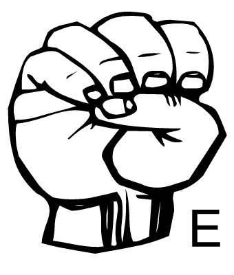
Oddly: the ASL e is pretty fantastic, especially given the comment about strong hands.
Of course, most people will think it's some sort of "power", but hey... fuck them!
posted by I Love Tacos at 7:45 PM on January 12, 2006
Of course, most people will think it's some sort of "power", but hey... fuck them!
posted by I Love Tacos at 7:45 PM on January 12, 2006
This is sounding like a reverse–Hanzi Smatter scenario in the making. Always think for a long time, much longer than you suspect you need, about getting a tattoo. Think even longer about typographic tattoos of any kind or in any script.
posted by joeclark at 4:04 PM on January 14, 2006
posted by joeclark at 4:04 PM on January 14, 2006
This thread is closed to new comments.
How about Friz Quadrata? It's elegant, but still very strong-looking.
posted by Robot Johnny at 1:06 PM on January 12, 2006