Fondness of O.P.P.
January 24, 2008 3:04 PM Subscribe
Can you help me find funny graphs/charts to show in my university level statistics class? They don't have to be technically correct, I just want something to put onscreen while the students are coming into class. Stuff like this is ok, but SFW is preferable.
Best answer: Maybe the relationship between pirates and global warming.
posted by procrastination at 3:10 PM on January 24, 2008 [2 favorites]
posted by procrastination at 3:10 PM on January 24, 2008 [2 favorites]
This blog "strange maps" looks promising, but I had this map in particular in mind.
posted by Brian James at 3:10 PM on January 24, 2008
posted by Brian James at 3:10 PM on January 24, 2008
Best answer: Indexed, now in book form.
I swear I'm not her agent or anything.
posted by hydrophonic at 3:18 PM on January 24, 2008
I swear I'm not her agent or anything.
posted by hydrophonic at 3:18 PM on January 24, 2008
Best answer: xkcd has a bunch as comics, specifically here, here and (the best one) here.
posted by sarahnade at 3:19 PM on January 24, 2008
posted by sarahnade at 3:19 PM on January 24, 2008
Indexed has been mentioned on the blue in the past and is pretty funny. I'm especially fond of the early stuff.
posted by hindmost at 3:19 PM on January 24, 2008
posted by hindmost at 3:19 PM on January 24, 2008
1000 Ridiculous Tragedies has some excellent pie charts.
posted by yarmond at 3:26 PM on January 24, 2008 [1 favorite]
posted by yarmond at 3:26 PM on January 24, 2008 [1 favorite]
There were some pretty funny user-created charts in this Mefi thread. For example:
Pie is seven times better than cake
what butts are
etc.
posted by Rhaomi at 4:49 PM on January 24, 2008
Pie is seven times better than cake
what butts are
etc.
posted by Rhaomi at 4:49 PM on January 24, 2008
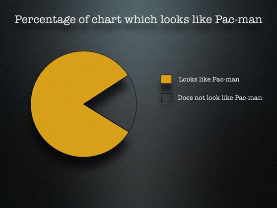
I have the pac man chart on my door at work and its gotten a lot of positive feedback, so definitely include that one.
posted by Diskeater at 6:47 PM on January 24, 2008
posted by Diskeater at 6:47 PM on January 24, 2008
Statshot on the Onion website has hilarious graphs and charts.
http://www.theonion.com/content/statshot/top_selling_nintendo_wii
posted by Zebtron at 6:50 PM on January 24, 2008
http://www.theonion.com/content/statshot/top_selling_nintendo_wii
posted by Zebtron at 6:50 PM on January 24, 2008
seconding (thirding by now?) indexed.
posted by thinkingwoman at 6:51 PM on January 24, 2008
posted by thinkingwoman at 6:51 PM on January 24, 2008
Slideshow with some of David Letterman's "Charts and Graphs." Not the best selection, alas, but worth a look.
posted by pmurray63 at 9:32 PM on January 24, 2008
posted by pmurray63 at 9:32 PM on January 24, 2008
Text content of many more Letterman "Charts & Graphs" bits from 2002 and later can be found here. You'd have to recreate the graphics yourself, but that wouldn't be hard.
posted by pmurray63 at 9:43 PM on January 24, 2008
posted by pmurray63 at 9:43 PM on January 24, 2008
Best answer: Have you checked out portions of Demtri Martin's standup where he uses a large pad on an easel with some very funny charts? (My favorite being the relationship between how beautiful a girl is and how much he is willing to listen to her talk about her cats.) I think that one is in his latest special "Demetri Martin: Person" Hope that's right.
posted by lpsguy at 7:45 AM on January 25, 2008
posted by lpsguy at 7:45 AM on January 25, 2008
I like this slide from the Gettysburg address powerpoint presentation.
posted by yarrow at 9:09 AM on January 25, 2008
posted by yarrow at 9:09 AM on January 25, 2008
America's Most Popular Charts is a personal favourite Statshot from The Onion.
posted by mhum at 11:27 AM on January 25, 2008
posted by mhum at 11:27 AM on January 25, 2008
« Older Multi line Text-to-column - A CHALLENGE FOR YOU! | What do our cat's paws suddenly look dirty? Newer »
This thread is closed to new comments.
posted by k8t at 3:07 PM on January 24, 2008