Graphic design and/or photoshop question
June 28, 2007 11:41 PM Subscribe
Graphic design and/or photoshop question. I'm designing a T-shirt, and I need to prepare/convert a photo I have of a car so that it is more T-shirt-ish. What I mean is, the photo is, well, photorealistic. Cars on shirts are usually sort of cartoony. Though I don't want to mess with the dimensions of the car and make it squished and bouncy looking. I just need the car to be less colors, or outlined, or ... something. I can't even really describe what I mean. Take a look at these images of T-shirts.
http://www.thet-shirtguy.com/JFPInt/mustang_1.htm
http://www.ptdesigns.com/images/t-shirts/folder/DirtCarsT-Shirts/OtherDirtCars/RJesseeL.jpg
http://www.cal-mustang.com/catalog/images/TS1009std.jpg
So how would I turn a photo like this:
http://barkbarkwoofwoof.blogspot.com/uploaded_images/65MustangLeftSide-742952.JPG
...to something like what is seen on those shirts? Is this something that can be done in photoshop? I'm an intermediate photoshop user, but have been unable to duplicate results anything like that. If it's possible, I would need to be directed to exact steps to follow.
Or is this something I need to have a graphic designer just draw for me? If so, any estimates on cost would be appreciated. Or if you or somebody you know would like to give me a quote, that would be welcomed as well.
(the mustang photo I linked to isn't the actual photo I would need converted)
Thanks.
My educated guess is that those were drawn (or traced from photos) in Illustrator or a similar program, not Photoshop.
If I HAD to do that in Photoshop, I would start by applying a filter. Probably Ink Outlines from the Brush Strokes menu. Then I would work on smoothing out the textures with solid color, and add some highlight with a lighter color.
BUT... I am not an expert in this type of work at all. Again, my money is on Illustrator, and a skilled designer.
posted by The Deej at 12:04 AM on June 29, 2007
The images on the shirts you link are illustrations, not photographs. Converting the photo you have to a similar style would take some doing.
posted by neckro23 at 12:11 AM on June 29, 2007
posted by neckro23 at 12:11 AM on June 29, 2007
If you just want a useable image, you'll need to pull it into illustrator and run live trace on it.
If you want it to look good, it's what Deej said: you'll need an illustrator who will take the time to hand trace/draw it in illustrator (or on paper), and make an illustration out of it.
posted by The Esteemed Doctor Bunsen Honeydew at 1:38 AM on June 29, 2007
If you want it to look good, it's what Deej said: you'll need an illustrator who will take the time to hand trace/draw it in illustrator (or on paper), and make an illustration out of it.
posted by The Esteemed Doctor Bunsen Honeydew at 1:38 AM on June 29, 2007
I've sometimes had luck creating this effect in Photoshop by first running a gaussian blur, then posterizing. You'll need to experiment with amount of blur and number of posterization levels, and you may or may end up with something useful, depending on the source image.
posted by Etaoin Shrdlu at 2:14 AM on June 29, 2007
posted by Etaoin Shrdlu at 2:14 AM on June 29, 2007
As a very quick example, here is a random Mustang pulled off of GIS, and here is the same picture, after a gaussian blur of 4 pixels and a 3-level posterization.
posted by Etaoin Shrdlu at 2:22 AM on June 29, 2007 [1 favorite]
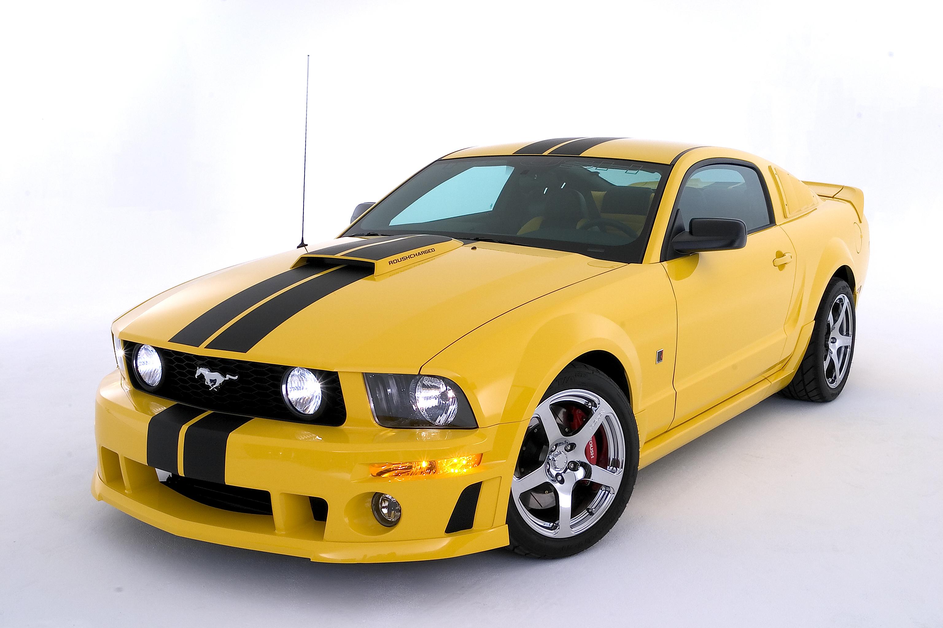
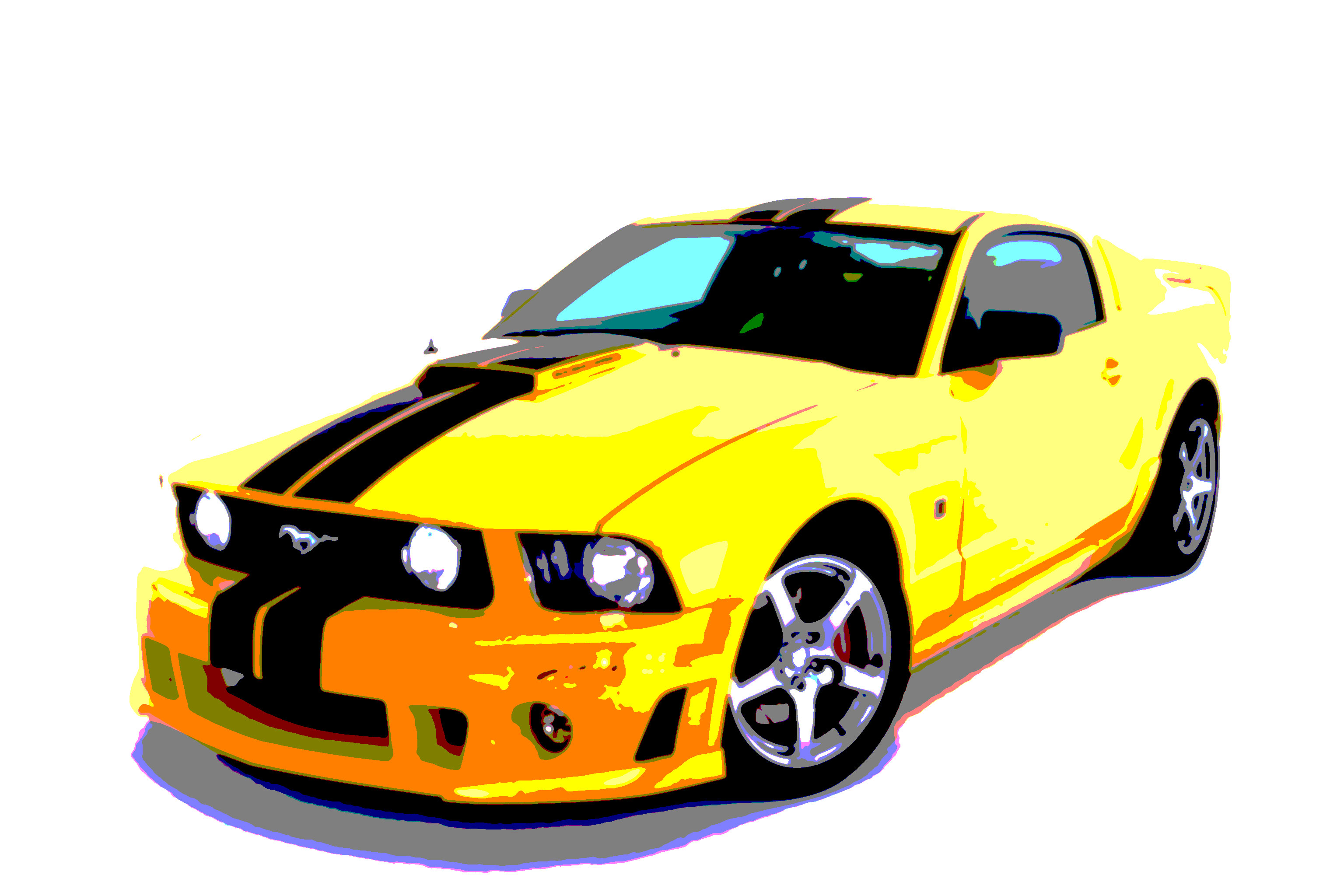
posted by Etaoin Shrdlu at 2:22 AM on June 29, 2007 [1 favorite]
Just Photoshop isn't going to work, even though it will look like what Illustrator (or another vector program--Inkscape is decent and free if you don't have Illustrator on hand) will produce, it won't scale properly to what you'll want on a shirt.
1) Remove background. (I use masks, you can use the eraser, but do make sure you're working on a copy of your image to avoid the accidental overwriting save.)
2) Stretch the contrast.... open up the curves dialog and adjust things so that your bright colours are BRIGHT and your dark colours are DARK.
3) Save, and open in a vector program--trace.
Here is your example, the top is 2 colours + white, the middle is 3 colours + white, the bottom is 2 colours + white again but with different tracing. And here's the vector form of it (same stuff, scales nicely). (Oh yeah, it's in grayscale, too, why? Because your car, it is white! and coloured highlights look funny at low colour depths.)
posted by anaelith at 2:44 AM on June 29, 2007
Best answer: Here's a tutorial on turning a photo of a car into a vector drawing in Photoshop, if you don't have Illustrator.
posted by AV at 4:52 AM on June 29, 2007
posted by AV at 4:52 AM on June 29, 2007
Well, that tutorial could also work in Illustrator just by making shapes on top of the picture of the car. Creating a path in PS isn't really that different to how you create them in AI.
I've taught PS. The part that makes this question hard for me is, as someone else said, there are lots of ways to do this. Each will work but will have different results, and that's where the whole artistry of Photoshop as well as personal taste comes in. Sure, I could draw it myself over the image. Or I could use livetrace. Or I could take a photo, pull up the levels to make the color separations more posterized, and then create new channels from the color layers, select each channel and turn them into work paths which I then copy into Illustrator and fill. And there are probably ten or twenty other good answers too.
There are a variety of possible ways to render any image, and for me what ends up being the best answer is usually based upon experimenting with it until I see something I really like the look of. So I hate to be vague but it's really hard for me to give you exact advice that I know is going to make the most kickass shirt that will look the way you want. You're probably going to just have to mess with the image using all of the different techniques mentioned here (or in books or online) until you find one that gives you results that really float your boat.
posted by miss lynnster at 5:10 AM on June 29, 2007
Best answer: Here's one technique I might use myself to make it two color. I'd probably fill the background with white (not blue) and stop before or after creating the dotted linescreen (depending on how it looked) and then save it as grayscale. Then I'd place that into Illustrator & draw color shapes over it making sure to have the transparency of those color shapes set to "multiply" or something.
Also, be sure to work at higher resolution than you would for web work. Printed things should be created at a minimum of 300 dpi (web is 72). Otherwise you will have fuzzy artwork.
posted by miss lynnster at 5:16 AM on June 29, 2007
Also, be sure to work at higher resolution than you would for web work. Printed things should be created at a minimum of 300 dpi (web is 72). Otherwise you will have fuzzy artwork.
posted by miss lynnster at 5:16 AM on June 29, 2007
DANG! Now that I wrote that big thing about how I didn't know how to answer you, I've gone through the website that I just linked to and realized it has a lot of great answers to help you. So just go to that link above as well as here and see what works for you. Good luck. Have fun experimenting! :)
posted by miss lynnster at 5:25 AM on June 29, 2007
posted by miss lynnster at 5:25 AM on June 29, 2007
Everyone is giving you great advice, but I want to echo what Jamaro is saying : the gradients and the careful application of highlights and shadows is what makes the illustrations in Example 1 and 2 pop, so beware that your resulting artwork on your first few tries may not have the "pop" that your examples do. This is something I do a lot of : Illustrator is my main tool as an artist/designer and even when you work with vectorizing a photo (with tracing tools or whatever) there is a fair amount of drawing, planning, experience and well, "translating," that goes into doing the work. Not trying to discourage you, just wanted to echo jamaro's realistic advice. Good luck!
posted by Slothrop at 8:25 AM on June 29, 2007
posted by Slothrop at 8:25 AM on June 29, 2007
If you don't have Illustrator, you can download a free 30-day trial from Adobe's website.
posted by PercussivePaul at 8:39 AM on June 29, 2007
posted by PercussivePaul at 8:39 AM on June 29, 2007
I ran a screen printing shop for 7 years and did this on a daily basis. You don't need Illustrator, although you can do it vector if you want (Livetrace is probably the best option if you don't want to spend a lot of time doing this). What you have to do is convert it into spot color seperations. There are a million ways to do this, if you google "color seperation for screen printing" you will probably find what you're looking for.
Remember in screen printing every color = another screen/setup fee/more cost. My method would be to isolate it, cut the general shape out to print as white (called an 'underbase' in screen printing lingo) and then run black (the 'key' image, I'd also trap the outside outline to make it easier for your printer to register on press) and possibly a gray for more tonal range on top of the white. You can of course run more colors to make it more photo-like but if you're going to do that I would just pay a professional seperator.
Your question is of course how to seperate the gray and black... well, you could fill entire books on this subject. Look at your channels, try the Color Selection tool, try converting it to bitmap and then overlaying that over your underbase... there's a million ways to do it depending on how you want the end result to look.
posted by bradbane at 9:32 AM on June 29, 2007
I would get a graphic-savvy friend to do it if I were you. Maybe 1 in 4 people I know have some kind of artistic talent, and something like this - translating an image into a new format, basically - requires more than just technical know-how.
But that's just me.
posted by tmcw at 10:27 AM on June 29, 2007
But that's just me.
posted by tmcw at 10:27 AM on June 29, 2007
It's possible that a tshirt shop would do this for you for an "art" fee.
posted by radioamy at 10:58 AM on June 29, 2007
posted by radioamy at 10:58 AM on June 29, 2007
« Older ... Aprikose in der Hose, und eine Bratwurst dazu. | How do you sign WTF in Japanese? Newer »
This thread is closed to new comments.
One thing you'll need to determine up front is how many colors the t-shirt will have. Each color will add another plate (and thus cost) to the run. The first images you link to are 5 colors or more.
posted by quadog at 11:58 PM on June 28, 2007