What's the typeface used on American street addresses
April 30, 2018 6:40 AM Subscribe
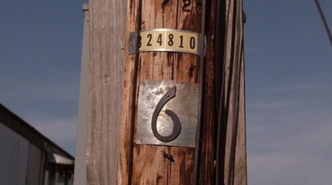
Thinking about the last season of Twin Peaks, I was wondering what the distinctive font is that is used for street addresses, like the 3 and the 6 here. There are street numbers in a similar style on houses in California and other places, and I wonder where this started.
Well, it's technically not a font, because it's not type. But those are just standard house numbers. You can buy them at Home Depot.
posted by kevinbelt at 9:16 AM on April 30, 2018
posted by kevinbelt at 9:16 AM on April 30, 2018
Right, but why are they the standard? Numerals in that style are nearly ubiquitous for house numbers and (as far as I can tell) almost never used in other places. What's the history behind them?
posted by a mirror and an encyclopedia at 9:37 AM on April 30, 2018 [3 favorites]
posted by a mirror and an encyclopedia at 9:37 AM on April 30, 2018 [3 favorites]
This is an interesting question, and I haven't found as much of an answer as I hoped when I started looking. So far I can't drum up a name for that particular house number character type, though I recognize it as well from random houses I've personally walked past, certainly in Portland, OR and I'd reckon when I've walked around other cities.
I made a quick go at identifying the type through automatic font search stuff like What The Font by cobbling together images from that Home Depot product page into a sample image, but got no close match, just various brush-style fonts with similar open 6 and 9 character and then stuff much further form the mark. If there is a canonical name for the type, or the source type its taken from, that would make it easier to try and track down the tradition of use, but this seems like it might require an actual domain expert to identify and name (or explain the lack of name for) that numeral style.
As far as the "why", which seems like the most interesting bit, the best I've been able to do so far is find a possible parallel example: when Portland reworked its street addresses city-wide around 1930, that included the creation of a standardized numeral tile set for displaying the new house numbers, e.g. these ceramic tiles. As a result, this particular number style is ubiquitous in Portland.
posted by cortex at 10:22 AM on April 30, 2018 [5 favorites]
I would guess the number forms come from sign painting tradition. So the named type came after.
posted by pernoctalian at 10:32 AM on April 30, 2018 [2 favorites]
posted by pernoctalian at 10:32 AM on April 30, 2018 [2 favorites]
There's a piece here that talks in general terms about numbers reflecting the design trends when houses of a certain style were first built, which for the US will include a lot of early 20th-century styles.
Another aspect may be that they replicate wrought iron or hammered brass (most obvious in the open 6 and 9) which was common for various bits of house hardware.
posted by holgate at 10:53 AM on April 30, 2018
Another aspect may be that they replicate wrought iron or hammered brass (most obvious in the open 6 and 9) which was common for various bits of house hardware.
posted by holgate at 10:53 AM on April 30, 2018
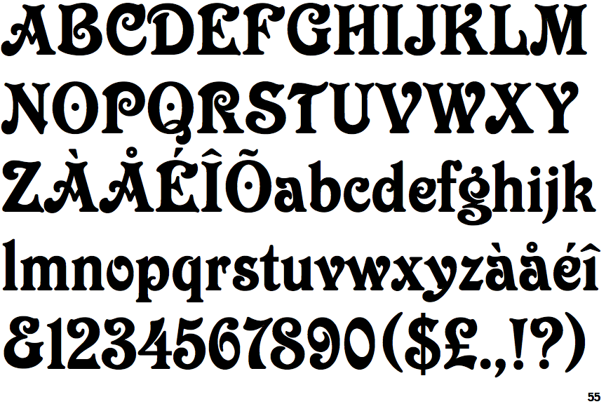
I could have sworn that I read something at one point about that particular style reflecting a chinoiserie trend of the time, but I’ll be darned if I can figure out where I saw that. But I can see the letters as Americanized “brush stroke” forms (here’s a good example of a few characters of that style together).
posted by stefnet at 1:25 PM on April 30, 2018
posted by stefnet at 1:25 PM on April 30, 2018
It's not quite the same as a street sign, but Milwaukee has distinctive, uniform address tiles on most of the older houses, two/three flats, and businesses around town.
posted by spinifex23 at 6:41 PM on April 30, 2018
posted by spinifex23 at 6:41 PM on April 30, 2018
I have a '70s Letraset catalog, and there aren't any close matches, but a few are in the ballpark-- e.g. Victorian and Eckmann Schrift.
Buffalo Nickel from 1001fonts looks similar too.
posted by zompist at 2:38 AM on May 1, 2018 [1 favorite]
Buffalo Nickel from 1001fonts looks similar too.
posted by zompist at 2:38 AM on May 1, 2018 [1 favorite]
A bit of progress! I asked folks on twitter for some help as well, and (thanks in part to a signal boost from freakin' Michael Bierut) got a few suggestions on possible leads. And this morning someone provided these two shots from a late-20s supply catelogue, featuring metal numbers that look just like the ones we're talking about. The source there is happily on the Internet Archive; it's Catalogue and price list no. 27 : aluminum white metal & brass pattern letters and figures from the H. W. Knight & Son Co. The stuff we're looking for is on page 60; row 5 seems like the closest match to my eye. No real name for the style/type there either, so I'm increasingly giving up on the idea that there is one to be found vs. it just being a tradition of a general visual style.
But this still doesn't explain (a) when/where/how the numbers came into ubiquitous use or (b) what the throughline is from a late-1920s? NY state manufacturer's catalogue to 20th century ubiquity to online hardward store SKUs is.
posted by cortex at 8:54 AM on May 1, 2018 [6 favorites]
But this still doesn't explain (a) when/where/how the numbers came into ubiquitous use or (b) what the throughline is from a late-1920s? NY state manufacturer's catalogue to 20th century ubiquity to online hardward store SKUs is.
posted by cortex at 8:54 AM on May 1, 2018 [6 favorites]
Response by poster: Holy cow! Thanks for the legwork on this, we'll get to the bottom of it.
posted by johngoren at 9:25 AM on May 1, 2018 [1 favorite]
posted by johngoren at 9:25 AM on May 1, 2018 [1 favorite]
I'm sticking with the Americanized chinoiserie revival answer. The supply catalogue dates those letters to the 1920s and gives some excellent examples that are much more "severe" than the modern day examples that have gained some rounding to the letterforms. There was a definite documented re-interest in chinoiserie at that time in history. See Grauman's Chinese Theatre built in 1926 and I would provide more links, but I'm at work, so look at the abstract to this thesis?
So I think it's a case of the high style of the time trickling down to everyday uses. The fact that these numbers DON'T have a specific name or style in that catalog makes me think they were more of the mass stock (again, influenced by a design trend) vs. a special order and that may have contributed to the ubiquity.
posted by stefnet at 10:01 AM on May 1, 2018 [1 favorite]
From The Manufacturer and Builder, vol.2 1870: "H.W. Knight munufactures metallic moulding pattern-letters and numbers at this place [Seneca Falls NY]... The adoption of these letters and figures by manufacturers throughout the country, on economical grounds, has been very extensive."
posted by oneirodynia at 11:53 AM on May 1, 2018
posted by oneirodynia at 11:53 AM on May 1, 2018
"But this still doesn't explain (a) when/where/how the numbers came into ubiquitous use or (b) what the throughline is from a late-1920s? NY state manufacturer's catalogue to 20th century ubiquity to online hardward store SKUs is."
This is just speculation, but based on my general knowledge of early 20th-century housing, I would probably bet that Sears had something to do with it.
This has been a pretty interesting thread! If you can't get any further (and heck, maybe even if you can!), it may be helpful to ask 99% Invisible for help. They accept pitches, and it seems like the kind of thing that would make a pretty good episode.
posted by kevinbelt at 1:03 PM on May 1, 2018 [2 favorites]
Well, the house numbers in the 1919 Sears Roebuck and Co Hardware Catalogue are not the same.
posted by oneirodynia at 4:10 PM on May 1, 2018
posted by oneirodynia at 4:10 PM on May 1, 2018
I checked Montgomery Ward as well, haven't found a match yet.
posted by oneirodynia at 4:11 PM on May 1, 2018
posted by oneirodynia at 4:11 PM on May 1, 2018
« Older Calming, relaxing and meditative web/android... | What's the right thing to do here? Newer »
This thread is closed to new comments.
posted by pipeski at 8:09 AM on April 30, 2018