CSS'ing my way to a 4/3 resolution?
January 18, 2006 3:38 PM Subscribe
What's the easiest/best way to design a site that's meant to be viewed 4/3 while ensuring it looks right on even widescreen monitors? [more inside]
Here's the deal: I'm building a website for my girlfriend. She and I drew the layout in Paintshop in an image of 1024x768px. I'm building it on my laptop, whose native res is 1280x800. Not thinking, I used percentages instead of pixels in my CSS, and now the rough layout looks terrible. 10% of my screen resolution is not proportional to 10% of others'.
So, what do I do? I think I'll just add a variably-sized empty/solid-color sidebar that basically paints over the difference between the user's monitor size and a 1.333 ratio.
This has problems, though:
* I don't want to take the traditional blog route and define everything in pixels. It's not good web design to set your content width to a constant 600px., so if I'm looking at it I've got 680px. of negative space surrounding it.
* I don't want to build the thing for a particular resolution, just a particular aspect ratio. If the viewer is at 800x600, he shouldn't need to scroll to see the bottom corners of my 1024x768 design.
* Maybe the biggest issue -- screen resolution refers (roughly) to the size of the monitor, not to the size of the web-viewing area. If my viewer at a 4.333 resolution is running a few layers of toolbars, she'll see a different area than someone with a cleaner browser.
I haven't had much time to think about this, and I've been typing in a rush as I'm due elsewhere soon, but I hope you get the idea. What do people do in these situations? A browser resize obviously isn't it -- I'll be a frequent visitor so I'd be pissing myself off!
I think most people with widescreen monitors don't view web pages full screen. I know since I got my 20" widescreen lcd, I view pages at more like 800 - 900 px wide. That leaves room for two pages or two apps side by side. You also don't want super long lines of text. if you're got more than 12 or so words per line, readability starts to decline.
Don't just go fixed or liquid, do a mix. Make the content section a flexible size, but cap its growth somewhere reasonable and include other elements that can fill white space. The reason so many sites use fixed widths is because it's much easier. You'll have to mess around with it and find a balance.
posted by voidcontext at 3:59 PM on January 18, 2006
Any chance we could see the design? The way that it is laid out greatly impacts your options.
posted by charmston at 4:00 PM on January 18, 2006
posted by charmston at 4:00 PM on January 18, 2006
...lots of people don't view their browsers at full size (I blame laziness and Macs)
I take issue with the idea that it's lazy not to view web pages with the browser maximized.
Everyone has to adjust to the reality that sites aren't going to look exactly like you'd like them to. That's based not only on display sizes and resolution, but also the fact that the user has a lot of options in controlling display -- and that's a good thing.
(I'm reminded of this everytime I happen to see a page that I frequent in someone else's browser and I remember what life was like before Greasemonkey and Adblock.)
If the percentage-based solution still lets people resize their browser to widths that they like, I say stick with that.
posted by camcgee at 4:19 PM on January 18, 2006
10% of my screen resolution is not proportional to 10% of others'.
I take issue with this statement. "Liquid"/ "scaling"/ whatever you want to call it layouts are designed for this problem. Also, there are a number of people with 16x9 monitors at work (and I suppose this Powerbook is similarly different) and I don't see any of them with browsers maximized.
You can make it scale if you don't love the design as it looks in your original mock up. Otherwise, leave it. It's nowhere near as important as you think.
posted by yerfatma at 4:24 PM on January 18, 2006
Yeah, on any screen wider than 800 or 1000 pixels it's dumb to run a browser window maximized. Maximization (and the taskbar) are hacks to make Windows usable on small screens. When your screen is big enough you stop needing the hacks.
posted by kindall at 4:29 PM on January 18, 2006
posted by kindall at 4:29 PM on January 18, 2006
Designing to an aspect ratio would be extremely difficult, and like chrominance says, would require the use of some post-load javascript.
"It's not good web design to set your content width to a constant 600px.,"
I dunno. After using a combination liquid/fixed layout in my blog for years, I went with a fixed 600/200 split. It's a hell of a lot easier to design around, and looks good to me.
"if I'm looking at it I've got 680px. of negative space surrounding it."
Maybe you do, but not everyone. I have a 20" widescreen (Mac, yes, blame me) and keep my browser window about 1/2 the screen's width. Lines would be too long to read otherwise.
posted by adamrice at 4:35 PM on January 18, 2006
I'm not sure I'm totally understanding your request, but it sounds like maybe you should look into the Jello mold technique, in which the layout is flexible but not fully liquid. Rather than being limited to exactly xx% or pushed out to 100% width, the max margins are set to a percentage of available space. Cool stuff.
posted by Tubes at 5:06 PM on January 18, 2006
posted by Tubes at 5:06 PM on January 18, 2006
There are three schools of thought.
There have been all kinds of usability studies in the realm of reading as a human interface design problem. And just about every study says the same thing: ideally, each line shouldn't be more than 60-80 characters. There's a reason why paperbacks all have basically the same format: it's easiest to read without straining your eyes. Same reason why textbooks make you sleepy: your eyes have trouble holding a line position as they scan left to right. 60-80 characters is about the limit of left-right, then up-down movement that the eyes will tolerate before reading speed is affected.
What does this mean to the web designer? What it means is, a column of text at ~12px (or 1em on most systems) shouldn't be more than about 600 pixels wide at most. This is where most blogs have it right; where they have it wrong lies in what they throw into that now empty space (EVERYBODY LOVES LINKS!)
posted by Civil_Disobedient at 5:08 PM on January 18, 2006
- Do it in Flash. Then you don't have to worry about the whole "javascript page resizing" issues (and they can get hairy if you want to maintain cross-browser compatibility).
- Do it in HTML with CSS and factor in a whoooooole lot of spare time to flesh it all out.
- Hard code a width and to hell with your initial design.
There have been all kinds of usability studies in the realm of reading as a human interface design problem. And just about every study says the same thing: ideally, each line shouldn't be more than 60-80 characters. There's a reason why paperbacks all have basically the same format: it's easiest to read without straining your eyes. Same reason why textbooks make you sleepy: your eyes have trouble holding a line position as they scan left to right. 60-80 characters is about the limit of left-right, then up-down movement that the eyes will tolerate before reading speed is affected.
What does this mean to the web designer? What it means is, a column of text at ~12px (or 1em on most systems) shouldn't be more than about 600 pixels wide at most. This is where most blogs have it right; where they have it wrong lies in what they throw into that now empty space (EVERYBODY LOVES LINKS!)
posted by Civil_Disobedient at 5:08 PM on January 18, 2006
Response by poster: Thanks for the responses, everybody. Now I've got more time to think.
The biggest thing I've learned is that I'm weird for keeping my browser window maximized on my laptop. Old habits die hard, I guess. It's not quite widescreen enough for two browser windows, but maybe I'll try squeezing iTunes into the left gutter or something, and see how I like it.
First, as requested, here's what I'm going for. Should have included it in the first place.
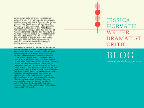
Part of the trouble is that there's already so much empty space, but at the same time if it doesn't stick to similar proportions, the design begins to look "off" (believe me!).
Or were you going to use an iframe or an overflowed div that doesn't play nice with mouse wheels?
Um, the second one. *whimpers*
I take issue with [my bit about losing proportionality cross-systems]. "Liquid"/ "scaling"/ whatever you want to call it layouts are designed for this problem.
You're right, and that's part of my problem. I designed my blog using almost exclusively em measures, and layout stuff didn't work immediately. I guess I've developed a sort of aversion to that strategy, and unfairly so. The first thing I try will simply be to convert my layout measures to ems, and my relative spacers to two consistent edges (probably top and right), and see what happens.
it sounds like maybe you should look into the Jello mold technique
I'm not sure how I could use this exact layout (meaning I'd have to take it apart ot understand exactly what was going on), but you did remind me of the min- and max-width properties. Between those and em scaling, I think I might be able to hammer this out tonight.
posted by electric_counterpoint at 5:50 PM on January 18, 2006
The biggest thing I've learned is that I'm weird for keeping my browser window maximized on my laptop. Old habits die hard, I guess. It's not quite widescreen enough for two browser windows, but maybe I'll try squeezing iTunes into the left gutter or something, and see how I like it.
First, as requested, here's what I'm going for. Should have included it in the first place.
Part of the trouble is that there's already so much empty space, but at the same time if it doesn't stick to similar proportions, the design begins to look "off" (believe me!).
Or were you going to use an iframe or an overflowed div that doesn't play nice with mouse wheels?
Um, the second one. *whimpers*
I take issue with [my bit about losing proportionality cross-systems]. "Liquid"/ "scaling"/ whatever you want to call it layouts are designed for this problem.
You're right, and that's part of my problem. I designed my blog using almost exclusively em measures, and layout stuff didn't work immediately. I guess I've developed a sort of aversion to that strategy, and unfairly so. The first thing I try will simply be to convert my layout measures to ems, and my relative spacers to two consistent edges (probably top and right), and see what happens.
it sounds like maybe you should look into the Jello mold technique
I'm not sure how I could use this exact layout (meaning I'd have to take it apart ot understand exactly what was going on), but you did remind me of the min- and max-width properties. Between those and em scaling, I think I might be able to hammer this out tonight.
posted by electric_counterpoint at 5:50 PM on January 18, 2006
Best answer: max-width in Internet Explorer will be useful. Elastic Design, In Search of the One True Layout, and Elastic Design Demonstration might help, too.
posted by kirkaracha at 7:53 PM on January 18, 2006
posted by kirkaracha at 7:53 PM on January 18, 2006
Personally I run my widescreen with apps maximized. That's why I got the widescreen in the first place - so that I can use the maximum space possible when using my computer. Sidebars (like the MeFi sidebar) can be open without crushing my screen real estate. Easier to see the tabs that I have open because there's more room for them to fit. No matter how weird you may think it is, that's how I use my monitor (and in my impression, only the Mac-trained folks tend to not maximize windows, largely because there's no one-click way to do it).
My point here is that you can never have control over what hardware I use to view your website, what browser I use, what screen resolution, etc. and you're going to have to get used to that fact. So, for those of us who like the maximized screen, be it on a widescreen or an unusually high screen res, here is my take:
90% of the fixed-width websites I see do it the wrong way: All content is locked relative to the top left corner. On my monitor, that looks awful. Half (sometimes 2/3rds) of my screen is now blank. There's no reason for that. If you're going to go fixed-width, use display: table and margin: 0px auto on your containing div to at least center the content in the page. An 800px-wide colum in the middle looks much better than an 800px wide column squished weirdly into one side of my display.
My personal preference is to use relative sizing to make things fit. Fixed-width (or fixed-precentage) nav column(s), with an elastic content space. You can use maxwidth if you desire. And don't forget that on a larger monitor small print is extremely hard to read. Using em to specify font size is preferable to using a specific size name (thanks to IE, the "standard" font size is often unreadably small in Firefox).
posted by caution live frogs at 6:43 AM on January 19, 2006
This thread is closed to new comments.
Accept the fact that not everyone will view your site at the same aspect ratio. Even if everyone ran at the same resolution, lots of people don't view their browsers at full size (I blame laziness and Macs). I'd even go so far as to say this is simply a limitation of the medium, and that what you're trying to do is unnatural. I mean, what if content scrolls past the bottom of the window? Isn't your aspect ratio screwed then? Or were you going to use an iframe or an overflowed div that doesn't play nice with mouse wheels?
</bitterwebdesignerrant>
posted by chrominance at 3:53 PM on January 18, 2006