What is the inspiration for this style of logo design?
December 2, 2016 1:01 PM Subscribe
Recently I've noticed a lot of designs for logos, tshirts, etc. with an X shape with images around it. For instance this Hamilton shirt or this Twitter account. Are they all inspired by some historic flag design? It seems really familiar to me but I can't figure out what it is.
It reminds me of the markings search-and-rescue teams put on houses in disaster zones to annote how much they searched and who/what they found.
posted by clew at 1:06 PM on December 2, 2016 [4 favorites]
posted by clew at 1:06 PM on December 2, 2016 [4 favorites]
Hurricane Katrina was when most Americans saw it first.
posted by SyraCarol at 1:12 PM on December 2, 2016
posted by SyraCarol at 1:12 PM on December 2, 2016
It's vaguely nautical and olde tymey reminiscent, but it's also one of those things that has already gone through a thousand iterations by bad designers who don't actually know what they're referring to when they use that type of iconography. So now it's just... a thing.
At this point, that hipster-ish X logo design is in the place Keep Calm And Carry On was a few years ago, where it's been divorced from its original meaning and is in some kind of weird cargo cult "IDK people seem to like this I guess" area of graphic design signifiers. I remember the retro smiley face going through the same evolution in the 90s. It started out having an explicit meaning (nostalgic reference to the 1970s) and ended up just being a sort of blob put on t-shirts and mugs because why not.
posted by Sara C. at 1:15 PM on December 2, 2016 [1 favorite]
I thought it was based upon crossed arrows.
posted by jraz at 1:16 PM on December 2, 2016 [1 favorite]
posted by jraz at 1:16 PM on December 2, 2016 [1 favorite]
Best answer: NYHC, short for New York Hard Core has been used by the punk scene in that formation since the 80s. Other geographies then adopted the fashion, too.
See: https://en.wikipedia.org/wiki/New_York_hardcore
and this google image search.
Edit: which is to say, that's for sure where the Hamilton shirt is drawing it's inspiration. I've no idea if that's the true origin of the design trope.
posted by Sleddog_Afterburn at 1:16 PM on December 2, 2016 [2 favorites]
Best answer: Oooh, ooh! This is relevant to my interests!
Based on my love of the tumblr yourlogoisnothardcore, I came across this Stack Exchange question with a variety of answers: Is there a name for logos with four letters in the quadrants of an X?.
In recent history, they point towards New York Hardcore in the '80s, as described in this article: 22 Iconic New York Music Logos Explained. However, some answers also mention the much older uses as showcased in this article: neat: the “hipster x” logo.
posted by redsparkler at 1:17 PM on December 2, 2016 [5 favorites]
First I saw of it: in the 80/90s it was used for a style of music called "New York Hardcore," which were bands like Agnostic Front and Madball.
posted by rhizome at 1:22 PM on December 2, 2016
posted by rhizome at 1:22 PM on December 2, 2016
Response by poster: Thanks, these answers are all good! If anybody has any other info I'd be interested. I really like that tumblr redsparkler.
posted by interplanetjanet at 1:40 PM on December 2, 2016
posted by interplanetjanet at 1:40 PM on December 2, 2016
It's used in search & rescue operations like in Katrina.
It conveys a lot of information to other rescue groups
posted by wwax at 2:14 PM on December 2, 2016
It conveys a lot of information to other rescue groups
posted by wwax at 2:14 PM on December 2, 2016
Ha, I saw the question, and I was like "looks like a hardcore thing", but I didn't realize that NYHC is where it started.
posted by kevinbelt at 2:32 PM on December 2, 2016
posted by kevinbelt at 2:32 PM on December 2, 2016
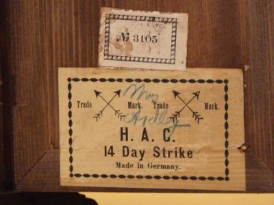
I've had the same question kicking around my head for a while. This Clock manufacturer logo uses the crossed arrows, so maybe accounts for some of the old-timely feeling of it. I suspect a confluence of the NYHC logos and some old-time ones is at play here. I can see why it's so prevalent, it fits the minimal-plus-reclaimed-old-things aesthetic many places go for perfectly. I am more or less heartily sick of it now, so I suspect/hope its time is drawing to a close.
posted by Jon Mitchell at 5:13 PM on December 2, 2016 [1 favorite]
posted by Jon Mitchell at 5:13 PM on December 2, 2016 [1 favorite]
The references to crossed arrows got me thinking about crossed swords. These are often seen in castles (in movies, anyway) as decoration or standby weapons. As a symbol, crossed swords show up in military organizations and in heraldry (scroll down a bit), both Christian and Islamic.
The coat of arms of the Holy See bears crossed keys.
The skull and crossbones is a very old symbol still in use in various ways today.
It may be hip and trendy today, but the idea of crossing two things as a symbol unto itself or as part of a symbol has been around a long time.
posted by bryon at 12:29 AM on December 3, 2016
Considering a lot of usage is to suggest "autenticity", particularly old-timey, it's possible it was inspired by some cavalry badges, starting from the early 20th century. Two crossed swords, a few have the unit on top and something else on the bottom (permanent detachment?). Might also be inspired by hobo code. Googling, some sources give X as something safe (be it a house that is "ok", a safe camp site with two dots on each side, a doctor with a sick face on top).
Starting from those two, putting a letter, number, year or random icon to customize it is just a small step.
It also reminds me of the Fire Diamond chemical identification badges, but that's very, very unlikely.
posted by lmfsilva at 4:25 AM on December 3, 2016
Starting from those two, putting a letter, number, year or random icon to customize it is just a small step.
It also reminds me of the Fire Diamond chemical identification badges, but that's very, very unlikely.
posted by lmfsilva at 4:25 AM on December 3, 2016
Looks very much like stylized rowing club logos with crossed oars.
posted by guy72277 at 1:42 AM on December 5, 2016 [1 favorite]
posted by guy72277 at 1:42 AM on December 5, 2016 [1 favorite]
This thread is closed to new comments.
posted by Alterscape at 1:04 PM on December 2, 2016 [2 favorites]