Thank a Farmer: Font identification, please?
November 25, 2015 6:37 AM Subscribe
At the bottom of this blog post is a sign that says "If you ate today, THANK A FARMER." Can you name the font, please?
I'd like to use this or a similar (American '30s?, rural, industrial; something like the font used at the bottom of this poster--Roosevelt and Lehman) font for a personal, non-commercial, non-internet project. Free or low-cost would be terrific. I'm particularly interested in the upper-case letters. Thank you!
I'd like to use this or a similar (American '30s?, rural, industrial; something like the font used at the bottom of this poster--Roosevelt and Lehman) font for a personal, non-commercial, non-internet project. Free or low-cost would be terrific. I'm particularly interested in the upper-case letters. Thank you!
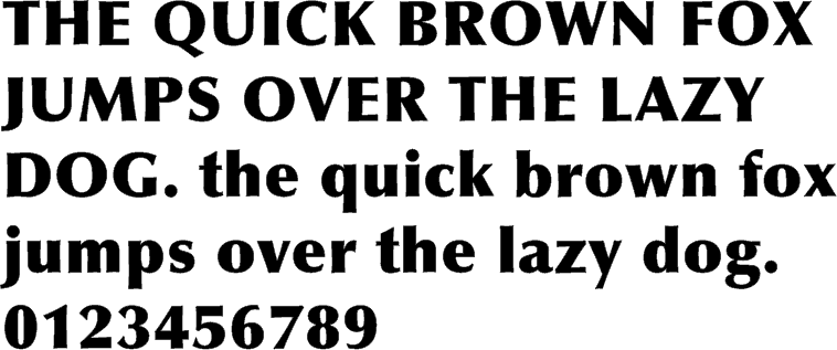
It also looks kind of like Optima (Black or Extra Black) only squooshed a little (but it's not).
posted by WesterbergHigh at 6:58 AM on November 25, 2015
posted by WesterbergHigh at 6:58 AM on November 25, 2015
At work, so a post-and-dash, but I can recommend DaFont as an excellent resource for freeware/shareware/donationware/public domain fonts, under various licences (including commercial).
I'll have a ferret around in there when I'm back at home tonight, and see if I can find something similar to what you're after!
posted by Morfil Ffyrnig at 7:56 AM on November 25, 2015
I'll have a ferret around in there when I'm back at home tonight, and see if I can find something similar to what you're after!
posted by Morfil Ffyrnig at 7:56 AM on November 25, 2015
The sign in the blog post looks like it was handpainted, not printed, so you probably won't be able to find an exact match. Identifont should give you some similar options. It's helpful because you can only search by the characters you have (i.e., THANKFRME).
posted by kevinbelt at 8:13 AM on November 25, 2015 [3 favorites]
posted by kevinbelt at 8:13 AM on November 25, 2015 [3 favorites]
I've seen a few of these font ID questions lately. What The Font is sometimes effective at answering that kind of question.
posted by cubby at 8:40 AM on November 25, 2015
posted by cubby at 8:40 AM on November 25, 2015
The sign in the blog post looks like it was handpainted, not printed, so you probably won't be able to find an exact match.
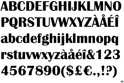
If it was handpainted, it was definitely done using some weight of Castle (or a Castle precursor--I don't know what the original typeface is, almost every major foundry seems to have their own version) as a reference. There are several distinctive characteristics, like the extreme x-height & the lowercase f, t and y.
posted by bcwinters at 9:55 AM on November 25, 2015
The sign looks to definitely be hand-painted, and looks a bit older than the Castle family (1975). The lettering style is a fairly standard lettering style used by sign painters of yore...Flat brushes in two weights with a slight pressure variation on the strokes. Those old guys were amazing to watch at work, and usually lettered without any sort of typeface reference. A simple sign like this would have been, maybe, 30 minutes work.
Even that poster appears to have been hand-lettered. It's definitely a lost art.
Over the years, foundries introduced tons of fonts that mimic this style. Anything that come close, like Castle, will work for you. Britannic Bold is another one that is easily found and would do (though it has a bit more flourish than the lettering on the sign.)
posted by Thorzdad at 10:33 AM on November 25, 2015 [1 favorite]
I agree with Optima Extra Black except for the lower case f but since it's handpainted, I think that's as close as you'll get.
posted by TWinbrook8 at 4:39 PM on November 25, 2015
posted by TWinbrook8 at 4:39 PM on November 25, 2015
This thread is closed to new comments.
posted by bcwinters at 6:56 AM on November 25, 2015 [2 favorites]