Making sense of multivariable statistics (with infographics?)
May 6, 2015 2:50 PM Subscribe
I'm working with some multi-variable data (up to 12 factors per event, from a possible 28 factors) so far I've only seen it discussed as a combination of two factors. Is there a way to elegantly (or at least clearly) display inter-relations of more features? I realize 12 factors is a lot, so anything more than 2 factors would be an improvement.
For sake of discussion, let's say this is about people's preference for sweets, and I have information on when people eat them, how they're feeling when eating a particular sweet, and the ingredients of the particular sweet. With that example, Person #1 likes chocolate cake in the evenings when they're happy, while person #2 likes chocolate chip muffins in the morning when they're feeling sleepy.
I feel like the results I've seen so far are as basic as "two people like chocolate, one person likes chocolate cake and one person likes chocolate muffins; chocolate muffins are eaten in the morning, while chocolate cake is eaten in the evening." And then I say, "wait, there's more nuance to this information!"
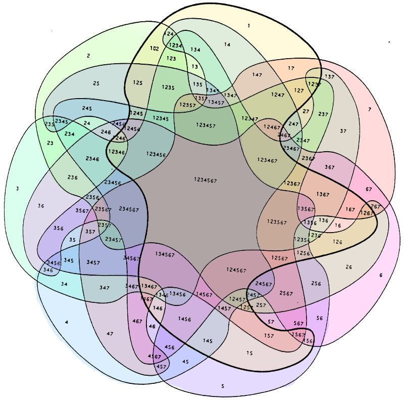
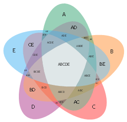
But there are 500+ records to sort, and so far I've only come up with Venn diagrams, and once you get to 7 factors, it takes as much time to read as if you were to see a series of bar graphs and try to mentally collate them. Even 5 factors is visually daunting.
What are some good examples and software for multi-variable infographics? Thanks!
For sake of discussion, let's say this is about people's preference for sweets, and I have information on when people eat them, how they're feeling when eating a particular sweet, and the ingredients of the particular sweet. With that example, Person #1 likes chocolate cake in the evenings when they're happy, while person #2 likes chocolate chip muffins in the morning when they're feeling sleepy.
I feel like the results I've seen so far are as basic as "two people like chocolate, one person likes chocolate cake and one person likes chocolate muffins; chocolate muffins are eaten in the morning, while chocolate cake is eaten in the evening." And then I say, "wait, there's more nuance to this information!"
But there are 500+ records to sort, and so far I've only come up with Venn diagrams, and once you get to 7 factors, it takes as much time to read as if you were to see a series of bar graphs and try to mentally collate them. Even 5 factors is visually daunting.
What are some good examples and software for multi-variable infographics? Thanks!
Are you trying to discuss causal factors for an event? If so, DAGs (directed acyclic graphs) might be your answer for representing the relationships among variables.
If you're just looking to discuss your data, I think your best bet is to break it up - talk about bivariate relationships first, show a limited number of variables in an infographic. If you are really concerned with showing each category in a detailed way, a table will be the easiest to understand. (I look at data a lot and I cannot parse those Venn diagrams at all).
For your example, I am assuming that "flavor" is the main outcome of interest. I would first discuss what flavors people prefer (X% like chocolate, Y% like orange, etc). I would then go through categories of food by dessert if they are comparable (more people who liked chocolate preferred cake than muffins AND more people who preferred donuts like orange). You can then discuss Time of Day (TOD) - TOD was affected by both flavor preference (more people who liked chocolate liked to eat it at night) and dessert preference (more people who liked muffins liked to eat in the morning).
You don't need to discuss every combination of everything in your data. (Because then you will be discussing 28!=3.04e29 relationships is. And that is insane.) You need to isolate what relationships are relevant to your analysis, and determine how to best represent them.
posted by quadrilaterals at 7:23 PM on May 6, 2015
D3.js can be a little obtuse to work with, but it does so many things...I admit to a little programmer's crush on it.
You might try a chord diagram or hierarchical edge bundling to see if your data is represented well.
posted by underflow at 8:52 PM on May 6, 2015
You might try a chord diagram or hierarchical edge bundling to see if your data is represented well.
posted by underflow at 8:52 PM on May 6, 2015
Response by poster: Thanks for these resources! I'll start digging in.
I gave the example of sweets in the OP because I didn't want to focus on the true data I'm working with: crash statistics. Some categories are so broad as to be meaningless without additional factors added to the consideration. For instance "road departure" is a major issue, so without looking at the other factors, less than ideal responses might be suggested (rumble strips help a drowsy or distracted driver, but if the road is too slick or the driver was speeding, they're of less benefit).
posted by filthy light thief at 7:32 AM on May 7, 2015
Perhaps an Instrumental Variables approach. You will find it in any good statistics package.
As a generality, any regression technique is going to try to find a subspace of your 28 dimensional space that best models your data. It is fine if things are in fact linear. Not so good if things are non-linear. You probably have a lot of binary factors like seatbelt (y,n).
posted by SemiSalt at 2:10 PM on May 7, 2015
« Older My brain rejects any man who treats me well. Help! | Getting out of limerence while still maintaining... Newer »
This thread is closed to new comments.
posted by adamrice at 3:01 PM on May 6, 2015 [1 favorite]