Effect of repainting my restaurant
August 22, 2005 5:51 PM Subscribe
I want to repaint the walls of my restaurant with a lighter colour. I want to gauge the effect this will have on the look of the place, but have neither 3D modelling software nor the knowledge to use this software. Can any of you Photoshop mavens assist?
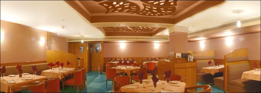
I designed most of my restaurant myself. Small pic here and a much higher quality pic here. It was designed to be a nice warm place, and indeed it's popular as a romantic setting.
But the burnt orange painted on the walls is casting an orange (no surprise there) hue on everything else, and I think much of the richness of the wooden panelling on the side, the flooring, etc. is getting blown out by it.
So I'm thinking of repainting the walls a nice light peach colour to make the other elements stand out a bit more and make the place look a tad more spacious. (Since those photos were taken, I've added some water colour paintings on the walls.)
I don't want to spend time and money repainting it and then find out it looks like crap. So... as I mentioned in the intro, can any of you Photoshop gurus help with techniques to perhaps simulate the effect of a light peach colour on the walls? It's not just a colour replace 'cause the tables, chairs, etc. all will be affected.
Mask of the walls using some of the selection tools. Then you can go in and do a color replace on just the areas in the selection tool.
It won't be perfect (without spending more time than it's worth) because the gradient created by the lights will get a little banded. Also, it looks like the the color balance in the photo may be wrong, but you can probably get a sense. Let me know if you'd like me to do it for you.
posted by willnot at 6:24 PM on August 22, 2005
Best answer: You might want to try the Color Smart tool on the Behr paint web site. It lets you pick colors and see how they look in a veriety of rooms. It won't let you see the exact effect on your room, but if you can find one of their examples that has a similar amount of wood you should be able to gauge the effect pretty well.
Sherwin Williams also has a tool called the Color Visualizer that's even easier to use. (Link is in the left nav bar of the linked page.)
Your restaurant looks gorgeous, by the way!
posted by MsMolly at 6:40 PM on August 22, 2005
Sherwin Williams also has a tool called the Color Visualizer that's even easier to use. (Link is in the left nav bar of the linked page.)
Your restaurant looks gorgeous, by the way!
posted by MsMolly at 6:40 PM on August 22, 2005
In fact, here you go: JPEG and Layered PSD File (20 MB). I spent about zero time taking care with the mask or the color replace. You can spend more time on it if you feel like you need to. The PSD file has the mask saved as a path and the original layer behind my peach layer so you can quickly reproduce my crappy selection work if you want to play with a different color.
I'll leave those files up on my server for a day or two.
posted by willnot at 6:43 PM on August 22, 2005
I'll leave those files up on my server for a day or two.
posted by willnot at 6:43 PM on August 22, 2005
For accurate modelling, you do want a 3D renderer with radiosity and one that can account for surface reflectance/absorption..etc.
posted by Gyan at 7:10 PM on August 22, 2005
posted by Gyan at 7:10 PM on August 22, 2005
Madman, Just my two cents. You've got a very nice looking place, and good advice above. If you (or someone you know) can use Photoshop, consider taking Willnot's layered file and play around with other colors. Looks like there are an awful lot of tones in your dining room in the orange/red/brown family. Maybe a contrasting color would serve your purpose and freshen up the place -- perhaps a light blue-green or pearl gray?
posted by rob511 at 11:40 PM on August 22, 2005
posted by rob511 at 11:40 PM on August 22, 2005

http://www.krisjohn.net/peachpit.jpg
I've tried to adjust the overall colours of the room to match the colour that will be bouncing off the walls. Since a large amount of light is reflected out of the larger ceiling fixtures, I've also indicated how they might look with a repaint, though they've come out more of a light brown than a peach or salmon.
At the very least it looks like you're also need to get new napkins, and possibly new chairs -- something to match the booths at the side.
Hope this helps.
posted by krisjohn at 12:51 AM on August 23, 2005
Honey, this isn't what you asked for, and I really did spend only a couple of minutes on it (and I'm definitely not an expert!), but still I feel compelled to share my off-the-top-of-my-head solution. I say lighten up the color of the ceiling (quite a bit) and use a contrasting color for the floor. (IANAID)
posted by taz at 9:49 AM on August 23, 2005
posted by taz at 9:49 AM on August 23, 2005
Response by poster: Thanks to all of you for taking the time to help. It's given me some ideas. I wonder if it would be appropriate to post a follow-up in MeTa when I'm finally done with it.
Just some notes:
1) There is definitely a colour cast to the pic and there's also a section behind the camera you don't see.
2) The ceiling is actually a light peach colour like this but because of the warm orange light, you don't make it out. The tablecloth is a similar colour.
3) The lowered section of the ceiling just above the booths is actually coloured a dark, chocolatey, crimson-ish brown, and again the photo deceives you. Here, this pic's brown (top right.)
4) The bright orange patterned ceiling lights actually don't affect the lighting beyond their recesses, and I'm going to keep them the same because they're beautiful. You have to see them to understand what I'm saying.
willnot, taz, and krisjohn, thanks for your time. I wish I could send you some food, but it would not survive the trip from India. ;)
posted by madman at 1:24 PM on August 23, 2005
This thread is closed to new comments.
posted by slipperywhenwet at 6:23 PM on August 22, 2005