How to find a chart of U.S. workforce composition by sector over time?
July 19, 2012 12:25 PM Subscribe
Looking for a simple economic history chart to make a simple point. An hour on google images has failed me; can the hive mind help out?
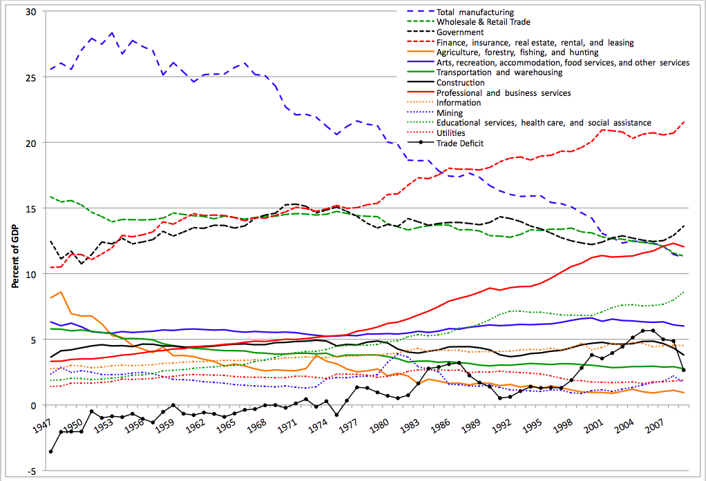
I'm teaching an introductory expository writing course at the college level this fall. In my first class, I'd like to show the class a simple chart from a reputable source that shows how our economy has changed over time from primraily agricultural and industrial to information-based. In other words, I want to impress on them that writing clearly and communicating well are useful skills, perhaps the most important they'll learn in college. After much searching, the best two charts I've found are this and this, and this. The problem is that the first one, which makes my point perfectly, doesn't supply its sources; the second one refers to GDP rather than employment, and is also a bit cluttered; and the third one seems to be a dead link. If anyone knows where or how to call this sort of thing up without too much trouble, I'd be grateful (and I won't be offended by a ltmgtfy.com url if I've just been using duffer search terms for some reason).
I'm teaching an introductory expository writing course at the college level this fall. In my first class, I'd like to show the class a simple chart from a reputable source that shows how our economy has changed over time from primraily agricultural and industrial to information-based. In other words, I want to impress on them that writing clearly and communicating well are useful skills, perhaps the most important they'll learn in college. After much searching, the best two charts I've found are this and this, and this. The problem is that the first one, which makes my point perfectly, doesn't supply its sources; the second one refers to GDP rather than employment, and is also a bit cluttered; and the third one seems to be a dead link. If anyone knows where or how to call this sort of thing up without too much trouble, I'd be grateful (and I won't be offended by a ltmgtfy.com url if I've just been using duffer search terms for some reason).
Best answer: On the BLS website, this looks like relevant data:
ftp://ftp.bls.gov/pub/suppl/empsit.ceseeb1.txt
Probably you could throw it into Excel and make a decent-looking chart out of it. (It's nonfarm payrolls, and doesn't go back to 1860, but I actually think that's better for your purposes--while the long history is fascinating, this makes a good argument that writing is even more important than it was for these kids' parents).
posted by _Silky_ at 1:12 PM on July 19, 2012
Response by poster: Thank you both! A friend of mine once said that to get out of trouble you need a quick gun and a big gun (I think this was a life metaphor drawn from too many hours on first-person shooters, but anyway). The census link is a great quick gun and the BLS dataset is an excellent big gun.
posted by sy at 1:21 PM on July 19, 2012
posted by sy at 1:21 PM on July 19, 2012
It only goes back to 1980 for the US but it turns out the World Bank actually has a great website (way easier to use than BLS, but less data). you can select country and then choose what indicators you want, in this case employment in industry, agriculture, and services (as % total employment). It's too recent to show the collpase in farm employment but the decline of industry/rise of services shows up well. It lets you export to Excel.
Thanks to this question now I know about the great WB site.
posted by Wretch729 at 1:26 PM on July 19, 2012
Thanks to this question now I know about the great WB site.
posted by Wretch729 at 1:26 PM on July 19, 2012
« Older My cats want to know whyit's okay for ME to play... | Chicken thighs, you are so tasty, but I will... Newer »
This thread is closed to new comments.
The Bureau of Labor Statistics and the Census websites are a nightmare to navigate, (data.gov is only a little bit better) but if you emailed them or asked a reference librarian I bet you could get the logitudinal data you're asking for. Then just make your own graph.
posted by Wretch729 at 1:04 PM on July 19, 2012