Circles and nodes visualization software
January 20, 2011 10:40 AM Subscribe
I'd like to create a data visualization like the Guardian one linked here. I've looked everywhere and can't find out what this kind of chart is called, or what kind of software exists to help me make it. Any ideas?
Best answer: For software, you might start with Processing and Tableau. There's a large community of people in this scene; a good landing spot is FlowingData. And, of course, if you really want to start down this road, the first stop is Tufte.
posted by proj at 10:51 AM on January 20, 2011 [3 favorites]
posted by proj at 10:51 AM on January 20, 2011 [3 favorites]
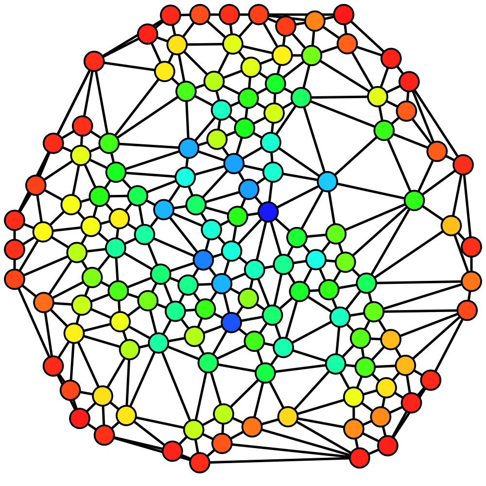
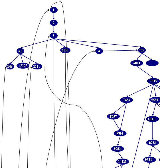
Best answer: In mathematical terminology the circles-with-lines-between-them* drawing is called a "graph" (with a very specific, special meaning different from what "graph" means in standard English.)
That Guardian image is a particular kind of graph called a "tree" - again with a precise mathematical meaning but you can see the analogy, that the lines always branch out as they leave the central circle, never connecting into loops. See how this or this aren't trees because they have loops, but rather they're more general kinds of graphs.
Then, the way that the Guardian graph is laid out is called a force-directed layout.
One other detail as pertains to data visualization is that the circles are obviously being sized relative to the value each one represents.
* Circles and nodes are actually the same thing and another synonym for them is vertices, singular vertex. The lines are called edges.
posted by XMLicious at 11:17 AM on January 20, 2011 [1 favorite]
Best answer: Also, the links that proj gave you there are definitely the way to go if you have something like a large spreadsheet or database that you want to turn into a vizualization like this. However, if you're only making something as small as the graphic in the Grauniad article, you might take a look at Inkscape. It's actually a free illustration tool along the lines of a simplified Adobe Illustrator, but it has minimal graph layout features that just happen to do exactly what you'd need to draw something like this.
All you'd basically need to do is draw a bunch of circles, connect them to each other with the "Create Diagram Connectors" tool (Ctrl + F2), and then open the Object -> Align and Distribute dialog (Shift + Ctrl + A), select everything you just drew (Ctrl + A) and press the "Connector Network Layout" button in the Align and Distribute dialog, which I'm pretty sure is implementing a force-directed layout algorithm. Then go ahead and play with the other buttons in Align and Distribute and use the drawing tools to tweak everything and attach labels to the circles and get it looking the way you want it.
posted by XMLicious at 11:49 AM on January 20, 2011 [1 favorite]
It is a stylish mindmap. There are lots of softwares to help you make these, but you'll find that professionals usually work with Adobe (Illustrator or Photoshop) in order to get the level of detail and customization that they need. However, if you go the route of mindmap-specific software, MindManager and MindGenius seemed to be leading the pack when I checked a couple years ago.
posted by foraneagle2 at 12:04 PM on January 20, 2011 [1 favorite]
posted by foraneagle2 at 12:04 PM on January 20, 2011 [1 favorite]
Best answer: As described here, I just got started with Processing, and I would not recommend it for drawing pictures; the graphics commands are very low-level (like drawing individual shapes) and of course you have to do it all by writing code. It would only be a good idea when you need both interactivity and animation, which that Guardian picture doesn't have.
GraphViz is an amazing program for automatically laying out graphs (in the sense XMLicious describes). I've used it to make diagrams like the one in the Guardian, except with even more nodes. You write out your data in a specially formatted text file that describes what's connected to what (among other things), and GraphViz converts that into an image, handling the hard part (i.e. how to arrange the graph) automatically. If you want to make it even prettier, you can import the image into your favorite drawing program like Inkscape or Illustrator. I don't think you'd be able to make something as colorful as the example without the last step.
posted by Chicken Boolean at 12:09 PM on January 20, 2011
Many Eyes can create a number of different "maps" or "tree" diagrams. It's a little finicky about formatting data for input, but it's free and creates some professional-looking infographics.
posted by Sifleandollie at 12:48 PM on January 20, 2011
posted by Sifleandollie at 12:48 PM on January 20, 2011
Response by poster: Fantastic - lots to look at here. I do have a fairly large dataset and don't want to spend time drawing circles manually - looks like I'm going to have to take the plunge with Graphviz. Thanks everyone!
posted by chrispy at 1:50 AM on January 21, 2011
posted by chrispy at 1:50 AM on January 21, 2011
This thread is closed to new comments.
I imagine the people who make them are using some sort of graphics program, like Adobe Illustrator.
posted by royalsong at 10:46 AM on January 20, 2011