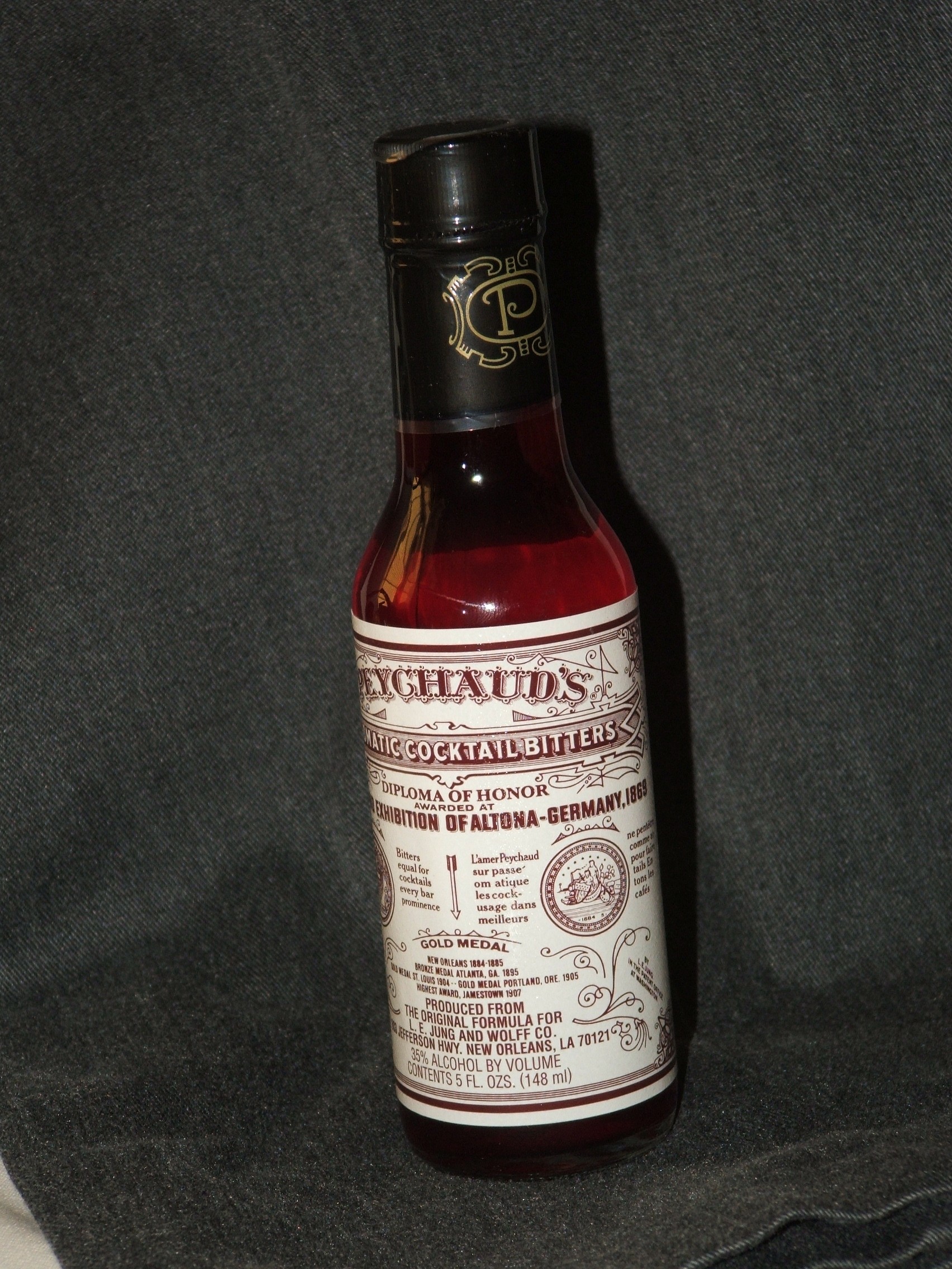
What is the font used in the Peychaud's Bitters label?
November 10, 2010 9:23 PM Subscribe
What font is used for the "Aromatic Cocktail Bitters" text in the Peychaud's Bitters label?
I'm in the early stages of learning Photoshop and Illustrator. I want to create a logo that resembles the part of the Peychaud's Bitters label that reads "Aromatic Cocktail Bitters," including the box surrounding the text. Does anyone know the font that is used, or a similar one?
Incidentally: I love these old-fashioned cocktail labels. I wonder how, precisely, they were designed before the advent of digital tools, which seem yet to produce labels to rival them.
You're asking in the wrong place. The Typophile Font ID Board will have you an answer in a matter of minutes. Those guys are scary good.
posted by schmod at 9:54 PM on November 10, 2010
posted by schmod at 9:54 PM on November 10, 2010
Yup, brocktoon's right. That's definitely it. Bummer that it's expensive!
posted by patronuscharms at 10:48 PM on November 10, 2010
posted by patronuscharms at 10:48 PM on November 10, 2010
Oh wow, thanks for turning me on to LHF.
posted by Señor Pantalones at 11:10 PM on November 10, 2010
posted by Señor Pantalones at 11:10 PM on November 10, 2010
Bummer that it's expensive!
40$? Pretty cheap for a typeface.
posted by beerbajay at 11:30 PM on November 10, 2010
40$? Pretty cheap for a typeface.
posted by beerbajay at 11:30 PM on November 10, 2010
Definitely not a match. The K is very different. It's possible that the label text is hand drawn - this was pretty common for a long time. Hensler might be based on the label.
posted by scose at 12:10 AM on November 11, 2010
posted by scose at 12:10 AM on November 11, 2010
Scose is correct; Peychaud's Bitters is like 200 years old and that label would have been hand-drawn with a hand-drawn font. As such there is no typeface for it, unless someone has since drawn it out and made up all of the other characters as a labour of love and homage. You can ask for close suggestions at Typophile, though, and get something stylisticly close, the same way Avenir is used to approximate the hand-lettering on the original Keep Calm and Carry On* sign.
*I'm sure I read about this specific example on the Blue but I can't be arsed to look.
posted by DarlingBri at 6:42 AM on November 11, 2010
*I'm sure I read about this specific example on the Blue but I can't be arsed to look.
posted by DarlingBri at 6:42 AM on November 11, 2010
The LHF Henslers has serif-y things on it. Aromatic Bitters does not.
posted by SLC Mom at 7:45 AM on November 11, 2010 [1 favorite]
posted by SLC Mom at 7:45 AM on November 11, 2010 [1 favorite]
Hensler is "the font that is used, or a similar one".
I wonder how, precisely, they were designed before the advent of digital tools, which seem yet to produce labels to rival them.
I'm no printing historian, but the ornamentation was most likely drawn by hand, and printed with a lithograph press.
posted by Brocktoon at 10:31 AM on November 11, 2010
I wonder how, precisely, they were designed before the advent of digital tools, which seem yet to produce labels to rival them.
I'm no printing historian, but the ornamentation was most likely drawn by hand, and printed with a lithograph press.
posted by Brocktoon at 10:31 AM on November 11, 2010
« Older Underwear for a grown-up Superboy | Signs a New York rental apartment is not infested... Newer »
This thread is closed to new comments.
I googled the part of the label you requested and tried cropping it so it would work with What the Font and nothing's coming up that truly matches. I would submit the logo to their forum anyway just in case an expert's out there who can identify the typeface. :) This photo in particular seems to be the clearest.
posted by patronuscharms at 9:35 PM on November 10, 2010 [1 favorite]