Great social/economic infographics?
July 2, 2010 11:22 AM Subscribe
Infographics: How to visualize a country?
What's the greatest social/economic info display you've ever seen? What makes it great? What interesting thigs did you see there?
What's the greatest social/economic info display you've ever seen? What makes it great? What interesting thigs did you see there?
Topographical crime mapping was pretty interesting. Especially because I have a hard time with visualizing abstracted data.
(You know about Information is Beautiful and Information Aesthetics, right?)
posted by griphus at 11:35 AM on July 2, 2010
(You know about Information is Beautiful and Information Aesthetics, right?)
posted by griphus at 11:35 AM on July 2, 2010
It might be a little broader than you're looking for, but Worldmapper is pretty great. Previously on mefi.
posted by rtha at 11:41 AM on July 2, 2010
posted by rtha at 11:41 AM on July 2, 2010
I'm a big fan of the work on http://data.worldbank.org -- while the presentation isn't terribly flashy they've done an impressive job of gathering decades of data, normalizing it across all countries, and making it possible to do simple ad hoc visualization. They've also exposed the underlying source data, so people who want to do heavier crunching can.
posted by verb at 11:48 AM on July 2, 2010
posted by verb at 11:48 AM on July 2, 2010
zomg a question that was made for me!
This is a city, not a country, but it's pretty darned slick. Oakland Crimespotting
This site has a bunch of US politically-oriented maps.
radicalcartography is interesting - I like the place name etymology map (projects > browse by geography > continents and regions > american etymology)
chartporn maps category
Interactive US census maps
More US Census maps, not interactive (warning: ugly web design)
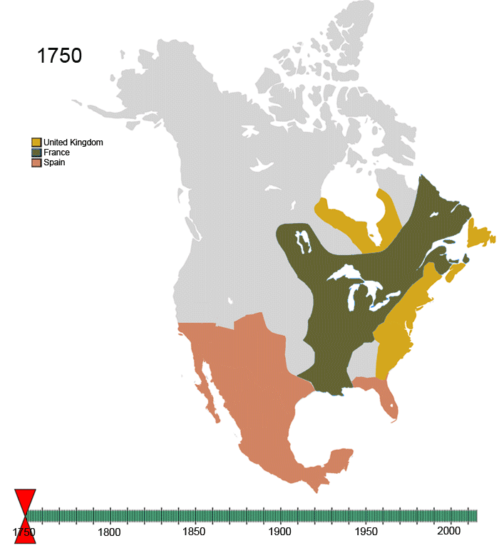
Non-Native American Countries' control over North America, 1790-2008 (animated gif)
The History of Religion (flash animation, self-link to my blog, I did not create the map)
I prefer maps that do not have jarring contrast between colors (bad, oh god my eyes, much better, awesome ), have a clear legend, and (if a small country) show that country in relation to its continent.
Many links via The Maproom. run by mefi's own mcwetboy.
posted by desjardins at 12:52 PM on July 2, 2010 [2 favorites]
This is a city, not a country, but it's pretty darned slick. Oakland Crimespotting
This site has a bunch of US politically-oriented maps.
radicalcartography is interesting - I like the place name etymology map (projects > browse by geography > continents and regions > american etymology)
chartporn maps category
Interactive US census maps
More US Census maps, not interactive (warning: ugly web design)
Non-Native American Countries' control over North America, 1790-2008 (animated gif)
The History of Religion (flash animation, self-link to my blog, I did not create the map)
I prefer maps that do not have jarring contrast between colors (bad, oh god my eyes, much better, awesome ), have a clear legend, and (if a small country) show that country in relation to its continent.
Many links via The Maproom. run by mefi's own mcwetboy.
posted by desjardins at 12:52 PM on July 2, 2010 [2 favorites]
Many years ago my parents had a poster of (I think) US income which used iconic people to represent every X population and had a lot of information (at least race, sex and employment sector) encoded into the icons. Unfortunately I can't find it online, but maybe somebody else will be familiar with it. I was always impressed with the balance between visual fun and actual information presented.
posted by ecurtz at 1:02 PM on July 2, 2010
posted by ecurtz at 1:02 PM on July 2, 2010
Cartastrophe is a blog all about maps and how poorly (or sometimes wonderfully) they can be put together.
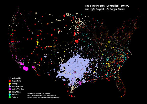
I really like maps that use unusual data to reflect bigger trends. This, for example. Or this.
posted by null14 at 3:22 PM on July 2, 2010
I really like maps that use unusual data to reflect bigger trends. This, for example. Or this.
posted by null14 at 3:22 PM on July 2, 2010
The Penguin Atlas of Women in the World has interesting maps demonstrating various data related to women's welfare around the world. There might be other books in the series, too.
posted by aka burlap at 11:19 AM on July 7, 2010
posted by aka burlap at 11:19 AM on July 7, 2010
This thread is closed to new comments.
posted by a womble is an active kind of sloth at 11:26 AM on July 2, 2010