How do I create an atari style computer game 8 bit image from a photo?
July 3, 2009 8:26 AM Subscribe
How do I create an atari style computer game 8 bit image from a photo?
Forgot to say, I'd use The Gimp, but I assume this is easy in Photoshop as well.
posted by salmacis at 8:32 AM on July 3, 2009
posted by salmacis at 8:32 AM on July 3, 2009
In addition to posterizing graphics programs normally have an effect called something like "Pixelate". If I were doing this I would probably convert the original image into greyscale first - then posterise it down to just a few colours (shades really). Apply pixelation to the level you want - then manually colour the whole thing in again. That gives you more control of what gets coloured what.
Finally bear in mind the the original games designers often used layering of game sprites. You can see this in the IT Crowd example you have linked to where they have used "Tank Command" style green wireframes. So you could try that approach too.
Here are some fonts that might work well if you need them.
posted by rongorongo at 9:02 AM on July 3, 2009
Not really what you asked for, but I did stumble over a photo to ascii char image converter just a couple of days ago:
Converter Home Page
Gallery / Samples
posted by csmason at 9:21 AM on July 3, 2009
Converter Home Page
Gallery / Samples
posted by csmason at 9:21 AM on July 3, 2009
You're not going to be able to automatically create ultra-low-res images like the ones you link to - for that style you need to draw it all yourself, pixel by pixel.
(You should've posted the photo so we could have a go!)
posted by malevolent at 12:11 PM on July 3, 2009
(You should've posted the photo so we could have a go!)
posted by malevolent at 12:11 PM on July 3, 2009
Best answer: All your examples were pixel-drawn by hand. Getting something that looks anywhere near as good through an automatic process I think is basically impossible (but ask again in 15 years).
Since these are basically cartoons, you want to use cartoony techniques, and do stuff by hand. You are going to be throwing away a lot of visual information. The shadows and textures are not necessary to the image, but it's very difficult for the software to recognize that they're irrelevant - often the shadows and highlights will have stronger contrast than the features you are interested in: e.g., figure vs ground, or skin vs hair.
I took a photo of my roommate, Dzin, and fooled around for about an hour and came up with this. (original)
I'm pretty good at photoshop but I'm not at all good at drawing.
What I did was use the pen tool to trace a few shapes - the face, the hair, the shades, the shirt, the arm, the beard, each on a different layer. Make a "shape" that captures the basic shape of the features. Fill them with a solid color (I just used the eyedropper to pick one from the photo). It's really helpful to know the keyboard shortcuts for transparency when you're tracing - the number keys do that.
Then I dropped it down in size to 32x32. Actually I tried a few sizes, and liked that one best.
I couldn't figure out how to make the shapes not antialias, so I just traced over them on a new layer with the pen tool, pixel by pixel. This sounds like a lot of work, but barely took any time at all, since it didn't require any thought. This also let me tweak some stuff I didn't like about the shades and so on.
After doing this I tried going back to the original and just hand-pixeling over the photo shrunk down, but by the scaling the photo down so far, I had made features too indistinct to really work with. So I think the cartoonification step (draw vectors over it) is worthwhile. If you feel creative it's also a good time to exaggerate people's features.
I definitely recommend working with the background separately; you won't want to spend nearly as much attention on clouds or buildings as you will on the people. I was able to get away with just using filters and adjustments to get it to fit the visual style of the character.
I wasn't happy with my original background though (pieces of Dzin were poking out from behind where I was sloppy), so I just grabbed a big swath of sky from another photo. I bumped the saturation of the sky, blurred it a little, dropped it down to a low resolution, changed it to indexed color (5 colors worked well), changed it back, and pasted it in on behind the layer with my character. My sky was a lot bigger so I could drag it around until I liked where the clouds were.
I resized the whole thing back up to 256x256 (it's important that it's an integer multiple of the original size; you can scale by a factor than to a fixed size), with the "nearest neighbor" setting, so the pixels would be big and chunky. Save it as a PNG, which will be smaller and look better, and you're all set.
posted by aubilenon at 12:28 PM on July 3, 2009
Can't help you create it, but here's a way you might want to use it
posted by namewithoutwords at 1:49 PM on July 3, 2009
posted by namewithoutwords at 1:49 PM on July 3, 2009
Probably not a serious answer, but you could ask this chap (link to MeFi article from today)
posted by Dub at 6:08 PM on July 3, 2009
posted by Dub at 6:08 PM on July 3, 2009
On the off chance you have Mathematica:
posted by hAndrew at 12:46 AM on July 4, 2009
ImageResize[
 ColorQuantize[ImageResize[ExampleData[{"TestImage", "Girl3"}], 24],
  8, Dithering -> False], 400]
posted by hAndrew at 12:46 AM on July 4, 2009
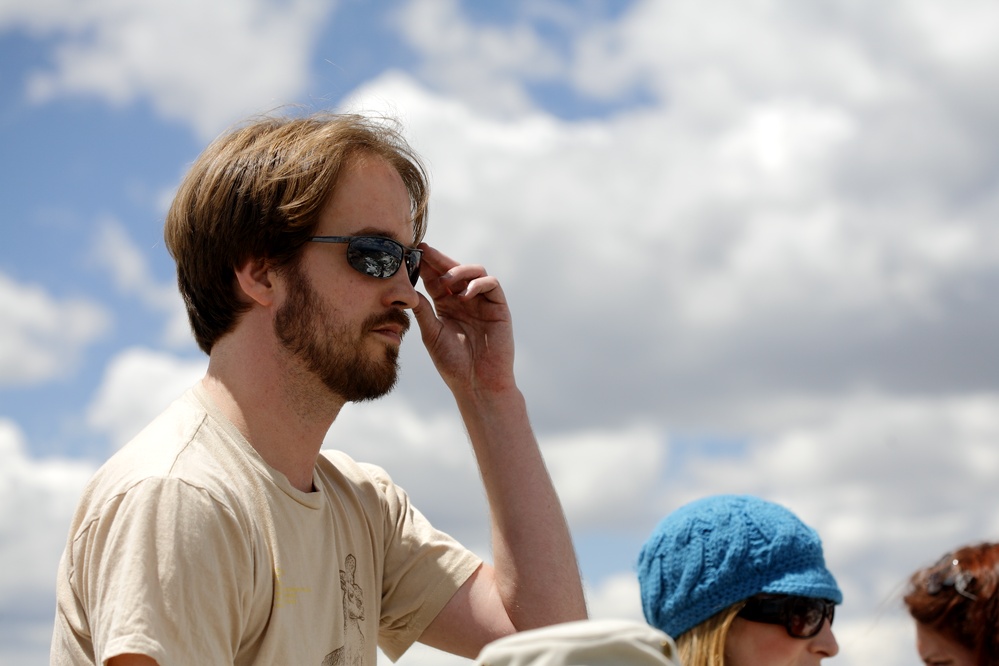
Response by poster: Thanks for the info.
Here is a photo for the people who wanted a go!!
posted by lamby at 2:37 AM on July 6, 2009
Here is a photo for the people who wanted a go!!
posted by lamby at 2:37 AM on July 6, 2009
Best answer: That's a really difficult angle - since it's head-on, nearly all of the information on his face is from shading. So if you make that flat, he turns nearly unrecognizable.
This is the best I could do, following the directions I posted. I had to put an outline on stuff to give him any chin at all.
posted by aubilenon at 1:46 AM on July 7, 2009
This is the best I could do, following the directions I posted. I had to put an outline on stuff to give him any chin at all.
posted by aubilenon at 1:46 AM on July 7, 2009
Returning to this thread a little late - but just to say that the IT Crowd title sequence was produced by the guys at Shynola. Shynola have done a lot of other work in the style that you are after.
posted by rongorongo at 3:30 AM on July 21, 2009
posted by rongorongo at 3:30 AM on July 21, 2009
This thread is closed to new comments.
1) Import the photo
2) Use the "Posterize" function to reduce the number of colours - 8 is a good number
3) Reduce the size of the image to the number of pixels you want
4) Zoom the image back to it's original size.
Simples! *wink*
posted by salmacis at 8:32 AM on July 3, 2009